How We Analyzed Customer Sentiment & Transformed Thousands of Reviews into Actionable Insights
From customer surveys to news reports, social media posts, online reviews, and more, there are massive amounts of text data about any given brand on the internet and beyond. This data builds up by the minute, and while you know that it contains valuable insights, it can be hard to get a handle on it.
Text analysis tools, like MonkeyLearn, can read through your text data at superhuman speed to provide accurate results and actionable insights.
Once your data is organized, you can use data visualization tools, like Google Data Studio (GDS), to make your data come to life. As a case study into the benefits of machine learning, we analyzed thousands of reviews of Facebook with MonkeyLearn’s text analysis tools and created a Google Data Studio dashboard to illuminate the results in fine detail.
Follow on to see how we collected, analyzed, and visualized text data using a selection of tools.
Facebook Reviews Analysis: The Results
MonkeyLearn offers a suite of text analysis tools that sort text data for broad picture overviews and fine-grained analytics. To demonstrate the power of MonkeyLearn, we analyzed over 2,800 user reviews of Facebook that were then visualized in Google Data Studio (more info on how to do this below).
We first ran the reviews through a topic analysis model to sort each review by the following topics: Advertisement, Messages & Inbox, News Feed, Notifications, Photos, Security & Privacy, and Videos.

Facebook’s security & privacy had, by far, the most mentions in reviews. And, by monitoring reviews over time, you can see that the number of reviews rise and fall significantly. This is why it’s helpful to run your text analysis constantly over time and regularly in real-time.
Next, we ran a sentiment analysis of individual topics to classify text as Positive, Negative, or Neutral. Monitoring customer feedback for sentiment will give you an up-to-the-minute view into the minds of your customers and the public at large.

Above you can see that customer feedback is overwhelmingly negative or neutral. However, businesses often receive more negative than positive reviews – only one in 10 happy customers leave a good review, while an angry customer is more likely to leave a bad review. Negative reviews are actually good for your business in a lot of ways. They help you learn from your mistakes and build trust (having only positive reviews would look suspicious), and allow customers to make more informed decisions.
As you scroll over each topic, you can see the total number of reviews and breakdown by sentiment.

Facebook’s News Feed receives the highest percentage of negative feedback, followed by its Advertisement and Notifications. These analyses can be performed on social media data, news reports, customer surveys, customer service data, the possibilities are endless.
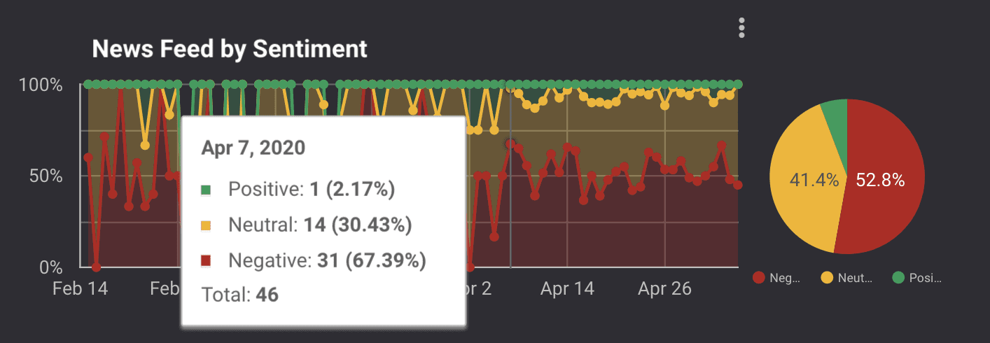
We also wanted to highlight the percentage share of each sentiment over time, and actual daily mentions by emotion, to see how public sentiment toward Facebook increased or declined.
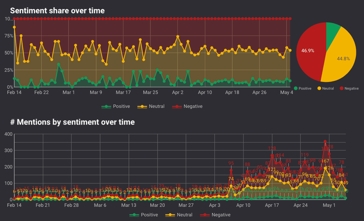

This is helpful to determine why positive or negative sentiment may have spiked on a certain date.
We dived even deeper into each of Facebook’s topics by sentiment and how it changed from day-to-day. On April 7, for example, there was a sudden surge in negative comments about Facebook’s news feed. By monitoring comments in real-time, businesses can take action as soon as they see a surge in negative comments about their brand. Then, by dividing sentiment into topics, they can respond even faster by routing customer comments directly to the relevant teams.
The second page of the dashboard visualization (below) shows results by individual mentions (as some reviews mention more than one topic). The middle column lists each of the more than 6,000 mentions as “opinion units” and shows their individual sentiment and topic.
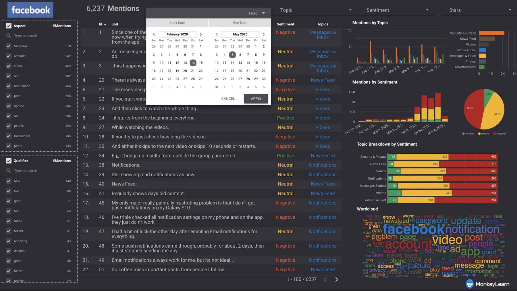
And you can see there is a dropdown calendar to narrow your analysis between two dates or a single day. Other dropdown menus can limit stats and graphs to only certain topics, sentiments, or star ratings.
Other analytics like aspect and qualifier (above left) and word clouds (below) are helpful to give you an idea of the most used and most important words, overall.
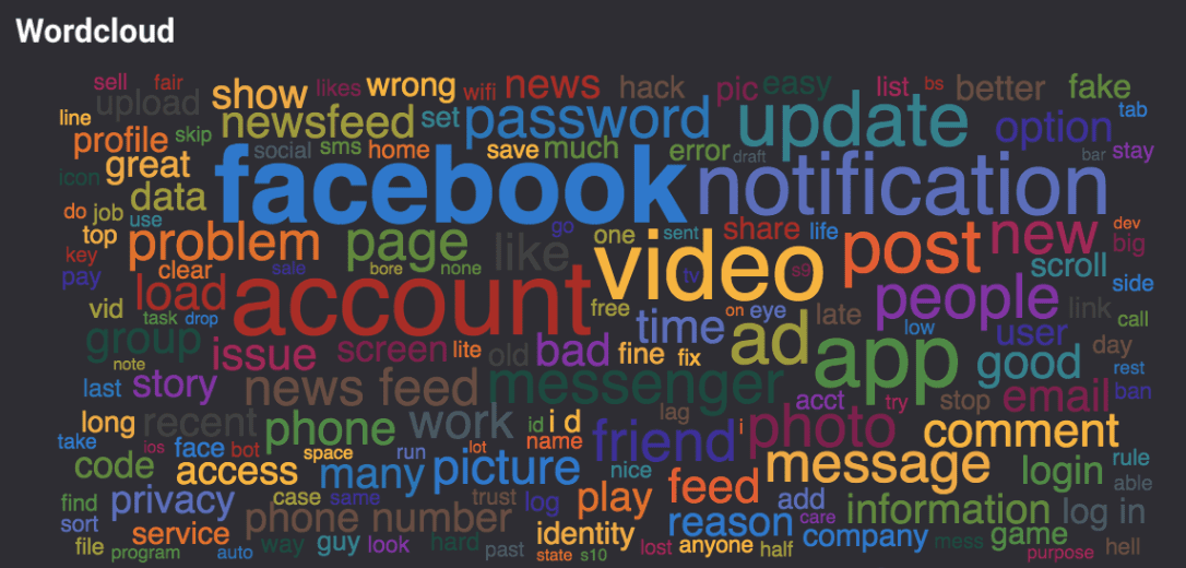
As you can see, MonkeyLearn joined together with GDS can truly bring the most out of your data.
How We Built Text Analysis Models & Visualized The Data
First, we pulled Facebook reviews using the MonkeyLearn Dexi integration. Dexi.io is an easy-to-use web scraping tool with no extensions or downloads needed. Dexi’s MonkeyLearn integration allows you to seamlessly synchronize the process of gathering and analyzing text.
Next, we built a topic analysis model, then used our pre-built sentiment analysis model to analyze the reviews by topic. It’s just five quick steps with MonkeyLearn:
- Partition Facebook reviews into opinion units.
- Upload the opinion units to a custom topic classifier.
- Define the tags: Advertisement, Messages & Inbox, News Feed, Notifications, Photos, Security & Privacy, Videos.
- Train the model by simply clicking through and choosing the appropriate tag for each opinion unit. The model will learn quickly and begin choosing for itself.
- Pass fresh data through the newly trained topic classifier, then through the pre-trained sentiment analysis model.
However, this process can be made even easier with MonkeyLearn’s new Workflows feature. Workflows allows you to streamline the process by performing multiple analyses on the same data with fewer steps. For example, you could split data into units, run sentiment analysis on those units, then categorize them by topic – all pre-programmed using triggers.
Rather than passing your data from one model to the next, Workflows allows you to create an automatic chain of events, so that each analysis runs consecutively without any human involvement.
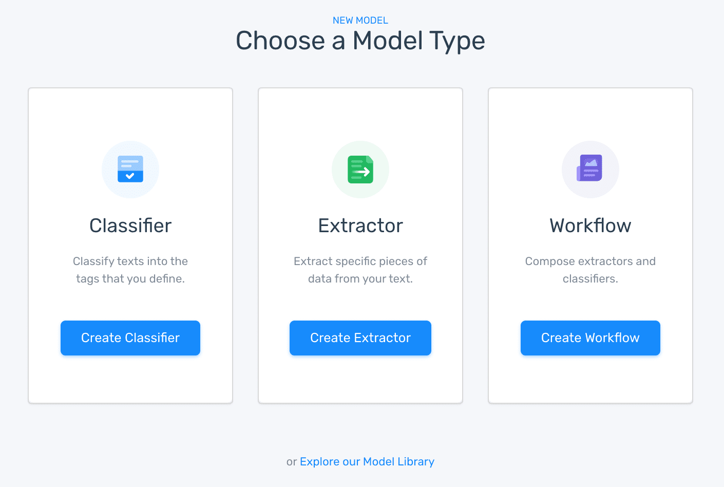
Workflows offer deep learning solutions to consolidate and declutter all of your text analytics. Now you can analyze more data and perform more types of analysis faster than ever.
Workflows also includes a Postgres database to automatically save every piece of text you analyze and every result. Connect the database to business intelligence tools like Google Data Studio (as we did above), Looker, Tableau, and more.
Conclusion
Machine learning tools can save time and perform previously impossible in-depth analysis. And you can train them specifically to your business or your field.
MonkeyLearn’s suite of text analysis tools goes far beyond topic and sentiment analysis, to get all manner of insights from your text data. And you can try them out when you sign up:
When you connect your MonkeyLearn results to visualization tools, like Google Data Studio, you can transform your data into wonderfully easy-to-understand insights that tell a story and help your business make truly informed decisions.
Sign up to MonkeyLearn, and try out our tools.

Federico Pascual
July 2nd, 2020


