Real-Time Sentiment Analysis Dashboard

Sentiment analysis identifies opinions in a text using machine learning algorithms to classify them as positive, negative, or neutral. For companies, it’s an essential tool to gain real-time insights about how customers feel on social media platforms like Twitter, in online reviews, and in customer support queries.
Maybe you need to analyze 100+ reviews or mentions about your app. Yes, it’s doable but it will take more than an hour. With a sentiment analyzer, you can get through this information in seconds, saving you a lot of time and effort.
To present this data, you’ll need to create a dashboard. Not only are the results easier to digest, but you’ll also be able to spot patterns that you may have otherwise missed by staring at a plain old spreadsheet. Dashboards are also great to share with your teams and stakeholders.
In this post, we’ll show you how to perform sentiment analysis using no-code machine learning tools. Them, explain how to present your analysis in Google’s free data visualization tool: Google Data Studio.
Getting started with Sentiment Analysis
Creating a sentiment analysis dashboard allows you to see all the metrics related to brand sentiment, helping you answer questions like:
- What aspects of your business generate more positive mentions?
- Which aspects get more negative comments?
- What are the most common keywords that appear in positive/negative opinions?
Also, you can filter sentiment data by date in your dashboard, so you can jump back to a specific time, or compare how sentiment towards your brand evolves over time.
But first, you need to organize unstructured data ‒ like product reviews, social media posts, survey responses, and many more ‒ and classify it by sentiment, so you can use those results as an input for your dashboard.
To get started, we’ll show you how to use MonkeyLearn to build a sentiment analysis model. Then, we’ll walk you through all the steps to creating a dashboard using Google Data Studio.
Build a Sentiment Analysis Model with MonkeyLearn
MonkeyLearn is a machine analysis platform, which lets you perform sentiment analysis in a no-code interface:
- Using a pre-trained model
- Building a customized model
Pre-trained text analysis models allow you to get started right away (no setup or coding needed). Check out this sentiment analysis demo to see how it classifies text.
But if you need a tool that understands domain vocabulary and provides results of further accuracy for specific use cases, you’ll need to build a customized sentiment analysis model.
To get started, request a demo from MonkeyLearn and follow these simple steps:
1. Prepare your training data
Training data is a collection of text samples that you will use to train your model. If you want to carry out Twitter sentiment analysis, for instance, you’ll need a set of tweets that include positive, negative, and neutral opinions. How much training data do you need? The more, the better; but around 20 examples for each category is a good starting point.
So, the first step is to export a set of reviews into an Excel or CSV file. However, since texts often contain several opinions, you’ll need to divide your dataset into smaller chunks of data, called opinion units. For this, simply batch-process your file using MonkeyLearn’s opinion unit extractor. You’ll receive a new document with the opinion units.
You can try our opinion union extractor demo here:
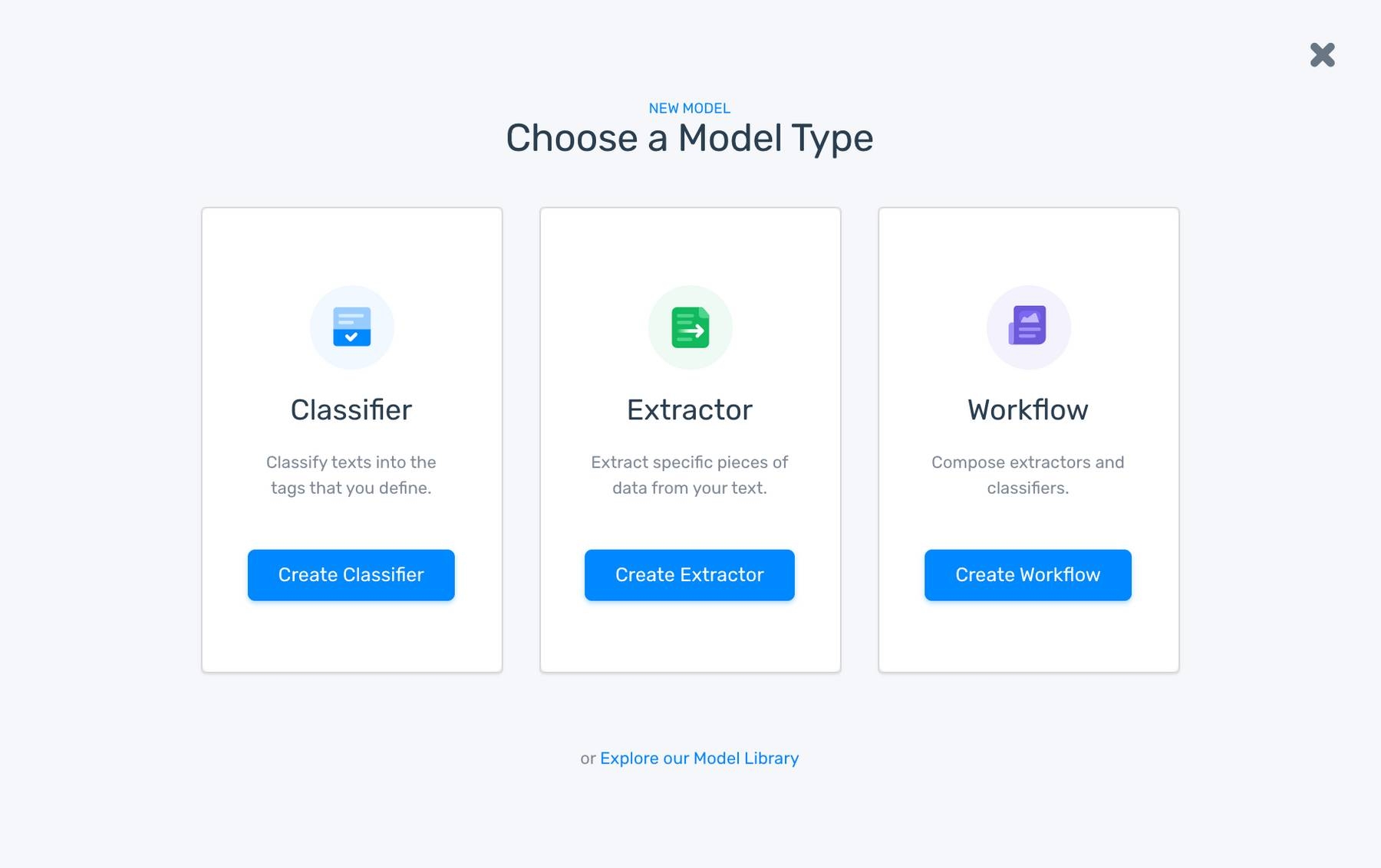
2. Choose a model type
Go to the main dashboard, click on “Create a model”, and choose “Classifier”.
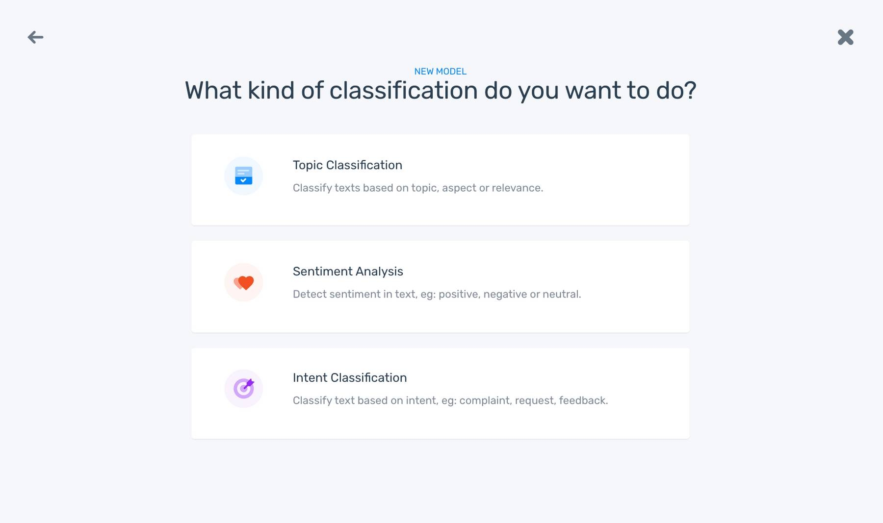
3. Select a type of classifier
To create a model that sorts data by sentiment, click on “Sentiment Analysis”.
4. Upload your data
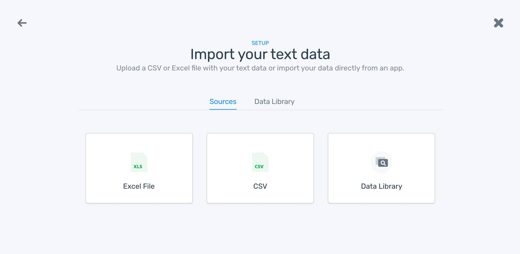
Here’s where you upload the CSV or Excel file with the extracted opinion units (make sure to select that column on the following step).
5. Train your sentiment analysis classifier
Manually tag each opinion as positive, negative, or neutral. That way, your model will learn from your criteria and use natural language processing techniques to decipher patterns itself. After tagging a few examples, you’ll notice your model making its own predictions. If there’s an incorrect prediction, you can re-tag the example with the right answer.
6. Test your model
Click on the “Run” tab to test your model. Paste a text into the classifier and see how well it performs sentiment classification. If the results are off, go back to the “Build” tab and tag more examples to improve accuracy.
7. Put your model to work with your own data
Your model is ready! Here’s how you can use it to classify your own datasets by sentiment:
- Batch processing: Upload a CSV or an Excel file with your data. As a result, you’ll get a document featuring a new column for tags (positive, negative, or neutral) and another one for a confidence value from 0 to 1 (in which 1 represents the highest confidence level).
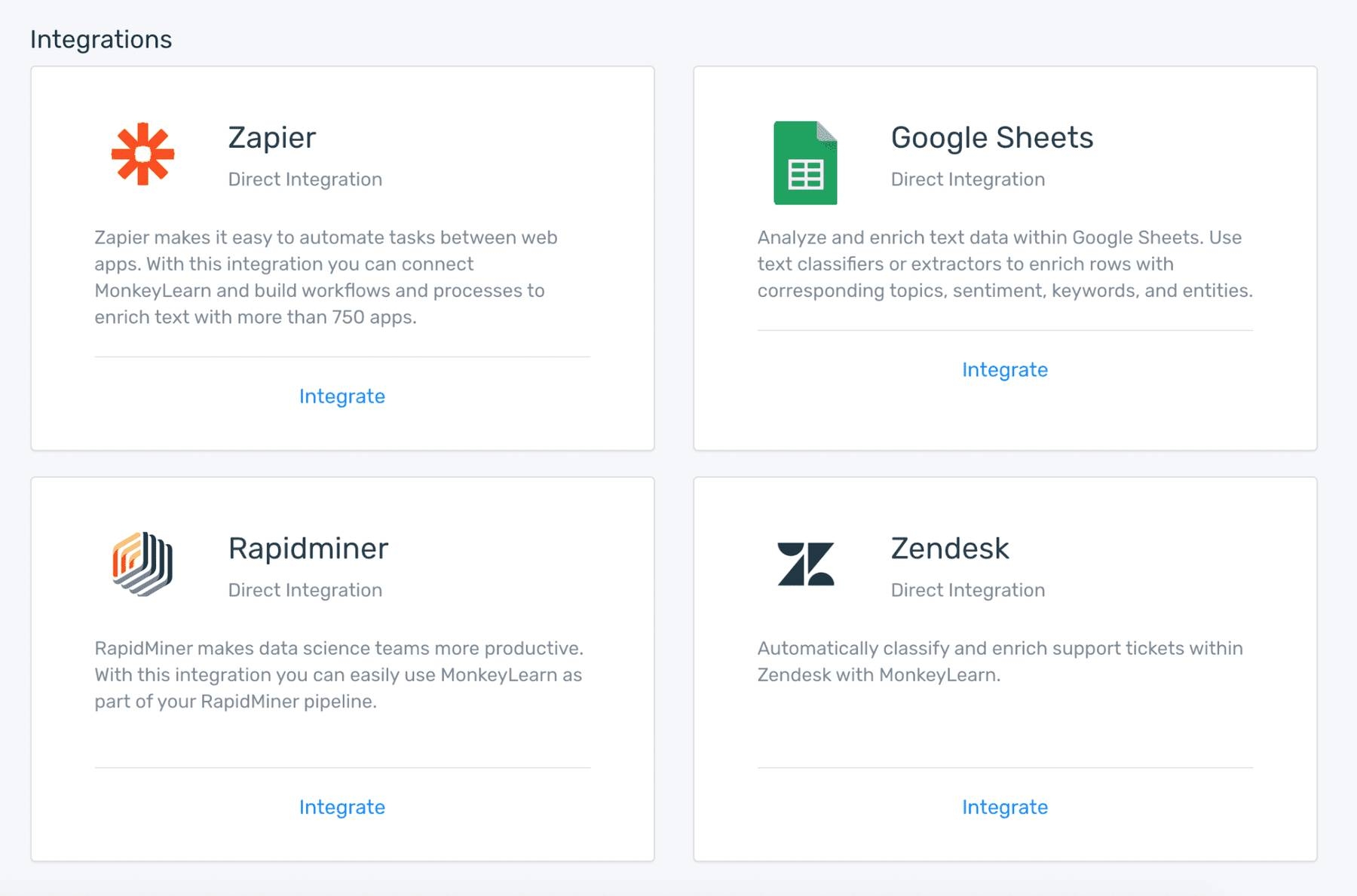
- Integrations: Easily integrate your model with third-party apps like Zapier, Zendesk, Google Sheets, and Rapidminer.
- API: Run your sentiment analysis model in your preferred programming language using MonkeyLearn’s low-code API.

Create a Dashboard with Google Data Studio
Once you’ve classified your data by sentiment, you’ll be ready to move to the next step: transforming a boring and dry spreadsheet into a visually appealing dashboard that showcases the key results of your sentiment analysis.
With Google Data Studio, a free and easy to use visualization tool, you can create custom and interactive dashboards, like the one below:
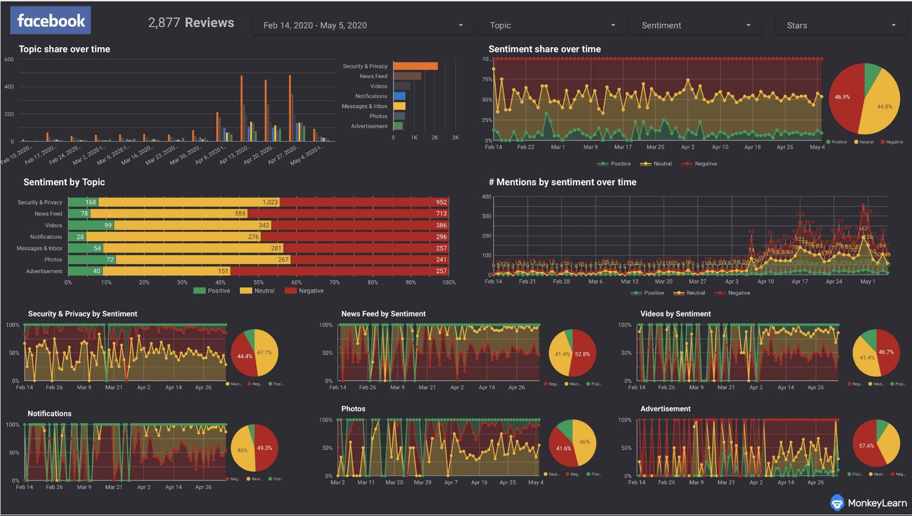
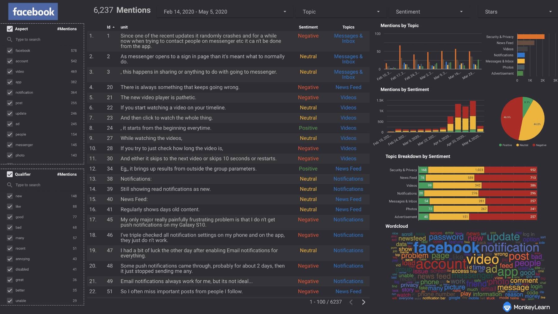
For this example, we used a set of Facebook reviews previously classified by sentiment using MonkeyLearn. The dashboard includes opinions classified by sentiment and aspect, and a word cloud featuring relevant keywords.
Ready to build your own sentiment analysis dashboard? Follow these simple steps to get started:
1. Log in to Google Data Studio with your Google account. You’ll be redirected to the homepage, which includes access to all your reports, your data sources, and a gallery of report templates.
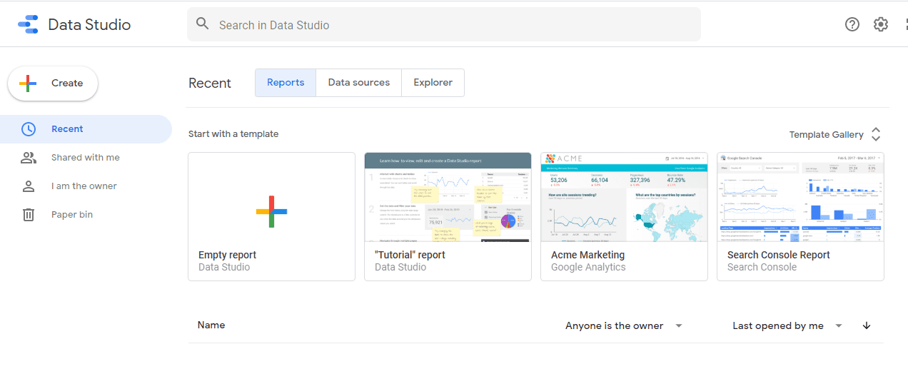
2. Create a new report. Click on “Create” - “Report” to create a new dashboard.
3. Add a new data source. Once you open a blank report, the first thing you need to do is to connect to your data. You can do this by clicking on “Add data” in the menu bar and select the data source(s) you’d like to visualize. For this tutorial, we’ll connect to a Google Sheets spreadsheet with product reviews classified by sentiment.
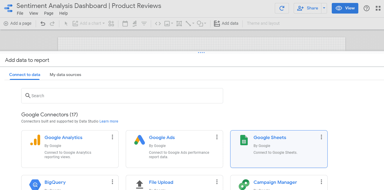
4. Organize the dimensions and metrics from your data source. When you connect a data source to the report, a table displaying your data will automatically appear on the report canvas. On the right side, there’s a panel that allows you to arrange the dimensions and measures that you’d like to use for the visualization.
5. Create a custom visualization from your data. Once you’ve specified all the data that you need, it’s time to create visualizations. Select the table and click on the dropdown menu at the top of the right-hand panel to find all the options available to create graphics, like tables, column charts, pie charts, and many more. Then, use the “Style” tab to format your graphic, using different colors and styles.
By jumping to the “Data” tab, you can always adjust the dimensions and measures to make sure you visualize the exact data that you want.
6. Combine different graphics to create a dashboard. A dashboard contains different pieces of information organized in a way that’s dynamic, attractive, and easy to understand.
Play with the tools on the menu bar to add new charts, embed images, add text, and include filters (you can choose to filter data by date range or using a specific dimension, for example, only show mentions with a “Positive” tag). You can also choose different themes and layouts for your dashboard.
7. Share your sentiment analysis dashboard with your team. Click on the top right button to share your report with other users or teams. You can also download your dashboard or share it on social media. Keep in mind that if you make changes or updates on your underlying data, those changes will be reflected on your dashboard.
Closing
Creating a sentiment analysis dashboard is a great way to showcase customer data, and share insights with members of your team. Visual data captures your audience's attention and makes it easier to spot trends and patterns that may otherwise go unnoticed.
With MonkeyLearn's sentiment analysis tools, you can make sense of your unstructured data in just a few steps. Then, you can use a visualization platform like Google Data Studio to build insightful reports that can drive smart business decisions.
Request a free demo from MonkeyLearn and get started with sentiment analysis.

Inés Roldós
July 6th, 2020


