What Data Visualization Is and Why It Matters 2022
Data visualization is the presentation of data or information in a visual format. Visual data is easier for the human brain to process, allowing it to single out trends and interpret patterns.
Data visualization (or ‘datavis’) serves as the integral bridge between humans and the increasingly complex data at our disposal - it specifically shapes data in order to display it in ways that our brains can best process it.
By doing so, data visualization unlocks the full benefits of ‘advanced analytics’ and ‘Big Data’ that occupy the cutting edge of tech today.
Without a proper way to interpret it, such data is useless to the human mind - we are simply not suited to processing long sheets and rows of numbers.
Because of this, data visualization is essentially a particularly ergonomic subset of data preparation. This means its primary goal is to make the display of information the most helpful it can be to the people viewing it.
If you aren’t practicing good data visualization you can’t get the most out of your data or your employee’s skills at interpreting it. By proxy, your business strategies will lack accuracy and likely fall short of what they could be. In modern markets, this could mean losing the edge to competitors and thus losing revenue.
It’s simple - just like any other type of data analysis, data visualization helps unlock results by increasing analytic potential.
Except with data visualization, the aim is to unlock untapped capacity already within the bright minds on your teams.
This is because the human brain is innately receptive to varied colors, patterns, and shapes. Small children can match colors, fit blocks into their respective holes, and differentiate a triangle from square - this ability does not lie dormant - rather our ability to interpret and draw conclusions from such patterns increases as we grow into adulthood and beyond.
When presented with a long list of numbers, coordinates, or, say, information about previous sales, people are much more inefficient than they would be if the data was represented visually. This capacity was first uncovered by Dutch cartographer Michael Florent van Langren in 1628, who employed line graphs while working to make sure ships were properly prepared for the journey ahead.
Since then, charts, graphs and other forms of data visualization have only grown in use and sophistication - from two-dimensional charts of train times to prevent collisions, to, these days, three-dimensional plots capable of visualizing sales data relative to time, location, and demographic all at once.
This article is a jumping off point for all things datavis. Feel free to click through to the section most relevant to you.
- What is Data Visualization
- Data Visualization Importance
- Predictive and Prescriptive Data Visualization
- Data Visualization Examples
- Data Visualization Use Cases
- Data Visualization Tools
- Takeaways
What is Data Visualization

Data visualization is the graphic display of data in chart, table, graph and other forms so that it is easier for people to interpret the data, single out trends and identify outliers, and draw conclusions to inform strategic decisions.
On a deeper level, data visualization is the rearrangement of data (whether numbers or text) into a digital format that is more optimized for our brains.
As we touched on, visual data is easier for the human brain to process, allowing it to single out trends and interpret patterns.
This is akin to if, say, your native tongue is Spanish but you had taken a beginner’s course in English. You might be able to pick out certain words and understand the letters, but the deeper contexts (particularly within complex texts) would elude you.
Data visualization, though, applies to everyone. Long before we had invented alphabets, or even numerals, we were interpreting visual patterns. Graphology, and now datavis writ large, was built in this image.
Datavis has always been a natural fit for business purposes. Being able to detect a cluster on a plot, or inflections on an x/y chart of time/profit are possible because of our innate pattern recognition. Here’s why forward-thinking strategy teams must use this to their advantage.
Data Visualization Importance
Charts, plots and graphs might not seem to be the most interesting topic right off the bat. Many might recall early schooling lessons on pie graphs, venn diagrams, or x and y axes, and quickly become bored.
But for business ventures, proper data visualization can be the difference between success and disaster, loyalty and churn.
For centuries, sharp business minds have used datavis as a helpful analysis tool - deploying it in both predictive and prescriptive capacities. This means they used it to both anticipate the future (predictive), and interpret past data (prescriptive).
Predictive and Prescriptive Data Visualization
Let’s enhance our understanding of both of these types of datavis by taking a closer look.
Predictive Datavis
Predictive data visualization is the display of data to help you forecast what is likely to happen in the future. By performing predictive analytics on your data and graphics, you are able to determine what actions are best to affect your desired outcome.
The results of predictive data visualization (and analytics), for better or worse, are most obvious when it comes to avoiding calamity. Let’s underline the disaster-avoidance potential of datavis with a crucial example, then go through its modern bottom-line value.
The key to extracting results from data visualization is maximizing human pattern recognition. But, pattern recognition is worthless if your data is inaccurate.
So, data visualization is useless unless you’ve 1) properly prepared your data, and 2) know what you are looking for.
Let’s look at this by way of a disaster-avoidance analysis performed by NASA:
Predictive Datavis & Disaster Avoidance: The Challenger
In her illuminating article When Graphs Are a Matter of Life and Death, Hannah Fry presents the case of the Challenger’s launch in 1986. It covers the data visualization that NASA looked at the night before as an example of what datavis can and can’t do.
This test case starkly illuminates what data visualization is capable of. It goes without saying that the disaster that followed is by no means one of just monetary value.
We live in a world of small margins, and all we can do is learn from our mistakes. As such, any business that understands its data (through datavis) can better protect its employees, its products and then, as a secondary concern, its profitability.
Datavis can prevent disasters, both real and economic.
Fry underlines this importance by putting forth two graphs for analysis. In the first, we see the incidents of damage during test launches (Y) plotted with the temperature of engine at time of launch (X).
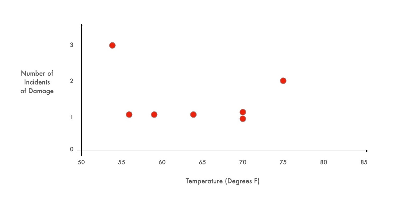
A fairly even distribution, it would seem. By adding up the numbers there are: 6 incidents of damage under 65 degrees and 4 incidents of damage over 65 degrees. Certainly not overwhelming evidence.
Then, we take a look at the second chart, where we plot both the instances of damage (red) (same as above) and the instances of no damage (blue).
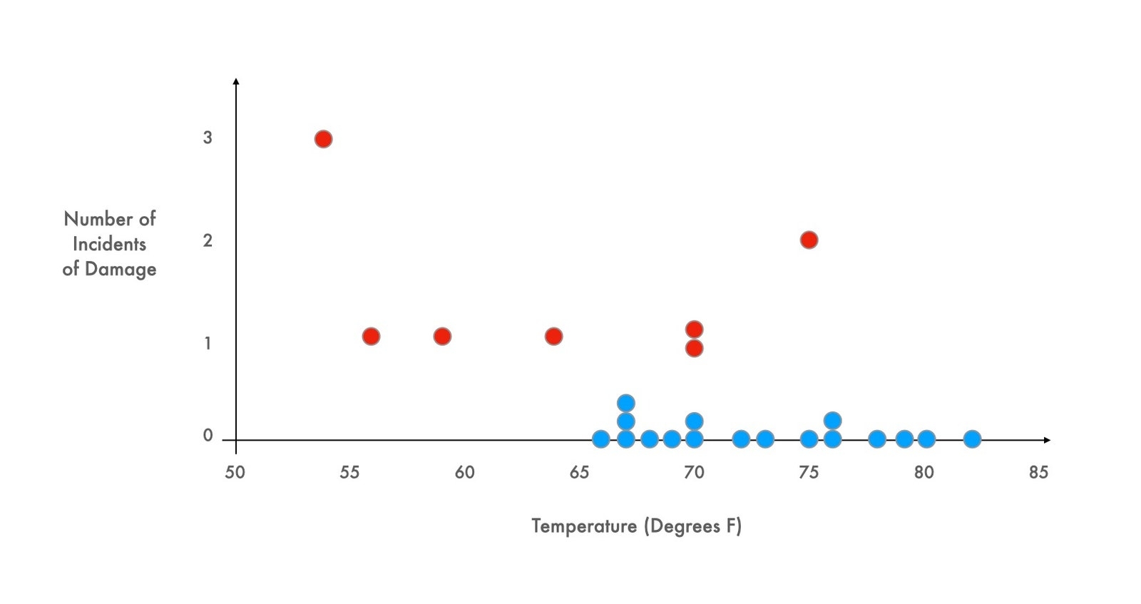
The difference, just by looking at the graph, is obvious. Our brains tell us that it’s obvious. We immediately see, based on the plotting of the instances of no damage (blue), that every launch under 65 degrees resulted in engine damage. We can deduce this because we see that every successful test (without damage) took place in conditions over 65 degrees. Our brains see all that blue and come to the correct conclusion without needing instructions.
With the second chart in their hands, NASA could have prevented disaster. The night before the tragic launch, they only had the first graph.
The right graph can save careers, products, and lives.
It can also (almost) predict the future. With the right plots, calamity can be avoided and results achieved, both in business and science. This is why proper and comprehensive data visualization has become of increasing importance for scientists, engineers, and businesses alike.
Many remember the lessons of the Challenger - make sure your data visualization is accurate. This entails not only making sure you have scoured your research to include all data points, but also that your data is displayed using the correct type of plot (more on this later).
Prescriptive Data Visualization
Prescriptive data visualization is the display of data to help you understand what has gone on in the past. This allows you to perform diagnostic analysis to solve problems so they won’t crop up again.
Prescriptive Datavis: Plugging Holes
While the Challenger example is an example of data visualization used to foresee a problem to come (predictive), prescriptive datavis, although seeking to solve already existing issues, can be even more valuable.
Savvy businesses know, much like in customer retention (customer churn) and customer experience (CX), fixing issues for the consumer base you already have is usually of equal or more value than trying to attract new customers.
Here, datavis links directly to CX and customer experience management (CXM) - the process of improving CX. Studies show that positive customer experience will be the number one differentiator between successful and unsuccessful businesses in current rapidly evolving online markets.
So, CX divisions are investing heavily in both
- Providing great customer experience for all customers, and
- Continuously improving their CX for existing customers hoping to increase positive sentiment and, eventually, engender loyalty.
In light of this, data visualization delivers great value for improving CX. It is the guiding hand that can inform what repairs are needed in your customer journey.
Great datavis seeks to both fix pain points that future customers might encounter, and detect and bring to your attention problems that existing customers are encountering, enabling you to close feedback loops.
Ideally, perfect datavis can, in this manner, steer us clear of future danger while actively repairing our existing shortcomings. Let’s look at how it might accomplish this by going through the most common types of datavis, and their relative merits.
Data Visualization Examples

This is where we can seek to expand our data visualization horizons beyond the colored pie charts and boring x and y axis slopes of our youth.
Or do we.
While cutting edge datavis lingo has evolved into the professional sounding terms that we are going to go through to below, it is important to remember any attempt at data visualization is only as valuable as its clarity.
If a chart is too complex to be deciphered by the people who view it, it is worthless. Organizing data in an easy to view manner should always remain the prime objective.
With this in mind, a basic, colored graphic that clearly demonstrates its point is not necessarily of lesser value than a complex, variable heavy, four axis scatter plot.
But that’s getting ahead of ourselves. Let’s trawl through the most prominent types of datavis in modern business, namely:
1. Charts/Tables
We begin with the most familiar graphic from our childhood education: charts and tables. The chart/table approach to displaying data is the mother of all the subtypes to follow.
There are an insane amount of ways to display your data. Picking the right one can be tough, so best practice is to try a couple and see what makes the most sense to your eyes. Your team, after all, will be the ones viewing this, and you know them best.
Charts/tables encompass any visual representation of data that use points, lines, bars, or portions of a larger shape to indicate amounts of data.
That’s a broad definition and it gets broader - charts/tables also include what we have come to call graphs. A graph is a type of chart.
This might be confusing at first, but bear with us. Here’s a list of the most popular graphics that fall under this uber-category, and how they choose to convey their amounts of data.
1. Line Chart: Points plotted along axes.
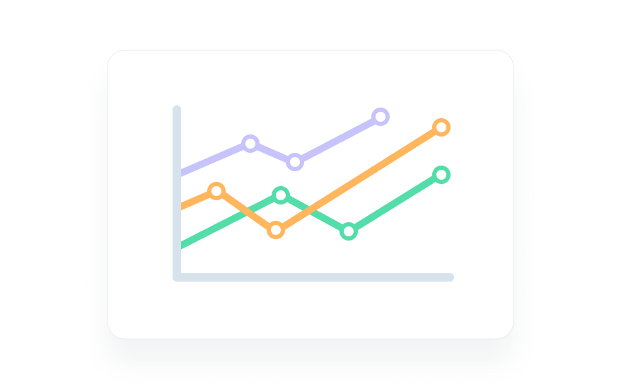
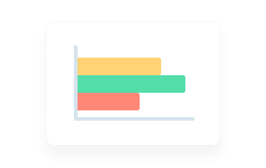
2. Bar Graph: Bars plotted along axes denoting relative amounts.
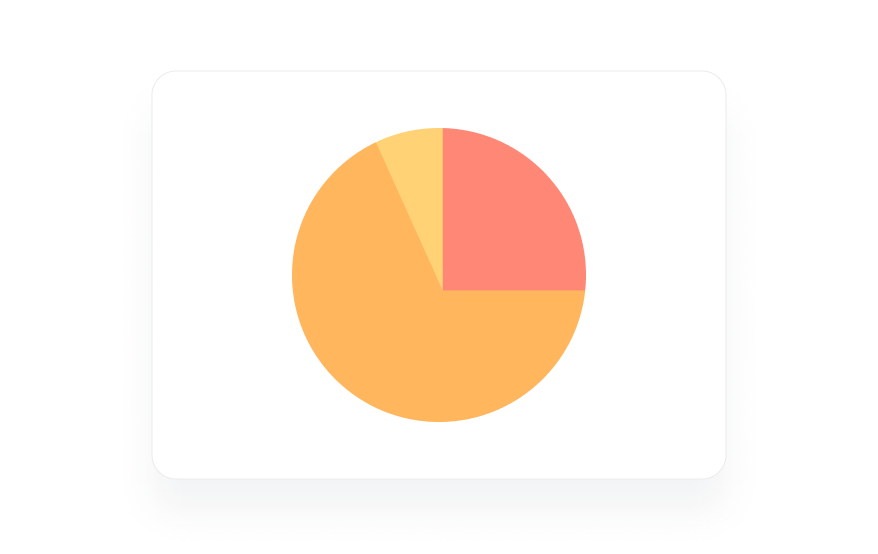
3. Pie Chart: Portions of circle denoting relative amounts.
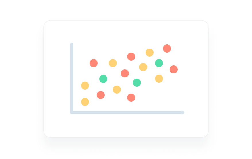
4. Scatter Plots: Points (datapoints) plotted alongs axes.
2. Infographics
If you’ve been on the internet over the last decade, you’ve likely encountered an infographic for better or worse (joking, kind of).
Infographics are the eye-catching, information heavy offspring of regular charts/tables.
Here’s one:
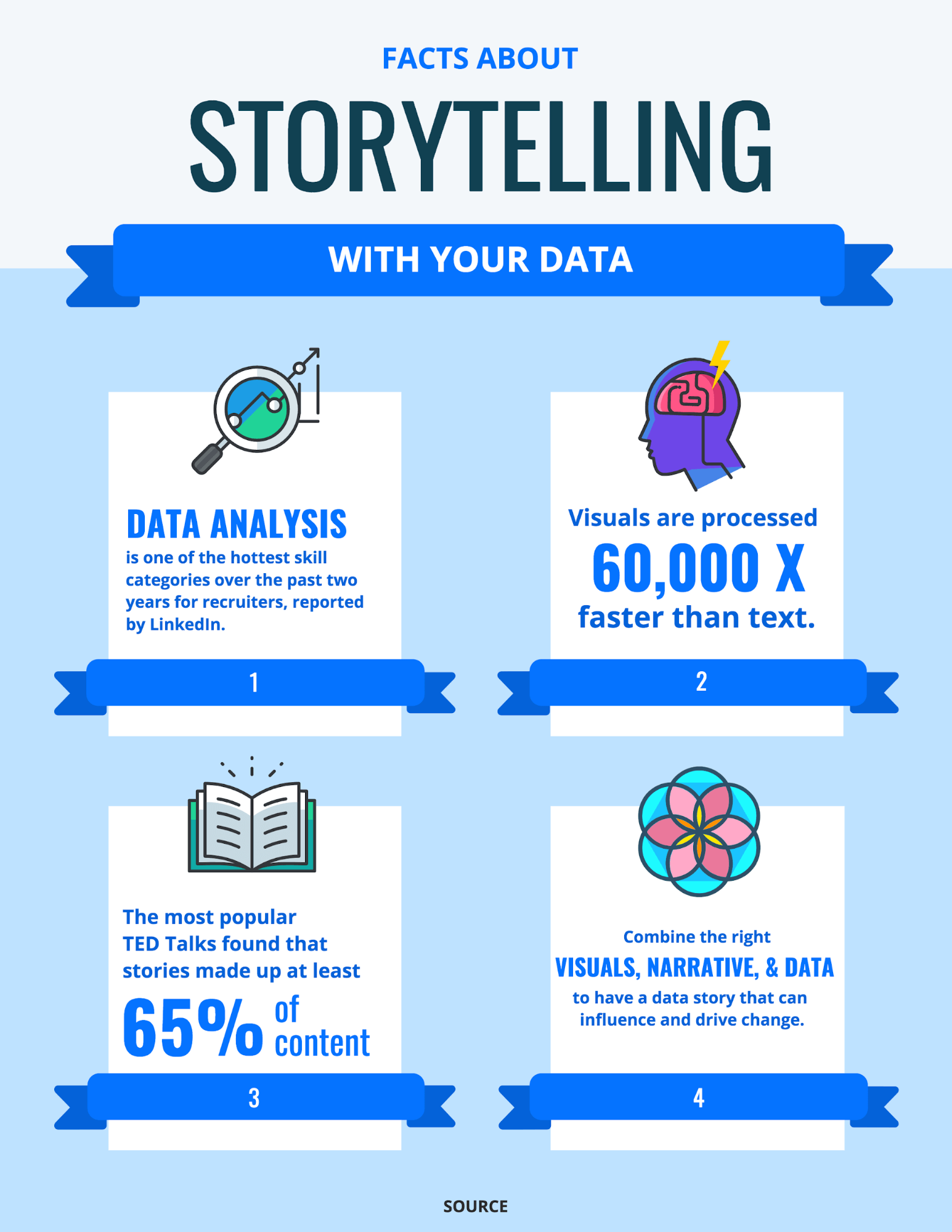
Suddenly, you’re inclined to look into how your company might better storytell with your data, right?
Even if you’re not, that’s the goal. In our modern day of views-equal-success, infographics pride themselves on catching users' eyes and conveying a narrative. They pair their statistical points with engaging imagery in order to educate readers and convince them to research further.
3. Word Clouds
Word clouds are a novel type of graphic that seeks to visually represent text data from a quantitative standpoint.
Much like text analysis takes unstructured, raw text data and seeks to quantify the number of opinions voiced via sentiment analysis, Word clouds seek to visually display the amount of times in the raw text that words or phrases crop up.
Word clouds are a great jumping off point for text analysis and text datavis because they are intuitive - even if you have never seen one before what it is trying to convey quickly becomes clear. They can help your team understand what, in a given archive, is worth further investigation in order to improve your products.
For instance, check out this one:
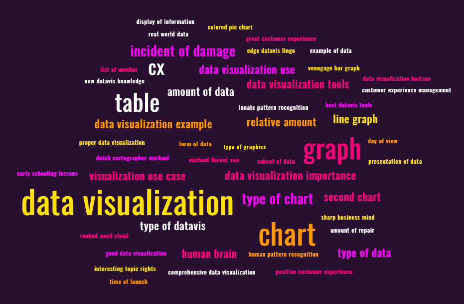
MonkeyLearn Free WordCloud Generator
That’s interesting - a lot of those are terms we’ve been discussing in this article.
As you may have deduced, that is because they are. The above word cloud was generated from all of the words used so far in the writing of this article. The more frequent the use, the larger the term appears in the cloud.
Word clouds are an engaging visual way to quantitatively look at text. It’s fun and stimulating to display your text data in this manner - but it can also yield huge benefits.
Here is the full display of MonkeyLearn’s free Word Cloud generator (just create a free account and plug away to your heart's content):
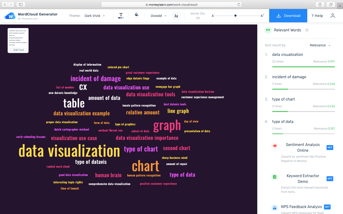
For a Word Cloud generator, this article is actually an extremely small sample size. With larger text entries, the usefulness of Word clouds only multiplies.
Imagine inputting an archive of all the existing customer reviews of one of your products. The Word cloud would have the ability to exactly quantify word usage count (see right) while displaying your results in an engaging way.
4. Diagrams
This might be a little confusing, but hear us out and we think it’ll be worth it:
Diagrams are a subset of charts/tables that aim to convey branching information.
Here are two of the three main types of diagram paired, with their subspecies listed below them:
1. Flowcharts (branch along a single timeline)
- Fishbone Diagrams
- Histograms
2. Tree Diagrams (branch hierarchically)
- Site Maps
- Mind Maps
- Family Trees
And, finally, we come to the last type of diagram: the infamous Venn Diagram. Venn Diagrams are an ingenious combination of pie-graphs and scatter plots and their ability to display the crossover between their data inputs is clever and easy to understand.
However, the reason we come to this last is that Venn Diagrams aren’t like other diagrams. They share a name but bear no real resemblance to their brethren.
5. Maps
We all know what a map is, right? Right?
Traditionally, yes. But in the world of datavis, maps come in a number of varieties.
Maps are actually the progenitor of all other types of data visualization. The first maps were generated, scaled down representations of real-life terrain. Maps in datavis are used for this, among other purposes.
As explained in the ‘Diagrams’ section above - some maps no longer represent actual terrain. Rather, they seek to guide the viewer through a branching layout.
The maps that we can separate out of this category are graphics that relate to geographic terrain. As a caveat, these maps can also be modified to convey much more than just terrain.
The best examples are choropleth map, a type of map that uses different colors and/or shades of colors overlaid on the geography to convey data.
We’ve all seen a choropleth, we just didn’t know the name. A ubiquitous type of choropleth is a map with different states or regions filled in with different colors, divided by their borders (think Risk).
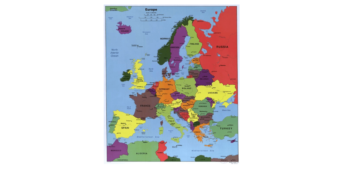
A choropleth map of Europe and its surrounding regions. Library of Congress
Choropleth maps can also convey data via the use of shading or gradients, like so:
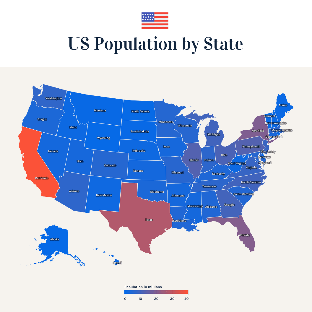
Many other useful variations on maps exist, all working to meld data and geography to better convey info for your team’s uses.
6. Other
Brilliant and clever minds are constantly thinking of the next, greatest way to display data. New formats will continue to be created to match our increasingly demanding datasets.
What is best for you and your team is up to you - there are plenty of options available. Whether you opt for something simpler, or look for a unique fit to suit advanced needs, let clarity guide you.
Some novel other data visualization include:
- Bubble Charts (tree diagrams in bubble form)
- SWOT Analysis
- Heat Maps
- Fever Charts (think stock charts)
- Population Pyramids (think food pyramid, but for population)
- ‘GIF’ Charts (see ‘The Next US’ in link)
- And many, many more
Now that we’ve laid out the overwhelming number of options out there, let’s look at a few specific uses for datavis and how it can bring value to an array of teams and industries.
Data Visualization Use Cases

To paint the most complete picture possible, here is how data visualization can empower the following teams/industries:
1. Data Science
It’s no secret that data scientists are overworked and overpressured.
Data scientists, whose job it is to ensure the accuracy of any insights your teams mine from raw data, often end up bogged down actually doing the data cleaning (transforming the data so it is ready for analysis). This is often due to a lack of other dataprep-capable employees.
Consequently, 74% of data scientists say that dataprep is the worst part of their job.
Easing the burden on data scientists, or at least making their labors worthwhile, is a great idea. Data visualization can be used to emphasize the value of dataprep work, convincing higher-ups to invest more in dataprep training. Or, it can make the fruits of data preparation worth the effort by underlining the findings of data analysis.
2. Marketing
Marketing teams know the value of strong visuals - an absolute must for any strong ‘deck’ (marketing speak for slideshow).
This makes data visualization a natural ally of marketers everywhere. Infographics, flow charts, and bar/pie/scatter plots can efficiently and effectively convey results to inform future business strategy.
3. Finance
Think of any stock chart you have ever seen (the segmented line plots dipping and diving at acute angles across the display) - this is a fever graph.
Financial professionals use fever graphs, as well as candlestick charts, to demonstrate the movement of their assets - from equities, to bonds to ETF’s and much more.
Furthermore, finance teams are called on regularly to present earning reports to their investors and boards. Here they are required to use various types of datavis (much like marketers) to display change in price and how it is tied to different industries/ demographics.
Beyond that, it gets much more complicated - thankfully there are datavis models capable of displaying even the most granular analysis.
4. Healthcare
Maps, among many other types of datavis, come in handy for healthcare professionals.
Think of the global pandemic - tracking the infection rate across various urban areas is key to keeping on top of spread and deploying the proper resources to the areas in most need.
What better than a choropleth map to visualize this data - especially a modern, fluid map that updates itself in real-time.
Beyond that, data visualization is crucial for healthcare professionals to manage demographic data to track and anticipate the health needs of their customers.
Data Visualization Tools

It’s time to jump from understanding data visualization to implementing it.
Data visualization tools abound - including many capable options. Datavis companies entice with free trials and promise vast functionality.
With so many options available, it's crucial to choose the best one for your purposes or risk going off on a tangent.
For now, let’s separate datavis into two camps:
- Those seeking to custom display results generated from Python or R.
- Advanced data visualization: Those seeking to display complex results from multiple sources (often no-code).
1. Datavis with Python or R
If you are seeking to display the data you’ve gathered with either of these languages, you’re in luck. Both have the capacity to generate high quality charts/tables/plots with simple code.
For Python, Matplotlib is the most popular choice for datavis - check out its open source library here. Additionally, here is a list of qualified alternatives, some independent and some addendums to the Matplotlib base.
As for R, the standard R libraries have built in datasets and datavis capacity via the ‘graphics’ package stored within base R - here is a guide to installing and using the basic functionalities as well as a few optional additional plugins.
2. Advanced Data Visualization
However, for larger endeavors with multiple data inputs, or for those seeking a no-code approach, more advanced plug and play data visualization platforms are the answer.
Let’s go through the value that a comprehensive, suite-style data visualization solution can add by using MonkeyLearn's own offering as an example.
Advanced data visualization suites seek to take the custom coding out of datavis, making it possible for employees of any level of tech-savvy to be able to view and sample from the data at ease. Furthermore, they seek to be input friendly (so that the data flows right in) allowing you to always have up-to-date data, in whatever form, at your fingertips.
The MonkeyLearn All-In-One Data Visualization Studio (that’s a mouthful) was designed with this in mind. It puts an emphasis on being comprehensive, powerful, and easily integrated.
Here’s why you should care about those three factors.
Integration
While many datavis platforms boast of their vast repertoires of graphs, MonkeyLearn promises you all of the same but focuses on making sure you can actually use them.
With the backing of MonkeyLearn’s industry leading data analysis AI, you can ensure that you have the most advanced and accurate data coming into your datavis platform, ensuring correct and insightful output.
From there, it becomes a matter of making sure all of your teams and their employees can easily use the datavis platform you buy. That’s why MonkeyLearn has complete API integration so it can interface with your existing business software/apps. It also comes with an open-coding library, allowing your technical employees to customize to their hearts' extent.
Increased integration ensures more use of effective datavis and easier onboarding, leading to more data-savvy employees and less burden on both tech support and data scientists.
Power
Your datavis can only be as good as the analytics engines behind it. We saw this with the stark example of the challenger data at the start of this article.
To be at the top of the data visualization game, you need analytics platforms that can track and plot data at every angle, ensuring you don’t miss anything.
As stated, MonkeyLearn's automated AI is simply the most powerful out there. With customizable keyword extraction and cutting-edge sentiment analysis both backed by advanced machine learning (meaning you can teach the AI to analyze your data your way), MonkeyLearn is both agile and powerful. It can handle any business’ analytic needs both at scale and to their needs.
Comprehensive (ness?)
Here is where we might compete with other datavis companies on their turf - i.e. by comparing how many different types of graphs we offer.
However, the MonkeyLearn Studio doesn’t just aim to overwhelm you with a ton of types of charts that you will never use. Rather, we’d like to guide you to the types of display we think are most valuable, and then keep them updating in real-time all in one place.
Our AI can suggest graphs that might be of value, and automatically populates your dashboard home screen with a number of options right off the bat (below is what this looks like out of the box).
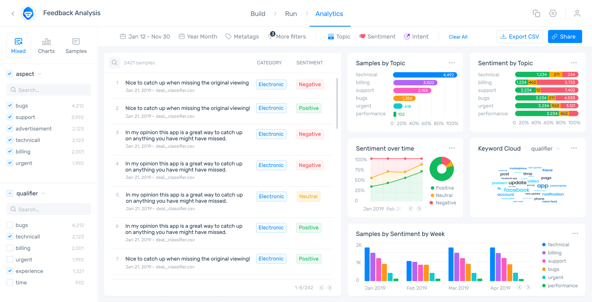
Now that’s not to say we don’t have all the graphs you might ever desire. Your dashboard is fully plug and play customizable - you choose what you want to display. Even better, you can pull whatever graph you want and sample it for presentations/decks/email blasts/whatever the need may be.
Go ahead and play with your own topics and inputs on our free public dashboard to see how this works.
The main tenet of our datavis approach is to provide you the datavis you want, in the best formats possible. But, we emphasize quality and helpful machine learning to help get the right graphics in your hands.
Takeaways
Automation may be the future of analysis, but humans aren’t going anywhere.
When it comes to making high-level, strategic decisions with real-world, environmental, and business complications, your team leaders need the best data insights possible. The best analytic engine is useless to them, however, if the results aren’t properly communicated.
Data visualization is the bridge between the powerful insights AI can provide and the real-world of business strategy. As such, having the right graphics at the right time can change the course of a company. That value can’t be undersold.
MonkeyLearn can help bridge that gap with top-of-the-line AI and data visualization software. Sign up for a demo with one of our automation experts, or jump right in to a free trial today.

