How to Create an Employment Analytics Visualization in Less Than 10 Minutes

Ever wondered which city has the highest tech jobs? Or recruitment openings? Will your career be better off in NYC or SF? Turns out you can answer these and many more questions by doing some simple data analysis. Using three awesome free tools (import.io, MonkeyLearn and Plot.ly) you can obtain, classify, and visualize all the data we need in just 10 minutes!
In this tutorial, we’ll start by using import.io’s Magic API to obtain hundreds of job postings from LinkedIn. With this, we’ll write a small Python script to process and send the data to MonkeyLearn so they may be classified using one of the public models, effectively enriching the original data with the tag each job belongs to. We’ll then finish by uploading it all to Plot.ly and obtaining some insights from the data through the use of graphs.
Let’s get started!
Step 1 - Obtaining the data with Import.io
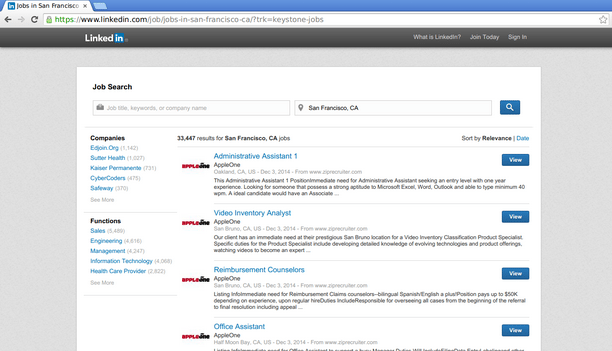
No analysis can be done without some data, so we’ll get that first. For this analysis, we’ll be using data from LinkedIn’s job directory.
To get this list into a processable format (i.e. data) we simply pop the URL to this page into import.io’s Magic API. In no time at all, you should see a table containing all the jobs from that page and all the following pages. Easy!
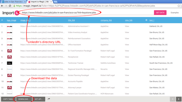
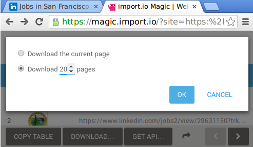
The next step is downloading our data into a CSV file named linkedin-sf.csv, like so:
Step 2 - Enriching the data with MonkeyLearn
You’ll notice that pretty much all of the data (job title, description, company, etc) is in text format, which makes it difficult to analyze without some additional manipulation. We would ideally want to assign a tag to each job, derived from its description, as that information is not provided by LinkedIn. This is where MonkeyLearn comes into play!
In case you’re not familiar, MonkeyLearn is a platform for getting data from text using machine learning. Developers with any level of experience can easily extract and classify information from text and integrate the technology into their own platforms and applications in an easy, fast and cost-effective way.
To this end, we’ll use one of MonkeyLearn’s public models, the Business Classifier, to assign a tag to each of the job postings (you’ll need a MonkeyLearn account). Public models are general-purpose models created by the MonkeyLearn team for common classification tasks, so you don’t have to build them from scratch.
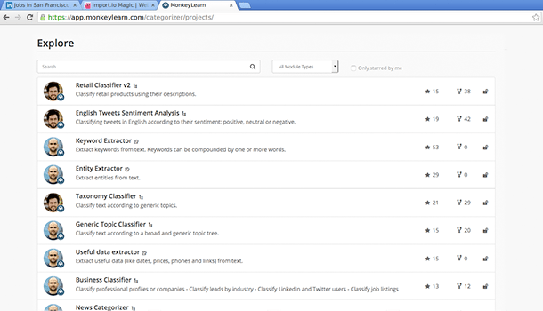
_Public Classifiers_
We will now use MonkeyLearn’s API to enrich our data using a small Python script, with the help of the pandas and requests libraries.
We’ll start by reading the contents of the CSV file into a pandas’ DataFrame:
import json
import pandas as pd
import requests

# Your API key goes here.
API_KEY = ''

raw_df = pd.read_csv('linkedin-sf.csv', encoding='utf-8', skiprows=1,
                     error_bad_lines=False)
Next we keep only the columns we're interested in; namely: job title, description and location for each of the postings:
df = raw_df[['text_1', 'title_link/_text', 'snippet_text']]
df.columns = ['location', 'title', 'description']
Now we’ll build a list of the contents of each job posting, which will be sent to MonkeyLearn. We’ll be classifying in batches of 150 postings at a time in order to be more efficient:
content_df = list(df.title + ' ' + df.description)

categories = []
step = 150
for start in xrange(0, len(content_df), step):
    end = start + step

    response = requests.post(
        "https://api.monkeylearn.com/v2/classifiers/cl_4PFzSWVR/classify/",
        data=json.dumps({
             'text_list': content_df[start:end]
        }),
        headers={
            'Authorization': 'Token {}'.format(API_KEY),
            'Content-Type': 'application/json'
    }).json()

    # We go through the results of the API call, storing the result on a list.
    for category in response['result']:
        categories.append(category[0]['label'])
Notice how classifying is as simple as POSTing to MonkeyLearn’s API. Finally, we merge the classifications and write it into a file:
augmented_df = df.join(pd.DataFrame(categories, columns=['category']))
augmented_df.to_csv('linkedin-sf-aug.csv', encoding='utf-8', index=False, header=False)
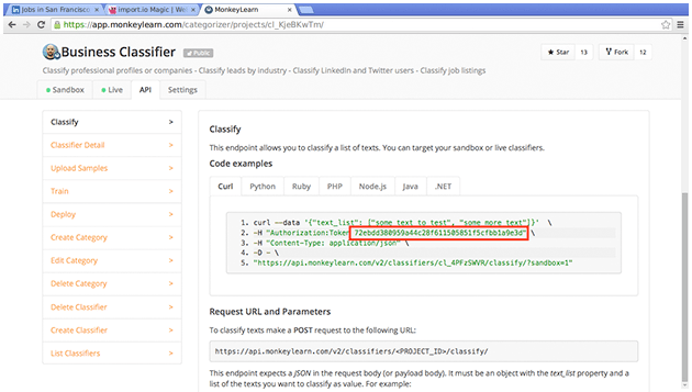
You will need to set your own API key, which can be seen on MonkeyLearn’s web, on the “API” tab of the classifier:
We now have a file called linkedin-sf-aug.csv, consisting on the job title, job description, location, and tag. Time to move to the data analysis!
Step 3 - Visualizing the data with Plot.ly
Now that we’ve classified our text data, we can move on to the true analysis. For now, we will simply visualize it through the use of the plotting platform Plot.ly (again, you’ll need an account). From our workspace, we’ll upload the data we just produced by clicking on the import button and choosing to upload a file:

Next, go to the grid view and open the file we just uploaded:
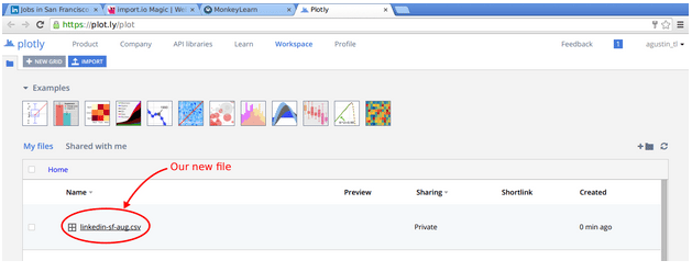
From here we will create a histogram with the number of jobs for each of the tags. Start by selecting the Group By option, then choosing the fourth column (that is, the tag) as G and x. We also want to sort the tag column alphabetically for easier comparison later. Finally, change the graph type and select Histogram:
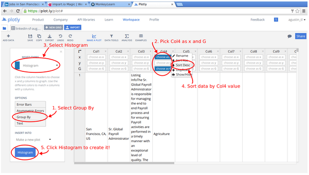
The resulting graph should pop up immediately:
And that’s it! We’ve gone through the whole cycle: data recollection, data processing and enrichment, and finally data visualization, all of it using web platforms which you can try right away.
In a similar vein, we could also collect information for different cities by changing the URL parsed by Import.io. For instance, by following the same process we can derive a histogram for New York City:
As you might expect, there are some key differences between San Francisco and New York City:
- San Francisco has a much higher proportion of High Tech job postings than New York.
- NYC has much more Finance jobs postings than SF.
- If you are job hunting on an Art related field, NYC is better for you.
- The Services area in NYC has much more demand for human resources than SF.
- If you are looking to give back and join a non-profit organization, San Francisco has a lot more job postings than NYC.
- Recreational, Medical and Media job postings are almost the same in NYC and SF.
Some of these findings were expected and some were a big surprise. Combining import.io, MonkeyLearn and Plot.ly it’s a quick, easy and fun way to work with data analytics.
This is just scratching the surface when you combine import.io’s web data collecting power, MonkeyLearn’s machine learning capabilities and Plot.ly’s analytics platform. By combining these tools developers can easily perform sentiment analysis of reviews, comments or any text scraped from the web, classify these texts according to their topics, extract keywords and more.
Have any cool ideas on how to combine import.io, MonkeyLearn and Plot.ly? Share them in the comments!

Agustin Azzinari
December 12th, 2014


