6 Ways To Create Good Data Visualization Designs

Data is no longer something that just data specialists need to think about - data now drives all good business decisions. It’s essential that leaders and stakeholders alike are able to access data to gain business insights and a competitive advantage.
To make your data more accessible to a wider audience, you need to have the correct tools and practices in place. Data visualization is one of these practices.
Data visualization makes it easier to understand and interpret large amounts of text and data by transforming it into a visual form. It follows, then, that the way in which those data visualizations are designed is crucial to achieving that goal.
Before you set out on your datavis journey, it’s important to make sure that your visualizations are telling the story you want them to. This means carefully planning your designs. A badly designed visualization can be confusing and might lead to the viewer coming to inaccurate conclusions.
Here we’ll start with the basics of datavis, then take you through 6 key principles you can implement for successful data visualization design.
Feel free to click through to the section that interests you the most here:
What is Data Visualization
Data visualization is the act of turning data and numbers into the form of maps, charts, graphs or infographics. This is done because it’s easier for the human brain to comprehend information in a visual representation rather than its raw form.
Data visualization is a key part of any good data strategy. Why? Humans find it difficult to process and interpret large amounts of text or numbers. We don’t work like machines. It’s impossible for us to process a large amount of unstructured data and draw conclusions.
We also respond much better to visuals rather than text. In fact, of the information that is transmitted to our brains, 90% is visual. Therefore, to help our brains process large amounts of information and draw useful conclusions, we need to feed it information in a visual format.
Data visualization is also good for business. If you are trying to get insights regarding your customer experience (CX), you need an easy way to pick up trends and insights within your data quickly. This is only one of the ways, data visualization, coupled with data analysis, can help.
Data Visualization Design
Data visualization can be a powerful tool. Only, however, when done correctly. As we’ve mentioned, a poorly designed visualization can end up doing more harm than good. So, it’s important to make sure that your data visualizations are effective.
When designing your dashboards and visualizations, there are certain principles or tips you should keep in mind to achieve this efficacy. These will enhance the value and effectiveness of your visualisations. They are:
- Know your audience and your objective.
- Choose the right types of visualizations.
- Make them organized, consistent and intuitive.
- Give context.
- Less is more.
- Use colors wisely.
1. Know Your Audience and Your Objective
Before choosing your datavis design, it’s essential that you know what you want to achieve from your visualizations, and who will be viewing them.
This is essential because if you design based on what you want to communicate to your end-end-viewer, it’s more likely that they will easily be able to grasp that information.
Your job is to make it easy for your viewer to make the business decisions they need to based on the data you are displaying for them. So, you will need to ask yourself what question they are trying to answer with this data and work from there.
You will also need to assess how familiar they are with the information you are presenting. And, you should keep in mind their abilities to read different kinds of graphs and charts. From there you can decide how simple or complex your visualization can be, and whether you need to add any explanatory notes.
2. Choose the Right Types of Visualizations
In order to choose the right kinds of visualizations for you and your stakeholders, you have to know a little about the different kinds and what purpose they serve. Let’s take a look at a few of the most popular options:
Bar graphs - Most people are familiar with bar charts which show bars plotted along axes and are used to compare different factors or categories. They are great for making comparisons.
Tables - Another old favorite, tables are made up of rows and columns and are good for showing a lot of information in a tidy, easy-to-read way.
Line Charts - These involve points that are plotted along axes and are good for tracking trends and changes over time.
Scatterplots - These show different variables plotted alongs axes with dots. The dots form patterns which allow the viewer to draw their conclusions. They provide a good way to show non-linear patterns.
Pie Charts - With these you can assign different variables or different quantities to portions of the circle (or pie) to then compare those variables. They are a simple, easy-to-understand chart.
Infographics - these are illustrations that offer an easy way to view a lot of information. When done well they are aesthetically pleasing and clear.
Word clouds - Essentially a visual representation of words, a word cloud will highlight and show words that come up in data with higher frequency. These are great for keyword data.
Maps - Maps are another familiar visualization and are great for showing data related to geographical regions or locations.
To get more information on the different types of visualizations, take a look at our data visualization types post.
3. Make Your Visualizations Organized, Consistent and Intuitive
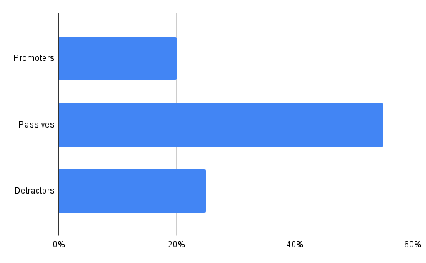
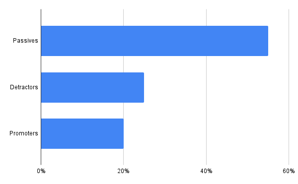
The whole point of data visualization is that the viewer will understand the data better than if it were in its raw form. It makes sense then, that the visualizations need to be intuitive and well organized.
When you are designing you are shooting for clarity above all else.
You don’t want the viewer to have to work hard to understand what they are seeing. Make sure your data is set out in a logical format. This could be alphabetically, by value or another criteria, depending on your data.
You should also take into consideration the hierarchy of data, placing different elements in certain places to attract more attention, and make sure that you have white space in your design.
These considerations should also be taken with regards to labels, fonts and colors (we’ll go into more depth on colors shortly). All of these elements are useful only when they are error-free, help the viewer understand the data, and are not distracting.
Your data should follow a natural order. To give you an example, instead of doing this:
You should do this:
4. Give Context
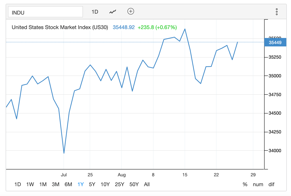
To help your viewer quickly understand what they are seeing, it helps to provide previous data as context. Data rarely exists in a vacuum so without context your results might actually be misleading.
In order to provide this context, you can add a benchmark or a zero baseline. You could also add short explanatory notes (emphasis on short).
Either way, by comparing it against existing data or insights, the viewer can easily tell how what they are seeing relates to what they already know.
The scale you chose also matters. In the below example of the US stock market, it’s important for small variances to be visible to the viewer. So the scale must be adapted according to this requirement:
5. Less Is More
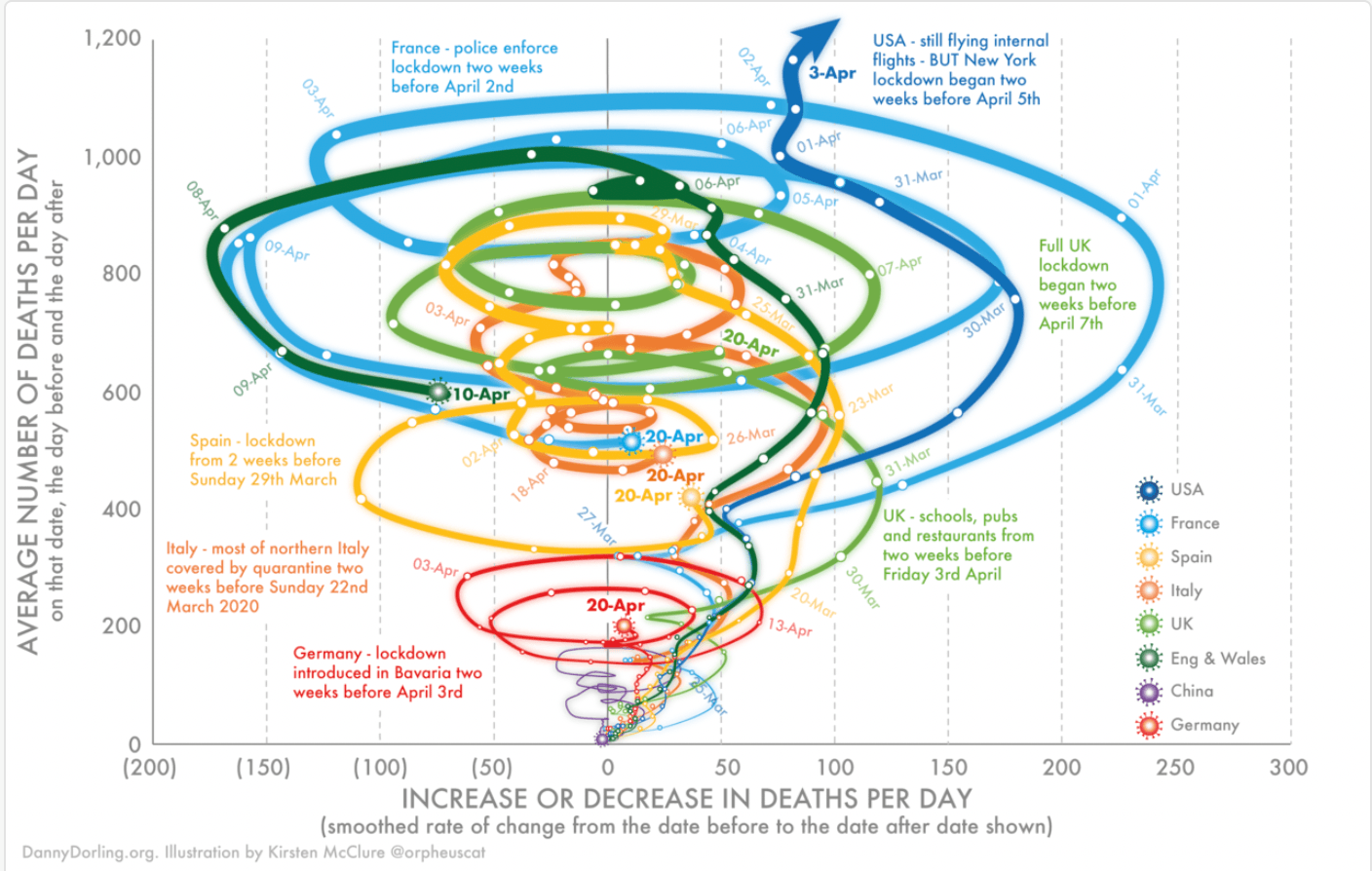
Following on from point number 3 regarding clarity and consistency, what you leave in, or more importantly, leave out, matters. Take out anything that doesn’t add value or that detracts the viewers attention.
As you move along the design process, continually refer to your original objective. Question whether the elements you add to your visualization are getting you closer to answering that objective. If they are not, remove them.
Charts like the following are a good example of how more detail can lead to confusion rather than clarity. There is too much for the eye to focus on and too many threads to follow:
6. Use Color Wisely
Color is both powerful and influential in data visualization. It can capture your audience’s attention faster and provide strong visual queues. It can also be confusing and distracting, depending on how you use it.
Some good principles to follow with regards to color include:
- Stay consistent with your use of colors. Do not interchange them in the same visualization.
- Don’t use too many different colors as this can be distracting.
- Choose high contrast color schemes over lighter colors. This makes it easier for people to read your visualizations.

- Respect existing color associations. For example, don’t try to use red for positive and green for negative.
Don't:

Do:

When choosing colors it’s best to be as inclusive as possible. Not everyone views color the same, for instance those with color blindness to do. When designing your visualizations, there are several tools that can help you plan for this. Adobe, for instance, provides color blindness filters that allow you to see how your work as a person with color blindness would.
Conclusion
Data visualization tools are indispensable when your visualizations are well designed, as they help your viewer to make sound business decisions.
However, a badly designed visualization can lead to your data being skewed. By taking in the points we have mentioned, you have a much better chance of starting on the right foot.
The software you use for data visualization is especially important. MonkeyLearn offers an all-in-one text analysis and data visualization tool suite that lets you view all your visualizations in one place.
Here’s an example of our interactive Studio dashboard:
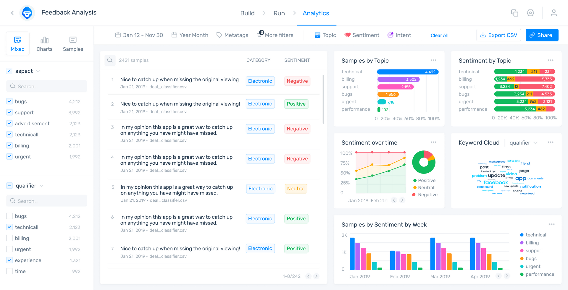
To see how MonkeyLearn can transform your data analysis and visualization experience, sign up for free or request a demo today.

Inés Roldós
August 31st, 2021


