5 Data Visualizations Trends for 2022 and Beyond
Data visualization, or ‘datavis’, is the future of business strategy and it is changing beneath our feet.
Because of a combination of technological and creative advances, the future of data visualization will bear little resemblance to its previous incarnations. Gone are the days of carefully filling in graph paper squares by hand - modern datavis will trend more towards fluid, real-time models capable of accurately capturing the entirety of nuanced data sets.
This guide will provide a nuts-and-bolts explanation of the five most important data visualization trends for 2022 and beyond.
Within, we’ll expand on the importance of data visualization trends, then explain and deconstruct each trend to enhance your understanding. Then, we’ll tie it all together by linking you to our all-in-one datavis studio that has the capacity to accommodate and display all of these top five trends.
Data Visualization Importance
Data visualization can significantly add value by conveying large datasets visually, making it easier for employees to digest. In a data-soaked world, this means a better grasp on critical customer data for any company.
Let’s take a look at some statistics supporting the benefits of great datavis. The main point is that human brains are optimized for visuals, not raw numbers.
By 2025, the IDC Worldwide Global Forecast estimates that the sum of business and consumer data will reach 175 zettabytes in size. Human inefficiency when it comes to processing this data may prove a problem.
For scale, a terabyte drive is one of the larger hard drives you could expect to buy in a laptop today - a single zettabyte is equal to one billion terabytes.
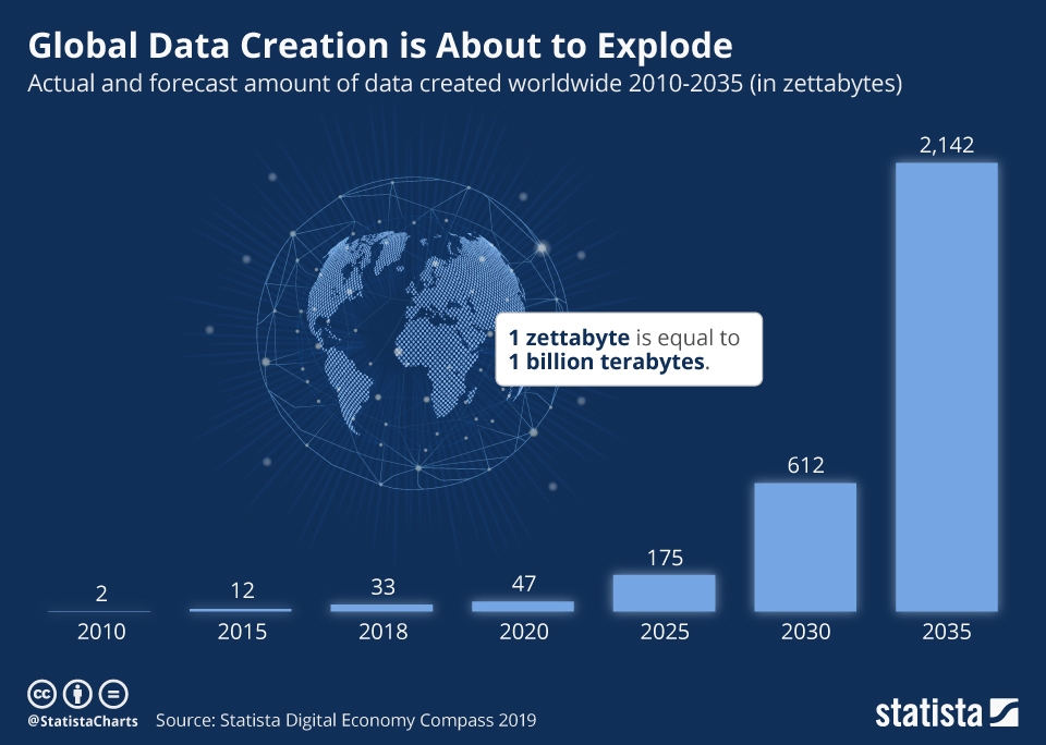
Via Digital Information World.
That’s a ridiculous amount of raw data floating around out there on our servers. Data visualization offers individual businesses hope at getting a grasp on it by taking advantage of the human brain's enhanced visual optimization.
Fortunately, said human brain is able to process visuals 60,000 times faster than text. Furthermore, it is adept at recognizing trends, identifying potential issues, and forecasting future development from clear visual displays such as well made graphs/charts etc.
So, why not let accurate datavis make the most of your data? By allowing the right programs to sort your data and generate your graphics, you will be able to leverage datavis to give your business the leg up on competition.
Next, we’ll emphasize specifically how this can be done using the five most popular (and powerful) data visualization trends out there.
Here we go:
Top 5 Data Visualization Trends
- Video Visualization
- Data Democratization
- Real-time Visualization
- Mobile and Social Data Visualization
- Artificial Intelligence and Machine Learning Datavis
1. Video Visualization
The statistics behind data retention through video is even more impressive than those behind static visuals - and that’s saying something.
We all know the emotional impact of a good movie, or the arresting capacity of an exhilarating music video. But the truth is even simpler - even with less exciting content such as that in a business presentation, our minds are hardwired for paying attention to video.
We retain data better with video. Participants in a recent study answered questions 323% better when they had a video aid, compared with those who had text-only instructions.
But that’s not all - we innately understand that video is easier for our brains to grasp and prefer it given the option. The same study found that 67% of users preferred to learn about a new product or service through a video rather than pictures or text.
These powerful factors mean that video infographics, and yes, video advertisements too, are here to stay. Their application for both business strategy and customer retention, however, are only beginning to be explored and are key areas for future strategic datavis implementation.
2. Data Democratization
Data used to have the nasty habit of being hard to understand - it required data scientists and other technical employees' attention to unlock its treasures.
This no longer needs to be the case. Advanced, no-code data analysis platforms can automatically process and unlock your data. This leaves it malleable and easy to display in whatever datavis mode that your employees of any level of tech savvy can dream up.
This is the ‘democratization’ of data which, when paired with an effective data visualization type choice, can unlock big data results for teams at all levels within your organization - and leave your technical employees in peace.
3. Real-time Visualization
You need to know when a problem arises at the exact moment it arises. Early detection in business strategy, customer retention and brand presence can have dramatic impact on your bottom line.
You can see below how Zoom is able to address a customer issue quickly because of this kind of early detection.
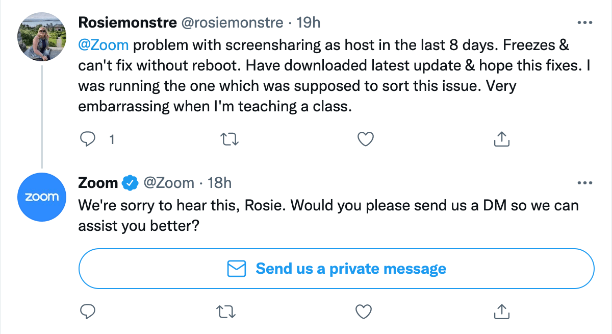
This underscores why the best kind of data visualization is up-to-date data visualization. Say goodbye to static charts - real-time data visualization is here to stay.
An excellent, illustrative, example is the Monkeylearn Studio Dashboard:
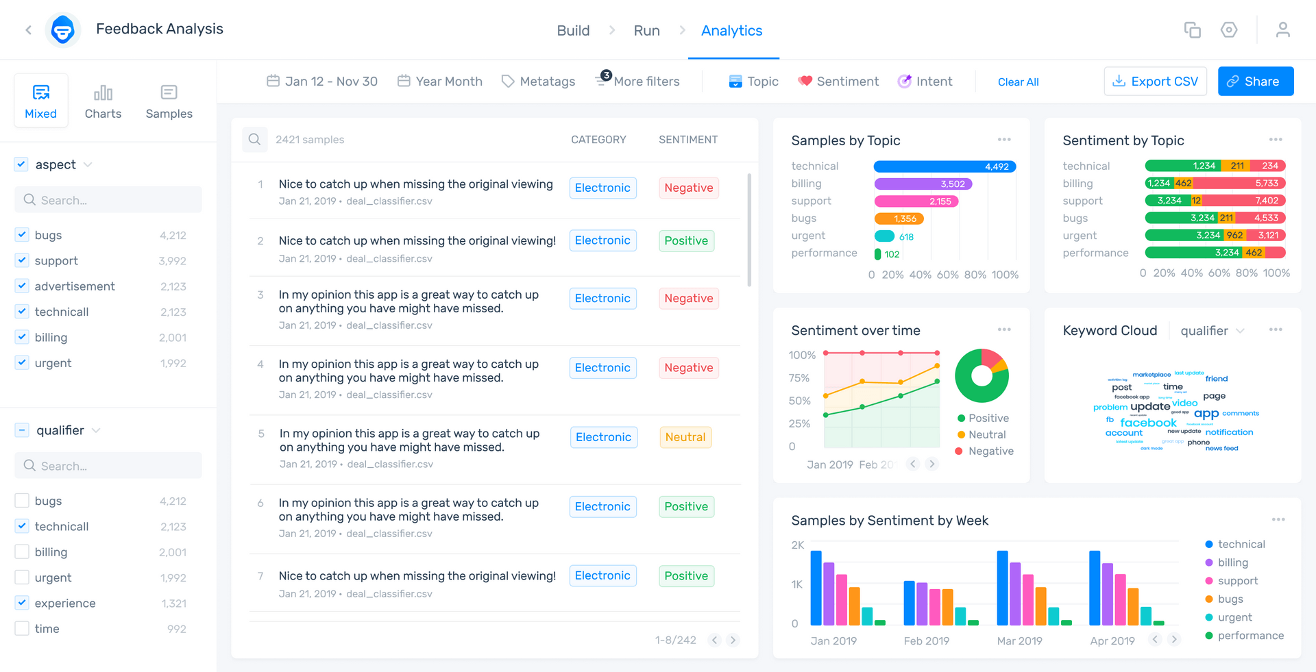
As you can see, it keeps tabs on customer feedback as it comes in and collates it into appealing, understandable graphs. You can explore the public demo of the dashboard here.
If the situation depicted in the tweet above occurred, and your business had it’s handy-dandy MonkeyLearn dashboard running, you would be made aware of the issue right away. The users who were encountering your business’s version of a ‘screen sharing issue’ would submit their error reports to your customer support, and these reviews would pop up in the middle of your dashboard, already tagged and analyzed using sentiment analysis (see middle text column in the dashboard above).
4. Mobile and Social Data Visualization
Via Sisense.
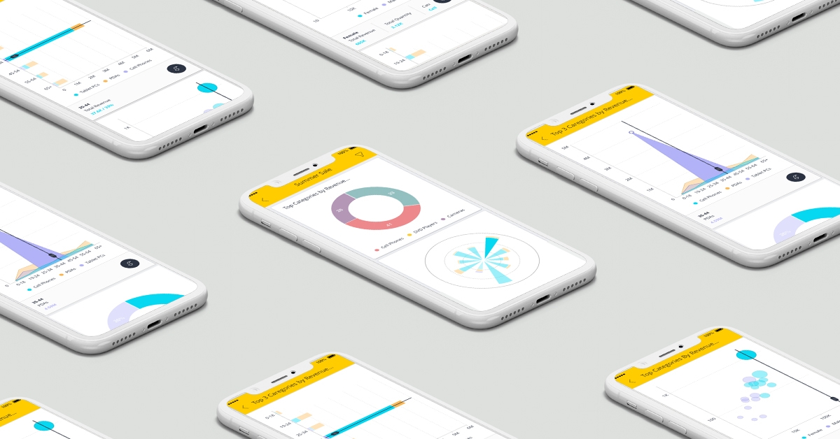
How people access the internet is changing, too. According to Broadband Search in Feb. 2021, 56% of internet access came from mobile devices.
That’s a huge market share. As such, it’s important to understand that data visualization is not only for your in-house team needs - it can also be used to reduce customer churn, enhance loyalty, and even attract new customers - all via the persuasive power of visuals.
Whether existing or potential customers are informing themselves about your services on social media, on your site, or on an online review board, mobile-optimized data visualization is essential. Content that is incompatible with mobile devices means a customer could switch to a competitor in frustration. Or, it could just mean that they don’t see a key graphic that you have paid good money to have strategically displayed.
Either way, the end result is the same - dreaded customer churn. Being on top of your mobile data visualization game is an easy but critical step.
5. Artificial Intelligence and Machine Learning Datavis
This could easily be number one - AI and machine learning are the backbone of all great data visualization and will be increasingly key as technology progresses.
Data visualizations not backed by advanced AI are doomed to be inaccurate and inefficient in the long run. Because it turns out that humans are just as bad at accurately sorting raw data as they are at processing it.
Customer feedback is best handled by unbiased programs that can sort said feedback in real-time and according to your specifications. This eliminates the need to send employees to perform countless hours of grueling hand-tabulation that is bound to have some bias.
Takeaways
In the coming years, businesses will compete at the razor’s edge of data visualization by pitting their advanced data analysis and visualization algorithms against each other in the search for peak efficiency. Yet, in the modern cyberspace a number of companies don’t even employ AI yet.
Luckily, there are some great options on the market. MonkeyLearn’s customer feedback analysis AI and comprehensive data visualization studio is a superb industry-leading solution. By giving it a whirl you can revolutionize your feedback and datavis approach in one step.
This no-code studio solution addresses and has the capacity to harness all five of our data visualization trends. Its dashboard can display your data in any form and keeps all of your visualizations in one place. Even better, it does this with a data-democratic, no-code approach, thus streamlining the collection and analysis of your data and putting the power of it into each and every of your employees’ hands.
See for yourself how MonkeyLearn’s offering can meet your business needs by jumping right into a free trial, or schedule a complementary demo with one of our data analysis experts.

Inés Roldós
September 16th, 2021


