The 14 Most Common Datavis Types and How To Use Them
Data visualization types are the different formats you can use to visually display your data. The right type of datavis is able to visually convey raw data in a way that increases results and unlocks understanding.
Matchmaker, matchmaker make me a chart. In the world of data visualization where presentation is the whole purpose, finding the ideal visual match for your data is key to success.
This article will take you on a journey through the 14 most common data visualization types to find the perfect match for your data.
The ideal data visualization type for any dataset is the one that best conveys your data clearly to the humans that will view it.
That’s it - it’s that simple. Datavis’s job is to transform your information from hard data, to a visual aid for the bright minds of your teams, who can then make insightful decisions from a place of clarity.
Let’s hop to it - here is the roadmap of how we’ll proceed.
What is Data Visualization
Data visualization is the presentation of data or information in a visual format.
The aim of data visualization is to allow the human brain to more easily interpret datasets - in this way it is the sibling of data analysis. A page filled with row upon row or column upon column of large and heavily decimaled data might make sense to a computer, but is hard to grasp for us humans.
So, we turn to an alternative way to visualize our results. We don’t change the values - instead we search for ways to display them in a way that is easy to understand and interpret.
Understanding and interpretation must always remain our prime directives. By designing our data in a way that is easily digestible, the best possible outcome is novel interpretation by the living, breathing members of our team.
Essentially, the right chart can help us get the best out of ourselves.
Let’s get into finding that right chart/table/graph for your data.
Data Visualization Types
Data is not going away. In fact, it’s expanding.
Take the Internet of Things (IoT), the principle that the internet is growing in size at a rate far beyond any physical resource in the real world. The IoT concept references the fact that 90% of existing online data has been created in the last two years alone. Technology and its ability to create data shows no signs of slowing down.
Point being, there’s a ton of data out there. So, we need to keep pace with our ability to process it.
Thankfully, we created data visualization long before the internet came around, so we have a head start. And, some of those early chart types are still incredibly efficient at helping make sense of heaps of data.
Here are the 14 most common types of data visualization types you can leverage in your journey to conquer your data. We’ll start with the most recognizable ones.
- Table
- Bar graph
- Stacked bar graph
- Pie chart
- Line graph
- Area chart
- Word cloud
- Scatterplot
- Gantt chart
- Heatmap
- Timeline
- Bubble chart
- Waterfall chart
- Funnel chart
We are going to evaluate each datavis type with regards to two distinguishing factors:
- Type: What type of datavis it falls under: Temporal, Hierarchical, Geographical, Combined, or Other.
- Best For: The type of data we think it most effectively captures.
We’ll explain the reasoning behind each as well as some other background, and provide examples as we go.
1. Table
Type: Combined.
Best For: Displaying a small number of complicated data types.
Tables are very nearly raw data, just organized. They display a variety of characteristics surrounding the data types you choose to display. They are very closely related to datavis dashboards in that they allow you to display the totality of the data surrounding each type in one place.
The downside is that with too many rows or columns, and too many details around each data type, they can become cluttered. So, we recommend you keep the number of inputs low so that your teams can parse what they are seeing.
2. Bar graph
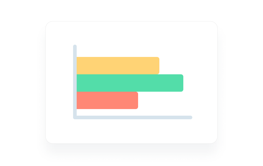
You likely are able to recognize this. Bar graphs are often thought of as the most basic type of graph, and for this reason they are taught first at school.
Best for: Comparison between small number of categories
Type: Temporal
Another reason they are the first type of graph taught is that they are the quintessential temporal graph.
Temporal data visualization types are linear and one dimensional, tracking variables over a period of time.
Bar graphs fulfill this requirement in a rudimentary way - they display the amount of each of the variables they track within a timeline indicated in the title or the subtitles of the graph. For example, you could track the types of car (bars) sold in a dealership (amount/height of different bars) during January (timeframe of the whole graph).
In exactly this manner, bar graphs are great at tracking comparative amounts. However, if you have too many types, they can be overwhelming and bog down user eyes, requiring closer examination.
3. Stacked bar graph
Type: Temporal
Best For: Best for Comparison Between Small Number of Categories + Divided Responses
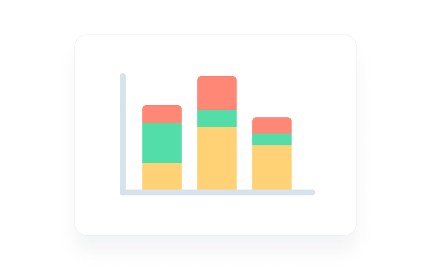
These are bar graphs with a slight complication - they focus on divided inputs (male/female, user/non-user, homeowner/non-homeowner, etc).
As you can see above, this can help differentiate responses by demographic types or by whatever other differentiating factors you deem important.
4. Pie chart
Type: Combined
Best For: Simple overlapping data
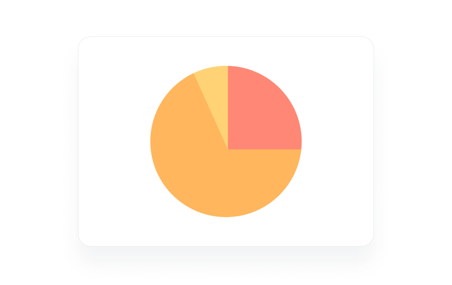
The beauty of the pie chart is in its simplicity. It takes a number of inputs, gauges them by size, and creates a visual representation of the amount of overlap. This can be a simple shortcut to a greater understanding of shared space, shared target audience et cetera.
However, the overlaps are best when they are very different in size - if all the overlaps are around the same amount, the differences can be difficult to differentiate to the blind human eye. Relatedly, pie charts struggle at scale. A small difference at scale could represent hundreds or even thousands of customers. This would be important to your teams, but easily overlooked in a massive pie chart.
5. Line graph
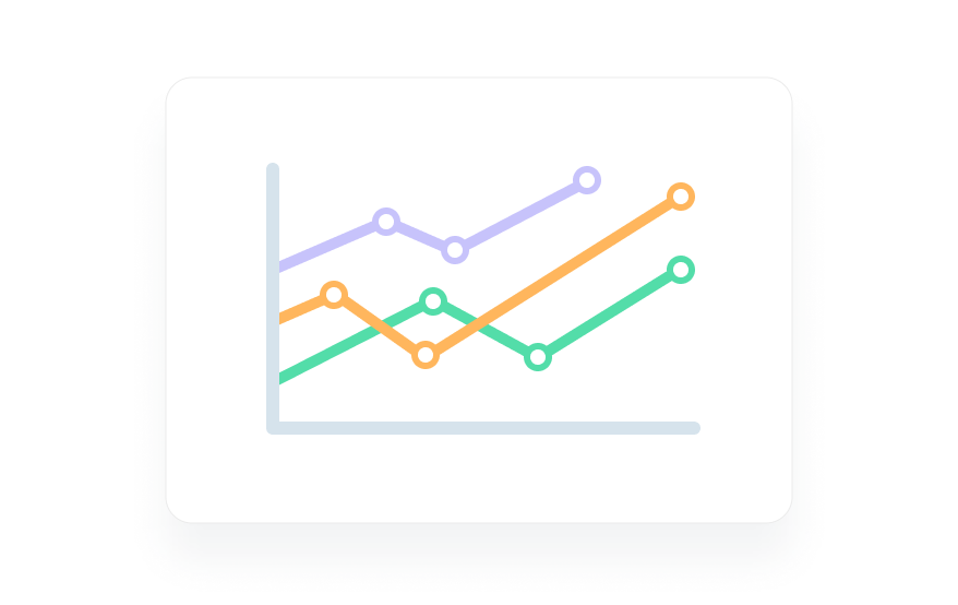
Type: Temporal
Best For: Line graph Relative input amounts tracked over time.
Another classic, the line graph represents temporal datavis to a T by tracking inputs over time. Line graphs are best for tracking progress, changes, and/or time related trends between a small number of inputs.
They can, however, be difficult to read if they have too many inputs (which lead to too many lines). The best line graphs have less than ten inputs, all mapped in starkly different colors.
6. Area chart
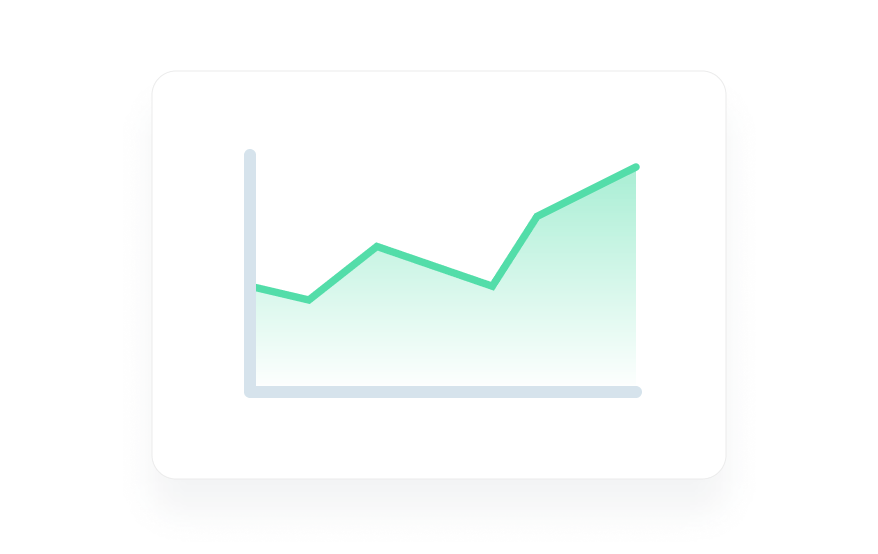
Type: Temporal
Best for: Relative input amounts tracked over time + easier to visualize differences.
As stacked bar graphs are to bar graphs, so are area charts to line graphs. They accomplish the same goals, but by highlighting relative areas, they can emphasize the difference in the square acreage between inputs.
7. Word cloud
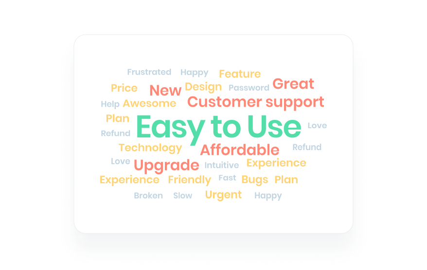
Type: Other
Best For: Text visualization
A unique type of datavis, word clouds expertly visualize frequency of the times words are used within a body of text - they are the visual embodiment of text visualization.
8. Scatterplot
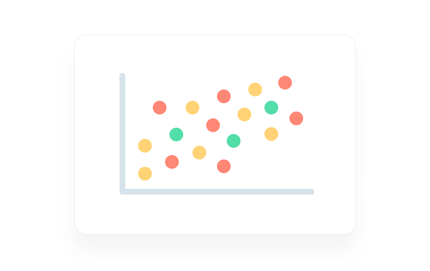
Type: Combined
Best For: Simple two-variable display.
Understanding what scatterplots are best suited for is easiest by remembering that they are not temporal.
They don’t track inputs relative to time, but rather against a second variable. You could plot, say, sales against size of home, voters by median age, or whatever you like. If you are plotting against time, it becomes a line graph.
9. Gantt Chart
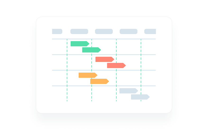
Type: Combined (Temporal + Hierarchical)
Best For: Mapping multiple development roadmaps over time.
Now we are truly cooking with gas. Gantt charts are an emblematic example of modern datavis.
They combine the strengths of temporal bar graphs with the hierarchical organization of flow charts.
As you can see above, they let you map the relative timelines of projects over time. Viewers are able to visualize how long each endeavor took to complete as well as where it took place along an overall timeline.
10. Heatmap
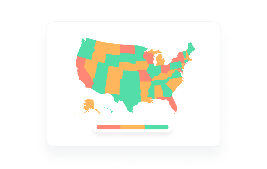
Type: Geographic
Best For: Data input plotted against location or customer website viewing data
Our first and only type of geographic input, heatmaps can be the key to understanding your demographics or how customers view your website.
Above you can see a heatmap of the choropleth variety - meaning the relative density of the result is plotted by color, from blue to red. These help you visualize where your product is most popular geographically. They can also show where the most problems with your service are occurring, or whatever else you can dream up to measure geographically.
Or, we can take the above principle and apply it to the virtual real estate of our websites, as Hotjar shows below.
By measuring average customer cursor location and clicks, you can better understand how users are interacting with your site.
11. Timeline
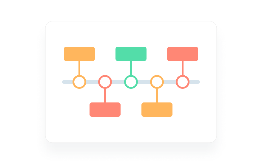
Type: Temporal.
Best For: Dissecting projects by time required to complete.
As we saw in the more complicated Gantt Charts, timelines can be useful to business for visualizing the amount of time that different goals take to complete.
With the more simple, classic timeline you can visualize relatively how long goals within one project took to complete as parts of the whole.
12. Bubble chart
Type: Hierarchical
Best For: Alternatively visualizing input amounts.
Bubble charts are the non-overlapping brethren of pie charts. They are common in infographics as they can be an eye-catching alternative to the classic bar graph.
13. Waterfall chart
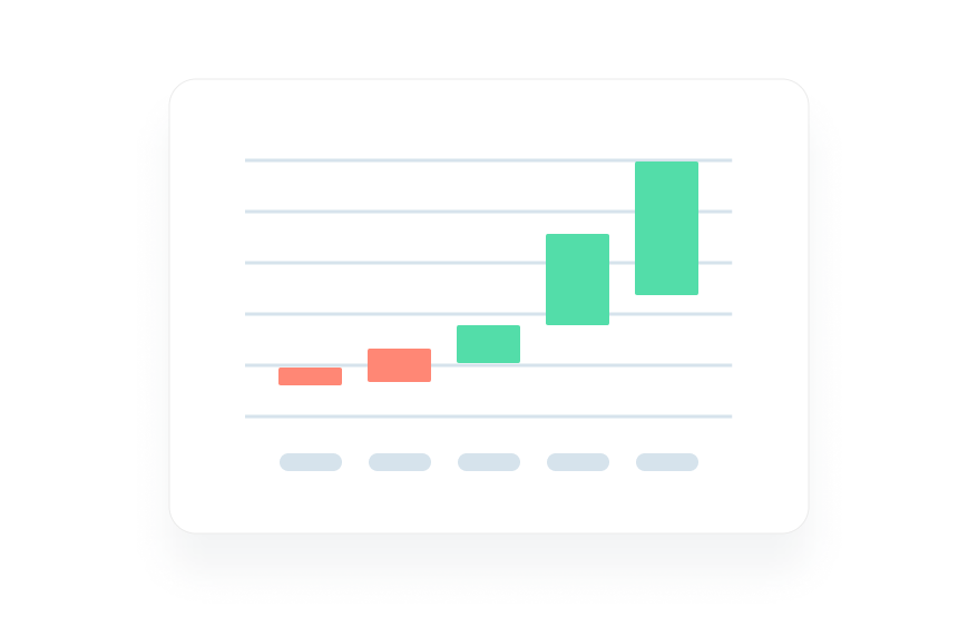
Type: Temporal
Best For: Visualizing positive/negative profits/progress within segmented time periods.
Known as Candlestick Charts in the financial world, waterfall charts have typically been used to measure profits across segmented periods of time.
Many businesses, for instance, use them to show profit trends for each month within a year or quarter. Green means positive profit and red means loss, with the size of each bar indicating amount in either direction.
Other uses can be dreamed up and applied - waterfall charts are great for visualizing period based change in general.
14. Funnel chart
Type: Hierarchical
Best For: Composition visualization
Funnel charts are a modern remix of the classic pyramid chart. Take the age old food pyramid - flip that upside down and you have a funnel chart.
This might seem like a gimmick, but people are used to reading from the top down. So, having the largest portion be the highest up makes the content easier to interpret.
Takeaways
New data visualization types are being dreamed up every day, with hybrids and variants to match every need. So, if none of these tickle your fancy, a google search, followed by integration or custom coding, can get you on your way to building something that works.
Before you go to all that trouble, though, we recommend you check out MonkeyLearn's All-In-One Text and Data Visualization Studio.
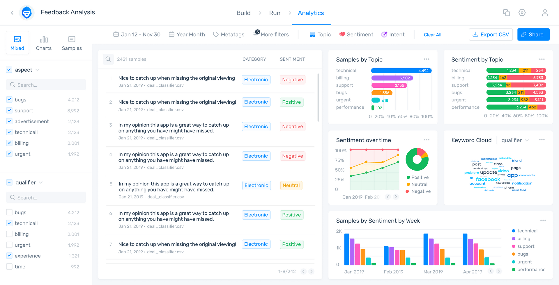
With a dizzying array of datavis tools and types available, easy API integration, and an open coding library, the Studio and Dashboard are a lifehack to finding or creating that perfect data visualization for your unique data.
And it can display all of your custom-curated graphs, alongside an array of alternatives it self-generates, in one place and keep them updated in real-time on your own custom dashboard.
Whether you decide to let us help you revolutionize your datavis game, the MonkeyLearn feedback analysis AI can help any business analytics department make the most of its customer feedback.
Schedule a free demo with one of our feedback analysis experts today, jump right in with a free trial, or read about data visualization and much more on our blog.

Tobias Geisler Mesevage
August 30th, 2021


