Text Visualization: Get Insights at a Glance
Businesses have access to huge amounts of text data, which contains a wealth of insights. It can be simple to transform into quick insights using text visualization tools like word clouds.
However, to gain truly actionable insights from unstructured data, like open-ended survey responses, emails, online reviews, and social media posts, you’ll need to analyze it first using advanced data analysis tools.
Find out how text visualization can help you uncover what’s hidden in your data, and learn how to use machine learning tools to take text visualization one step further.
Text Visualization Basics
Text visualization is the technique of using graphs, charts, or word clouds to showcase written data in a visual manner. This provides quick insight into the most relevant keywords in a text, summarizes content, and reveals trends and patterns across documents.
Companies use text visualization to:
- Summarize large amounts of text. Automatically highlight key terms in a series of texts, and categorize text by topic, sentiment, and more, saving hours of reading time. How long would it take you to read 500 online reviews? With a word cloud or data visualization dashboard, you can understand text data at a glance.
- Make text data easy to understand. The human brain loves visual data. In fact, we are able to process images much faster than text. Text visualization is an effective way of simplifying complex data and communicating ideas and concepts to team managers.
- Find insights in qualitative data. Customer feedback holds a trove of insights. Through text visualization, you can get an overview of the features, products, and topics that are most important to your customers. Learn what their pain points are and what you’re doing right.
- Discover hidden trends and patterns. Analyze and visualize insights over time to detect fluctuations, and quickly find the root cause.
At MonkeyLearn, we created a free word cloud generator that helps you create simple text visualizations in next to no time.
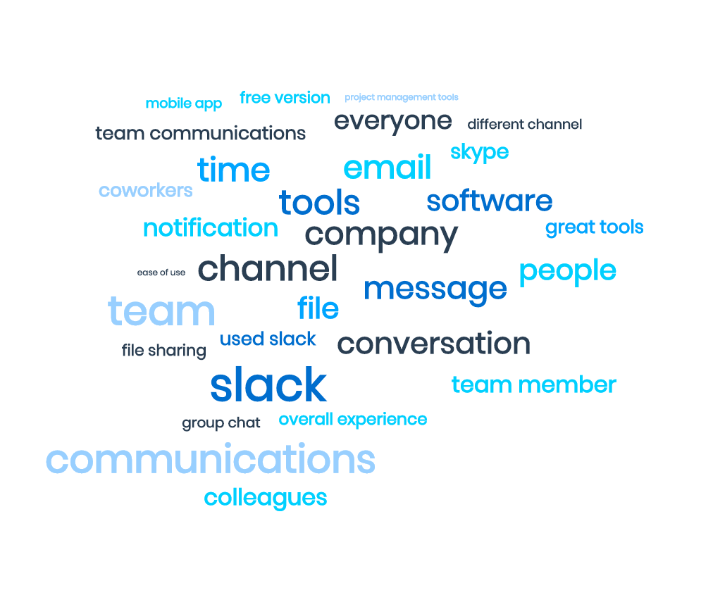
Word clouds show the words that appear most frequently in your text data, like in this example, below:
Here are a few reasons to try MonkeyLearn’s word visualization tool:
- Easy to use. Paste or upload text, click generate, and get a word cloud in seconds.
- Professional visualizations. Tailor your word cloud to match your branding
- Powered with AI technology. AI technology makes your word cloud smarter: it automatically detects collocations (words that often go together), groups words that share the same root form (stemming), and calculates how relevant a word is (instead of just focusing on word frequency).
Text Visualization with Machine Learning
Word clouds are a great starting point for visualizing qualitative data.
They provide basic and quick insights and can be useful for exploratory analysis, to learn what’s inside a dataset, and help you define labeling criteria for more advanced text analysis and visualization.
If you want to create richer text visualizations that tell a story and help you make business decisions, you’ll first need to perform text analysis with machine learning.
Text analysis (also called known as text mining) involves a series of techniques to structure your raw data. Using AI and machine learning, text analysis models can automatically sort your data into categories or extract relevant information from text.
Let’s go back to our dataset of Slack reviews.
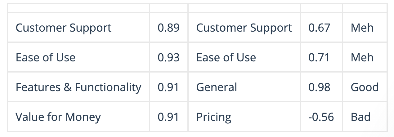
Imagine you want to know how customers perceive your brand. You could use topic classification to organize opinions by subjects, such as the app’s features, ease of use, pricing, and so on. Or, run sentiment analysis to detect positive or negative opinions. Combining both types of data analysis is known as aspect-based sentiment analysis, and shows you how customers feel towards specific aspects of your brand.
The text output would look something like this:
No-code machine learning tools, like MonkeyLearn, enable you to perform text analysis in a simple, fast, and cost-effective way. You can use pre-trained models like this free sentiment analyzer, to sort your data right away, or train customized models in a point and click interface.
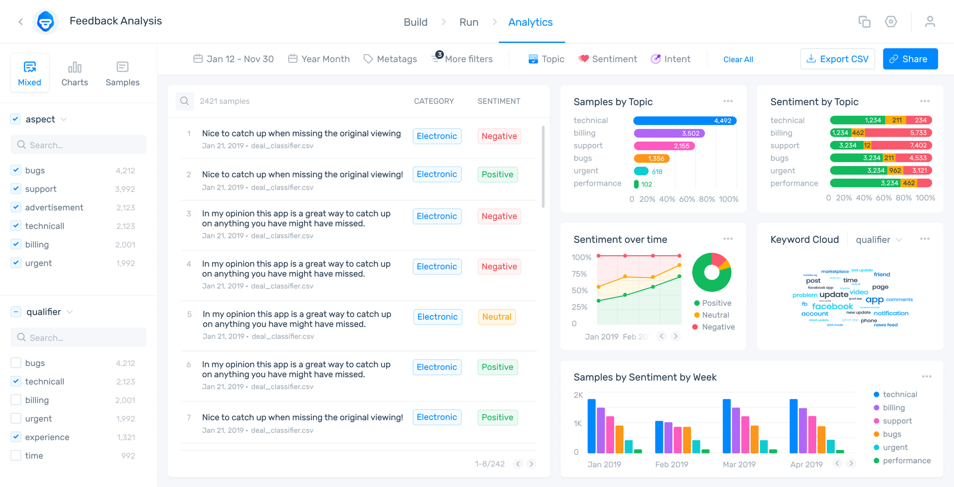
Once you’ve analyzed your data using text analysis techniques, you’ll want to transform the text output into something more visual that the whole team can understand. To create an in-depth text visualization use MonkeyLearn Studio, which connects directly to your analyzed text data so that your visualizations update in real time.
Through charts, filtered views, and keywords, discover and share actionable insights with your teammates:
Start Performing In-depth Text Visualization
Text analysis and visualization can help you make sense of qualitative data, quickly, easily, and at scale. Through charts, word clouds, and dashboards, you can turn plain text into eye-catching stories.
Visualizing your text data makes your data easy to understand, and enables you to draw actionable insights and reveal trends. To get fine-grained text visualizations, you’ll first need to use text analysis tools to sort your data by sentiment, topic, and detect relevant keywords.
MonkeyLearn Studio combines both text analysis and visualization, all in a no-code interface, making it accessible to everyone. Start analyzing huge volumes of data, and start transforming text analysis results into captivating visualizations.

Inés Roldós
October 23rd, 2020


