How to Analyze Your Survey Responses in 2022

Surveys can be one of the quickest and most dependable ways to get useful information about your brand, products, and services.
Once you’ve collected your survey data, though, you’ll need to analyze the results
The type of questions you ask and the number of responses you receive will shape the way you perform survey analysis.
In this post, we’ll show you that it’s just as easy to perform data analysis on your close-ended responses as it is your open-ended responses.
Want to get right into performing analysis on your open-ended data? Jump to the section on How to Analyze Qualitative Survey Data with AI.
If not, read on to analyze your qualitative data first.
- What Is Survey Analysis?
- Types of Survey Data
- How to Analyze Quantitative Survey Data in Excel
- How to Analyze Qualitative Survey Data with AI
- Visualize Your Survey Data in a Dashboard
What Is Survey Analysis?
Survey analysis is the process of analyzing responses from all types of surveys.
After implementing a well designed survey you need to dig into the details of the survey responses. This way, you can better understand customers, employees, and your overall brand performance.
Net Promoter Score and CSAT surveys are two of the most popular surveys, and are used to understand customer satisfaction after each touchpoint on a customer's journey, as well as overall customer satisfaction.
Since customer satisfaction can make or break a business, it’s important for businesses to analyze what their customers are saying in both quantitative and qualitative feedback.
Types of Survey Data
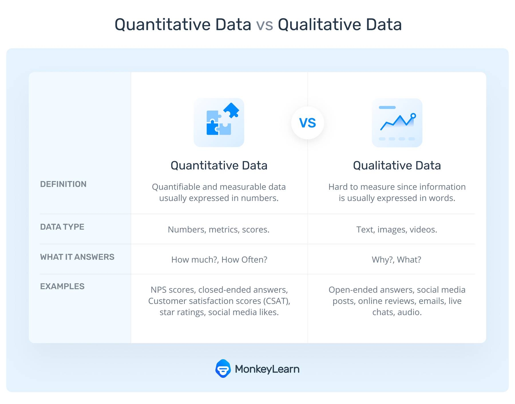
There are two basic data types in surveys: open-ended questions and close-ended questions.
Close-ended questions deliver quantitative data, also known as structured data. You’d analyze this type of data using everyday tools like Excel. The answers to close-ended questions are usually multiple-choice, rated on a number scale, or one-word answers, like Yes/No, so are easily quantifiable.
CSAT and NPS surveys can quickly help companies measure how happy their customers are with their product, service, event, or brand by asking an easy-to-answer closed-ended question.
But, these surveys often ask a follow-up question to understand why customers leave a high or low score/feeling. These open-ended questions elicit more detailed responses and can help companies really understand what they’re doing right or wrong.
Open-ended responses can be categorized as qualitative data or unstructured data. They’re harder to analyze because they are not organized in any predefined manner.
Later on, we’ll introduce you to survey analysis tools that make it easy to break down open-ended survey results for real qualitative insights. But first, let’s explore how to analyze survey data in Excel.
How to Analyze Quantitative Survey Data in Excel
To get the most out of your survey responses, start with the end result in mind by asking What are my goals and what insights do I want to gather?
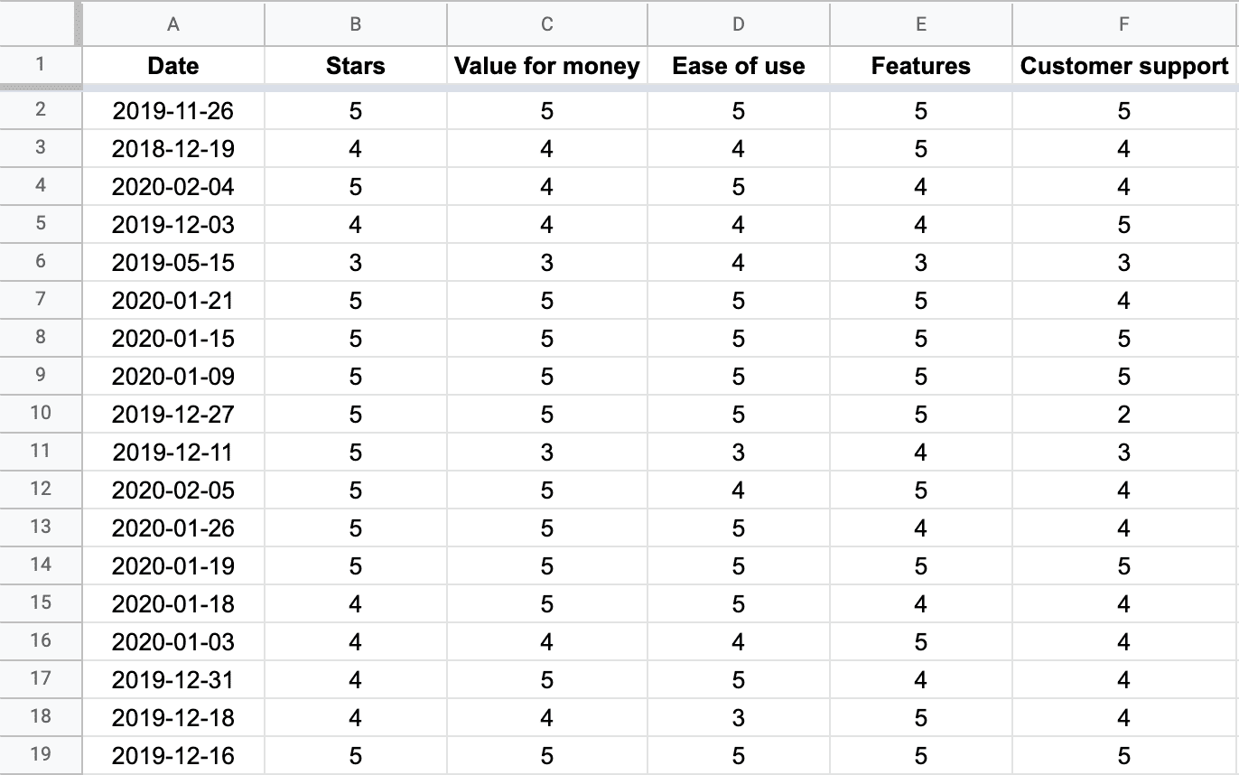
Analyzing quantitative survey data in Excel can be a snap with built-in formulas, tables, and charts. The below examples show the results of over 2,500 survey responses for the messaging app, Slack. Reviewers ranked the app from 1 to 5 stars on general use (“Stars” column), value for money, ease of use, features, and customer support. A snapshot of the overall data in Excel:
Filter survey data by different criteria
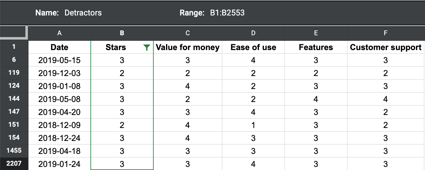
The below shows reviews filtered by survey respondents that delivered a rating of 3 stars or lower. To do this, click the left-hand corner to select the entire table, and choose ‘turn on filter’ by selecting the filter icon. Then, choose a conditional value of 3 or lower, and rename this view to ‘detractors’, survey respondents that give you a below-average rating.
Calculate mean, maximum, and minimum
The columns, rows, and cells in Excel have built-in formulas. In this case, simply highlight the entire column (or group of columns), and choose the correct formula in Excel. Type ‘=average’, ‘=max’, or ‘=min’ in the corresponding field and Excel will calculate the statistics for you.

Perform cross-tabulation with a pivot table
A pivot table summarizes the data of a more comprehensive table. Also referred to as cross-tabulation, it can provide a quick comparison of how different groups of respondents answered your survey questions, for example, you could focus on respondents in a particular age group, with a specific occupation, and more.
To create a pivot table, select the cells you want to use, click ‘Insert’from the menu bar, select ‘PivotTable,’ then choose the location for your pivot table. Drag the fields you want to use into the ‘PivotTable Fields’ window that pops up.
Create charts and graphs to visualize data
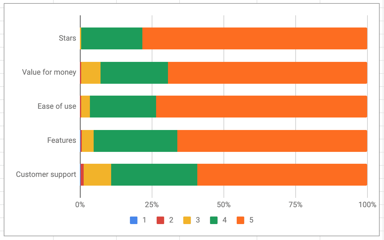
Simply choose the chart or graph you’d like to use from the ‘Insert’ menu, and Excel will walk you through choosing your fields. This graph shows the percentage value by star for each category. We can see that the results are quite positive, with more than 50% of the reviews being 5 stars (in all categories).
How to Analyze Qualitative Survey Data with AI
Qualitative data can be harder to analyze because it can’t simply be turned into numerical values to run through Excel formulas. But asking open-ended questions will help you to discover reactions and emotions that can’t easily be understood with Yes/No questions.
With AI tools, like MonkeyLearn, you can transform open-ended survey responses into real, actionable insights in just a few steps, and in next to no time at all.
With MonkeyLearn, you can:
- Automatically tag survey responses
- Read survey responses for sentiment and emotion
- Extract the most frequently mentioned topics and features
Simply upload an Excel file with long-form survey responses and perform any number of survey analyses, then output the results back into Excel. Or upload and download directly from survey tools you already use, like SurveyMonkey, Survey Gizmo, Google Forms, and more.
To learn more about how to analyze your open-ended survey responses, book a chat with us.
You can also try out tools like this sentiment analyzer, to see how you can sort survey responses by emotion. Paste in one of your survey responses to see how it analyzes your text:
Sentiment analysis is a cornerstone of text analysis that uses natural language processing (NLP) to categorize text data, like survey responses, into positive, negative, or neutral.
It goes beyond mere word definitions into opinion and emotion, even sarcasm. Powerful algorithms break the comment down and easily score the sentiment as Positive.
Some open-ended survey responses contain more than one opinion. To gain a more accurate analysis, these have to be separated into individual opinion units (fragments of text), otherwise, responses will be categorized as ‘neutral’ since opposing sentiments in one text will cancel each other out.
Chat with us to find out how to separate opinions in a matter of minutes. Just like we’ve done in this example below:

Once you have separate opinion units, you can get even more granular with your data analysis.
Try out how this pre-trained opinion unit extractor, below, separates text into smaller fragments:
Visualize Your Survey Data in a Dashboard
Now that you’ve picked apart your open-ended responses, put the data back together to uncover powerful insights with MonkeyLearn Studio – your all-in-one survey analysis and data visualization tool.
The below is a sample dashboard showing an analysis of reviews for Zoom:
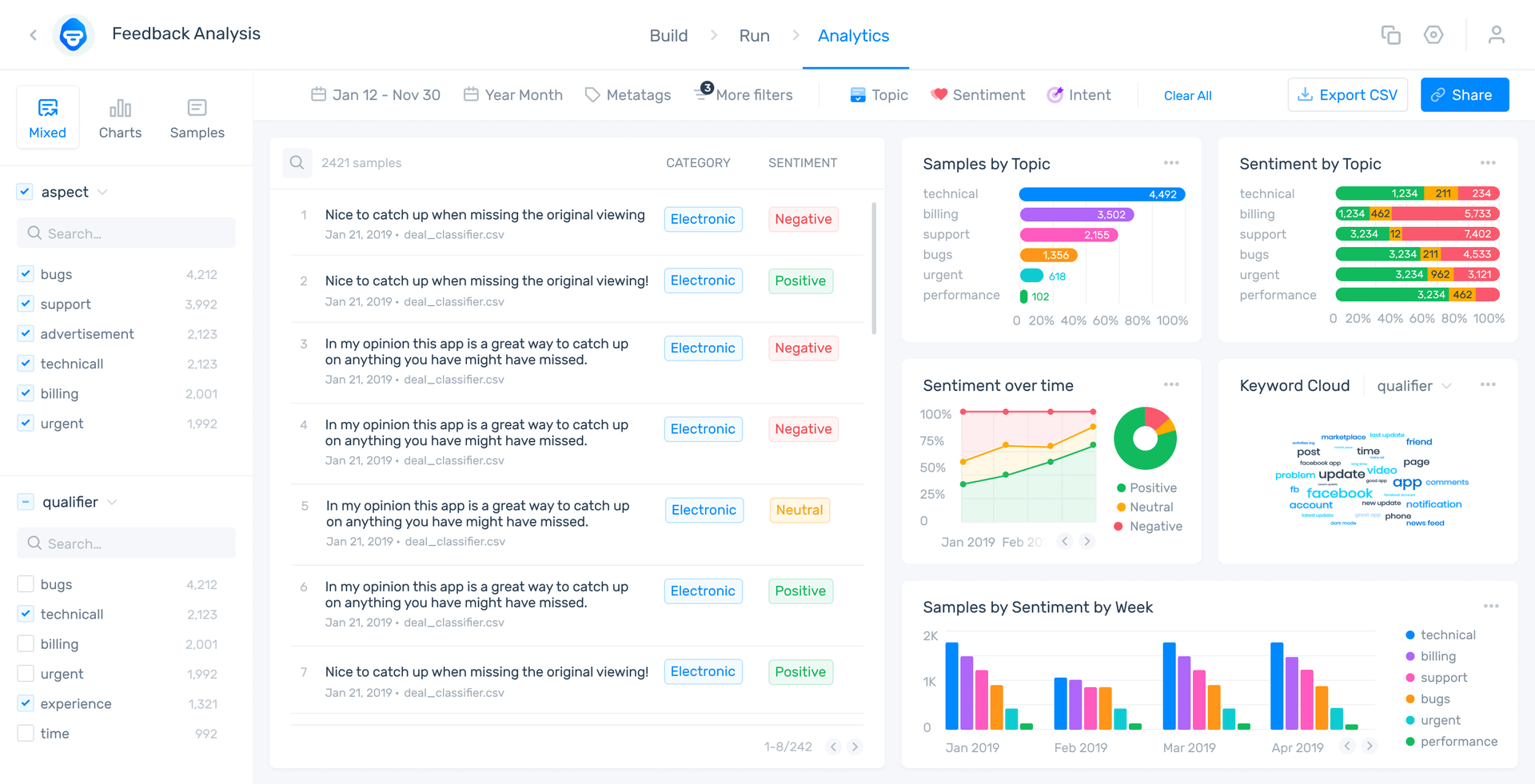
You can see sentiment analysis by category (aspect), individual responses by date, and keyword extraction that shows the most used and most important words: in the ‘Qualifier’ section on the bottom left and in the word clouds created on the bottom right.
Data visualization tools can put all of your survey data into one place for an expansive view or finite insights. Get to the data that’s not simply visible on a simple spreadsheet or graph.
With MonkeyLearn Studio you can manipulate your survey data and your findings right in the data visualization dashboard.
MonkeyLearn Studio offers countless insights and visualizations that can produce game-changing results for presentations, board meetings, and personal edification.
Book a demo to see how it works on your survey data.
Get Started with Survey Data Analysis
Customer surveys are an undeniably important aspect of business development, and Excel can be a helpful tool to analyze your quantitative survey results.
Using Excel in concert with survey applications and AI survey analysis tools can take your data to the next level.
Find out how MonkeyLearn can help you analyze your surveys and improve your analytics by showcasing your data in broad strokes or finite detail.
You can try out most of the powerful text analysis tools for free to see how they work. Or schedule a demo to understand the true potential of machine learning.

Tobias Geisler Mesevage
September 4th, 2020


