How to Take The Pain Out of Survey Analysis in 2022

Surveys are one of the most popular ways for businesses to gather customer feedback because they can tell you where your products, services, or business, may be lacking (or excelling).
But analyzing your survey results can be a challenge, especially if you have thousands of open-ended responses to wade through.
Thankfully, there are all sorts of tools that take the pain out of survey data analysis.
This article will explain what survey analysis is and the quickest way to perform survey analysis on different types of data.
- What Is Survey Analysis?
- Types of Survey Data
- Best Practices for Analyzing Survey Data
- How to Analyze Your Survey Data
- Automating Qualitative Survey Analysis with AI
- Survey Analysis Tools
What Is Survey Analysis?
Survey analysis is the process of analyzing customer survey responses for results that lead to actionable insights. Survey analysis examples include Net Promoter Score (NPS), customer satisfaction (CSAT), marketing, research, employee satisfaction, and more.
Types of Survey Data
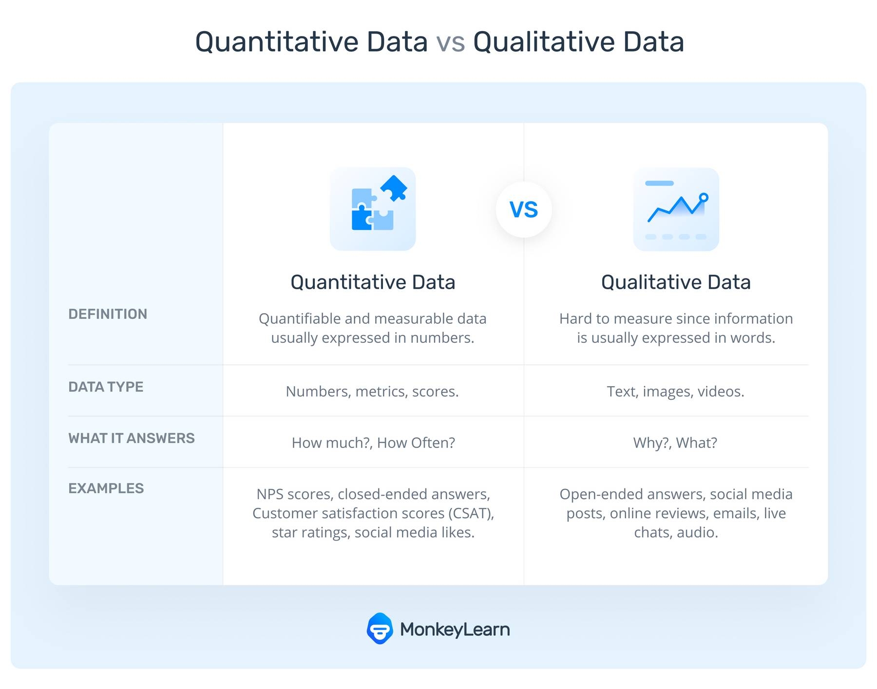
You can conduct either open or closed-ended surveys (or a combination of both), two very different instruments that will give you different types of information: qualitative and quantitative data.
Quantitative Data
Obtaining quantitative data means measuring values expressed in numbers. This method is structured and helps you draw general conclusions from your surveys. For example, if you would like to know how many customers like your new product, you can conduct quantitative research using close-ended surveys and obtain numbers as a result (82% liked it, 15% did not, and the rest are unsure).
Quantitative surveys are easier to analyze because they simply deal with statistics and rating scales, but they don’t provide a whole lot of insight.
Qualitative Data
Qualitative data, on the other hand, describes and explains a topic or phenomenon rather than measure it. Instead of values expressed in numbers, qualitative data comes in the format of open-ended responses.
Qualitative survey data goes beyond what happened and uncovers why it happened.
Qualitative data can collect and derive meaning from open-ended responses to get to the views, opinions, and feelings of the respondent. So, if you are more interested in knowing why 15% of your customers did not like your new product, you can conduct qualitative research and ask them open-ended questions, like "Can you tell us a little bit more why you didn’t like our new product?"
A qualitative survey provides you with more insightful information about your business and customers, but they’re a bit trickier to analyze than quantitative surveys.
Quantitative Vs. Qualitative Survey Data
Quantitative surveys are great for obtaining customer insights that help you see the bigger picture, while qualitative data goes more in-depth to understand why people feel a certain way.
If you need a general overview based on cold, hard facts, then you should go for quantitative research. This approach is also useful to confirm or reject hypotheses you may have about how customers feel about a specific topic or why they behave in a certain way.
If you are more interested in getting to know more about your customers’ views, opinions, and beliefs, then a qualitative approach is more appropriate. This approach is also useful for discovering issues or opportunities you may not have even considered.
Let’s take a look at when it’s better to apply qualitative methods over quantitative, and vice-versa:
- Generate New Ideas: Qualitative surveys gather in-depth data about an event, topic, product, and so on. The information helps you confirm your hypotheses or notice new issues or opportunities leading you to make data-based decisions and improve your product or service. That’s why this data is also called actionable insights because they either lead to action, validation, or rethinking of a specific strategy you have already implemented.
- Get More Answers: Responding to a quantitative survey is easier than answering a lot of open-ended questions, so more customers are likely to respond. It’s also simpler for the company to analyze this data. So, if you are looking for a lot of answers to broad questions, and you need them quickly, perhaps for a presentation, then quantitative research is the way to go.
- Gather Personal Insights: Using qualitative research enables you to get a better idea of your customers’ emotions. Cold, hard facts don’t show you how your customers feel about a specific topic and the reasons behind their sentiment, while open-ended responses let you “listen” to the voice of the customer (VoC).
However you choose to conduct your surveys, you’re guaranteed powerful results when you have the right processes in place.
4 Best Practices for Analyzing Survey Data
Follow along for some best practices for preparing and analyzing both quantitative and qualitative survey data.
1. Calculate Statistical Significance
Before making any big decisions about your products or services, you’ll want to check whether your survey results are due to chance or not.
In other words, you need to know if you can trust your data, which can be determined by calculating statistical significance.
If you can ensure that your survey data is representative of a sample group, then the greater your statistical significance and the more reliable your survey data will be.
When launching a new product, for example, you can’t send a survey to everyone in your target audience (let’s say those aged 18-35), but you can make sure that you target a random group of individuals that represent your audience.
2. Don’t Stop at Survey Data
Although survey data reveals a lot about how customers feel about your products and services, there are many other sources of data that you can turn to for additional information.
For example, unsolicited customer feedback is often more insightful because customers don’t hold back when leaving their opinions on online review sites and social media channels.
You can analyze this qualitative data to back up your survey results, and even find out new information about particular aspects of your business that your survey respondents didn’t reveal.
3. Compare Current Data with Past Data
While it’s always good practice to send regular surveys, you shouldn’t forget about your past data.
Current data helps you know what’s happening in your business now, but how do you know if you’re in a better or worse position than last quarter if you don’t compare current data to your previous survey results?
By creating graphs and charts that compare your data from one quarter to the next, you can easily track changes over time and spot any large fluctuations that are either cause for concern or celebration!
This will also help you know which areas you need to focus on and improve.
4. Prepare Survey Data for Analysis
So, you have carried out a survey and have fresh information to analyze. Is it time to make data-based decisions? Not yet! Before examining the responses, you should clean your survey data.
Cleaning data allows you to get the most valuable insights possible and increases the quality and reliability of your findings. Some things you will need to do to prepare your data for analysis are:
- Eliminate duplicate responses. It might come as a surprise, but some enthusiastic customers will answer your survey more than once, especially if you are offering an incentive for completing the questionnaire. Luckily, it’s very easy to delete duplicate content to better structure your survey responses. It’s industry standard to keep a customer’s first answer and eliminate the rest.
- Look for problematic respondents. Two types of respondents pollute your data: flatliners and speedsters: flatliners and speedsters. Flatliners just pick the same option in a series of multiple-choice questions. Some surveys ask scaled questions such as, How would you rate our customer service on a scale of 1-10? A flatliner would assign the same score to every item.
Speedsters, on the other hand, read surveys as fast as they can and answer in a random way. Let’s imagine you have designed a questionnaire to be completed in 30 minutes. A person who answers in six minutes is considered a speedster, as it’s just not possible for them to answer each question appropriately in such a short time. As a result, their answers are not valid. Experts recommend ignoring surveys that were completed in a third of the median time of completion.
Here are some tips to obtain clean data from your surveys:
- Try to include open-ended questions your respondents cannot skip. If they provide nonsensical answers, then you should take a look at their other answers to see if it’s worth analyzing those survey results.
- Use ‘Cheater’ Questions. These are queries aimed at eliminating respondents who cheat when filling in your survey. It’s very easy to spot cheaters in open-ended comments, as they are likely to give random answers. Multiple-choice random answers, on the other hand, are much more difficult to spot. One strategy you can implement is to add questions with commands such as Select two answers for this question to see if the respondent is truly paying attention to the instructions.
After cleaning all your data, you can start categorizing your survey responses using different methods.
How to Analyze Your Survey Data
If you’re collecting both quantitative and qualitative survey data, it’s best to analyze your quantitative data first, so you know exactly where you need to focus when it comes to analyzing your qualitative data.
More on analyzing qualitative data later. Let’s start with how to analyze your quantitative data:
1. Analyze Quantitative Survey Data First
To analyze your quantitative surveys, you’ll need to plug your survey responses into tools like Excel and Google Sheets, where you can quickly perform statistical data analysis using cross-tabulation, charts, formulas, and more.
If you’re using tools like Typeform, you’ll automatically receive aggregated survey results without having to process them yourself.
The Net Promoter Score (NPS) survey is also simple to interpret and provides in-built survey analysis tools. It simply asks how likely customers are to recommend a business or product, on a scale of 1 to 10.
Take a look below at the survey analysis of 2,800 responses from an NPS survey of the MonkeyLearn Word Cloud Generator.
We asked the question: "How likely are you to recommend MonkeyLearn WordCloud to a friend or colleague?" with responses scaled from 0 to 10:

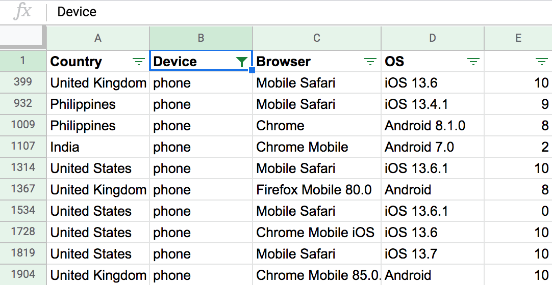
The respondents used the word cloud tool on desktop, tablet, or smartphone. You can filter the data by device to see how well each scored and find out which device was most popular by country:
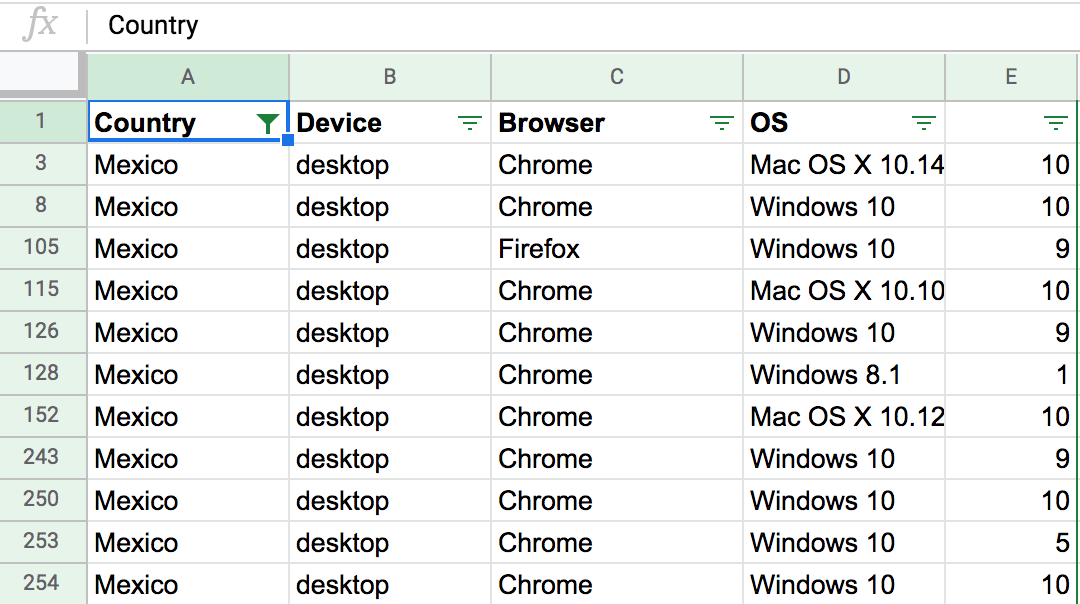
Filter by country to see how well-liked the app is by region or to find out if it may not be working well with a particular language:
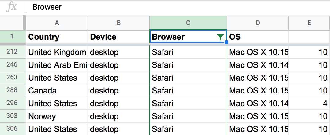
Filter by browser to see the preferred way to use the tool:
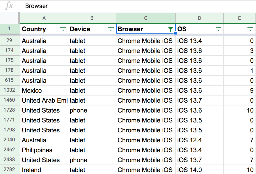
Or with which browser it may be particularly buggy:
You can get more fine-grained with your results by performing calculations, like mean, maximum, and minimum or using pivot tables.
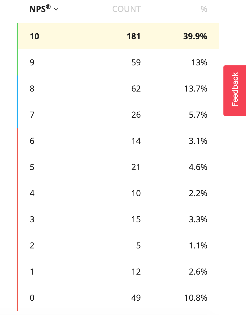
Break down your analysis to see overall count and percentage of scores:
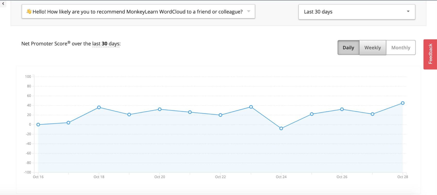
Follow the overall NPS score over time:
Survey data displayed in charts and graphs offers a quick and easily-to-understand view of your quantitative data:
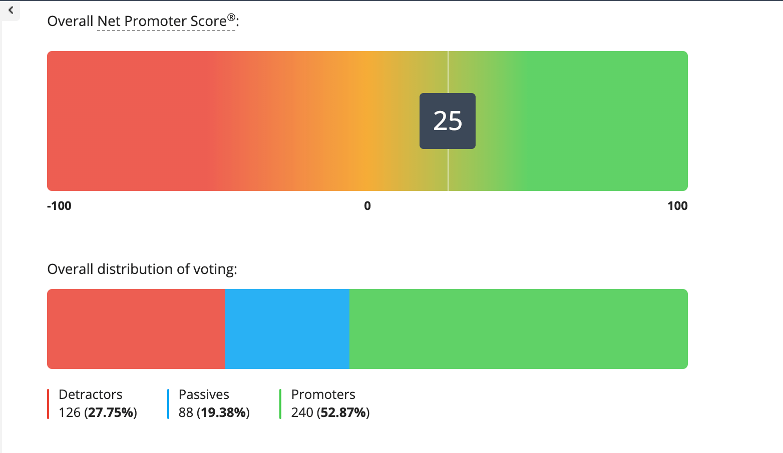
With your quantitative survey data analysis, you’ve uncovered the statistics and details of what is happening, next we’ll show you how to go into the why it’s happening with qualitative survey data analysis.
Read on to learn how qualitative survey analytics works, then we’ll walk you through a tutorial to analyze the open-ended follow-up questions to the NPS survey above: How can we improve MonkeyLearn WordCloud for you? and Any features we are missing?
2. Analyze Qualitative Survey Data
Analyzing qualitative information requires more steps, but the survey results will allow you to understand your respondents’ true feelings and opinions on any given issue and help you take action with powerful insights. And with the help of machine learning tools, qualitative survey analysis can be quite simple – and much more accurate than manual analysis.
You’ll first need to make sense of your data by categorizing responses. Let’s take a look at some ways to categorize your open-ended survey responses some best practices:
Product
When sending customers surveys for product feedback (that is, any piece of text that mentions a new feature, the name of the product, pricing, etc), you’ll find yourself with many, and varied, responses. You can create sub-categories within this main category that sort product feedback by urgent and minor issues, and requests:
- Urgent issues that hinder your product. Let’s imagine you launch a new feature within an existing product, such as a new filter for your photo editing app, and want to know whether your customers are happy about it. If customer feedback highlights an error, such as: Since I added the new filter, I can’t use other important features, you’d categorize this as an important product issue and take immediate action.
- Minor and distracting issues. Going back to the same example, a minor issue would be that two of the new filters are black and white when one should have a blue tint.
- Requests. Your customers may come up with an idea about a feature they think your product should have. This is valuable insight you can take into account, but it all comes down to the volume of requests you receive and the feasibility (and impact) of that particular feature.
Customer Service
Customer satisfaction surveys are often sent after support tickets are closed to find out how happy customers are with the service they received. Hubspot suggests that you look for patterns and the questions that customers ask most often. When consumers were asked what impacts their level of trust with a company, offering excellent customer service ranked number one, so ensuring the quality of yours is crucial to maintain customers and prevent them switching to the competition. By categorizing open-ended responses related to customer service, you can find out what customers like and dislike about your process and discover ways in which to improve your customer service.
Marketing and Sales
Having a tight customer feedback loop to keep your marketing and sales team updated will save you a lot of headaches and problems. For example, imagine that your marketing team mistakenly advertises your mobile app as compatible with iOS. A person pays for the service only to realize that the app doesn’t work on their phone!
You send a survey to find out how they rate the new app and ask open-ended questions to find out the reason for their rating. Obviously, the rating would be low and the text response negative about how the product was falsely marketed. By analyzing this text, you can quickly direct this feedback to the marketing and sales team, who can offer the customer a refund and post a tweet to let other potential iOS customers know that the app is not yet compatible with their software.
RUF: Another Way to Categorize Feedback
Of course, there are other paradigms for organizing and analyzing customer feedback. Atlassian, for example, designed its own framework that suits the needs of SaaS companies: RUF. They propose that you organize your feedback into 3 categories (Reliability, Usability, and Functionality), and use sub-categories within them.
- Reliability: It refers to the way in which your product performs (with or without errors, for example). Some subcategories include Performance and Bugs.
- Usability: This tag is related to how easy or difficult it is for customers to use your products. Within this category, you may use subtags such as Complexity, Content, or Navigation.
- Functionality: The functionality tag is specific to your product or service. If we take MonkeyLearn as an example, some subtags might include Training Models, Integrations, or Batch Analysis.
Why Is (Great) Categorization Important?
Before creating and defining your tagging structure for organizing your survey responses, it’s important to identify the questions you want to answer. Some of your objectives may include:
- Understanding trends in your overall customer satisfaction over time.
- Identifying customer service problems that frustrate your customers.
- Discovering product issues that annoy your customers.
Devote some time to think strategically, and define a structure and criteria for your tags. If you don’t, it will be hard for you to get any value out of your surveys. Once you’ve processed them, it’s a lot of work to go back and re-tag those survey responses.
Inconsistent tagging affects your feedback analytics and your team’s workflow. Teammates might feel confused if your tagging infrastructure is unclear. For example, they may end up tagging every text as General because they don’t know which tags to use for texts, or they can’t find an appropriate tag.
Let’s imagine that someone tags a survey response as General but it’s actually about Bug. Another teammate may read this response hoping to process this information, only to realize that it should have been routed immediately to the dev team so they can work on a fix. Time has been wasted, valuable insights have been missed, even potential customers lost.
Well-structured tagging is also essential to training a machine learning algorithm to auto-tag your customer feedback. When creating a custom model in MonkeyLearn, you have to first define your tags and then train the machine learning tool to use them correctly. If your tagging criteria is messy, then the model is likely to make mistakes, giving you incorrect results and insights.
Regardless of whether or not you want to use machine learning to analyze your surveys, it’s crucial to come up with a clear and consistent tagging system. You’ll understand your customer feedback better, and gain deeper and more accurate insights about your company, such as: what are your customers most confused about? Which aspect often results in poor satisfaction scores? Is your interface easy to use or not?
Now, let’s examine the ways in which your team can improve your feedback tagging process so that your texts are ready for machine learning to analyze!
Best Practices for Tagging Open-Ended Responses
Tagging can be a hassle, especially if you are working with high volumes of data. Luckily, there are some practices that will make this process easier. The following best practices apply to both analyzing feedback manually and automatically:
Take a look at what your respondents say
As you’ll be creating tags that apply only to your business, you need to first understand what most of your respondents say. It is useful to read approximately 30 open-ended answers from different surveys and jot down notes about the features, themes, or problems people commonly mention. This will help you define your tags.
Think about consistent tags
You’ll need clearly-defined tags that don’t overlap, especially to start with, so that humans and machines don’t get confused and tag responses incorrectly or inconsistently. Imagine receiving a comment that reads I’m confused because the page is messy and has too many options. If you created tags such as Design and Usability, this comment could fall into either category. To make it easier for the team (or the machine learning model) to tag this type of response, we recommend including brief summaries of each tag to make sure the difference between each tag is clear.
Don’t create tags that are too specific
If you come up with tags that are too specific, your machine learning model won’t have enough data to categorize your texts accurately. Likewise, your team might get confused or even forget about niche tags and opt for the ones they use more often. Instead of creating tags like Speed of Mobile Device, choose a broader topic like Function.
You don’t need to tag everything
It’s not necessary for you to tag every survey response, review, or comment you receive. Many of your customers leave comments about issues or problems that are original and unique. Focus on tagging common themes, opportunities, or problems that respond to a larger proportion of your customer base.
Try not to include too many tags
When analyzing your survey responses, you should always choose quality over quantity. If you include more than 15 tags, for example, machines and humans will find it hard to categorize survey responses accurately. Not only because it’s confusing having so many options, but also because teams would have to scroll down a long list of tags, looking for the most suitable one.
Embrace hierarchy
Help your team (or your model!) to analyze your texts by creating a hierarchy of tags. Grouping tags and having a solid structure makes your model more accurate when making predictions. Instead of lumping tags into one category, create sub-tags within the main ones. Ease of Use and Design can go inside Usability, for example.
Use a single classification criterion per model
When you analyze your survey responses, there are hundreds of ways to categorize them. For example, if you asked your customers to describe your products, you can categorize those responses in terms of the materials of the product (Wood, Steel, Plastic), its category (Healthcare, Electronics, Home), and so on.
So, instead of creating just one model with all these categories, it is much more convenient and precise to create two smaller models for the different groups of tags (one model for materials, one model for categories). It’s much easier for both people and machines to solve smaller problems separately!
Automating Qualitative Survey Analysis with AI
Automated text analysis with machine learning can help with the titanic task of transforming unstructured information into actionable insights.
Text analysis uses natural language processing (NLP) to automate the process of classifying and extracting data from texts.
It’s very effective when it comes to automatically analyzing your open-ended survey responses.
MonkeyLearn has a number of pre-trained text analysis models that can you can try out on your survey responses right away:
- Sentiment Analyzer: automatically analyzes text for opinion polarity (positive, negative, neutral).
- NPS Feedback Analyzer: automatically sorts NPS responses by Ease of Use, Features, Pricing, and Support.
- Keyword Extractor: extracts the most used and most important words from your survey responses.
- Company Extractor: automatically extracts the names of businesses and organizations from surveys or any text.
Alternatively, try out MonkeyLearn’s Templates.
With MonkeyLearn's Templates, you can upload your spreadsheet data and our machine learning models will do the rest. Templates are super simple to use and perfect for anyone who’s new to machine learning. They take you from data gathering to text analysis and data visualization, all in a single, easy-to-use dashboard for striking results.
Here’s how MonkeyLearn’s NPS Survey Template works:
NPS Template Tutorial with Sentiment Analysis
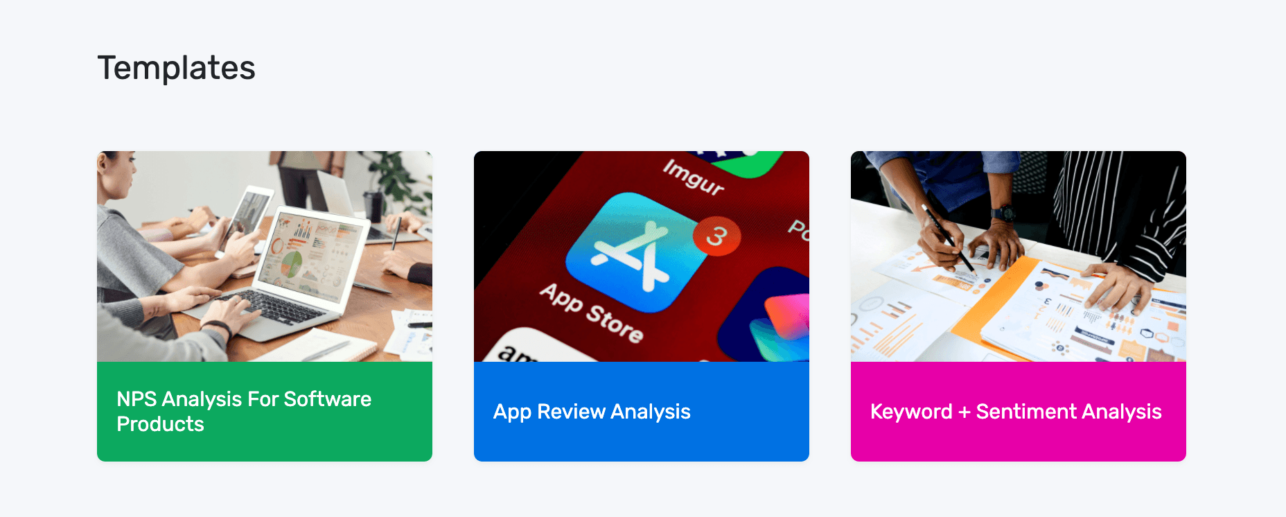
1. Choose the NPS Template
Choose the NPS template to create your workflow. This template combines three analysis techniques to comb through your data: sentiment analysis, topic analysis and keyword extraction run simultaneously to deliver detailed insights.
2. Upload Your Data
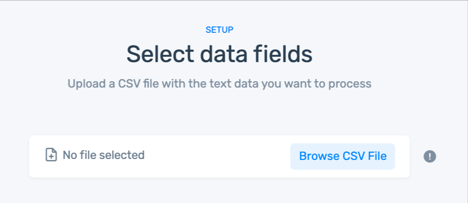
If you don't have a CSV file:
- You can use our sample dataset.
- Or, download your own survey responses from the survey tool you use with this documentation.
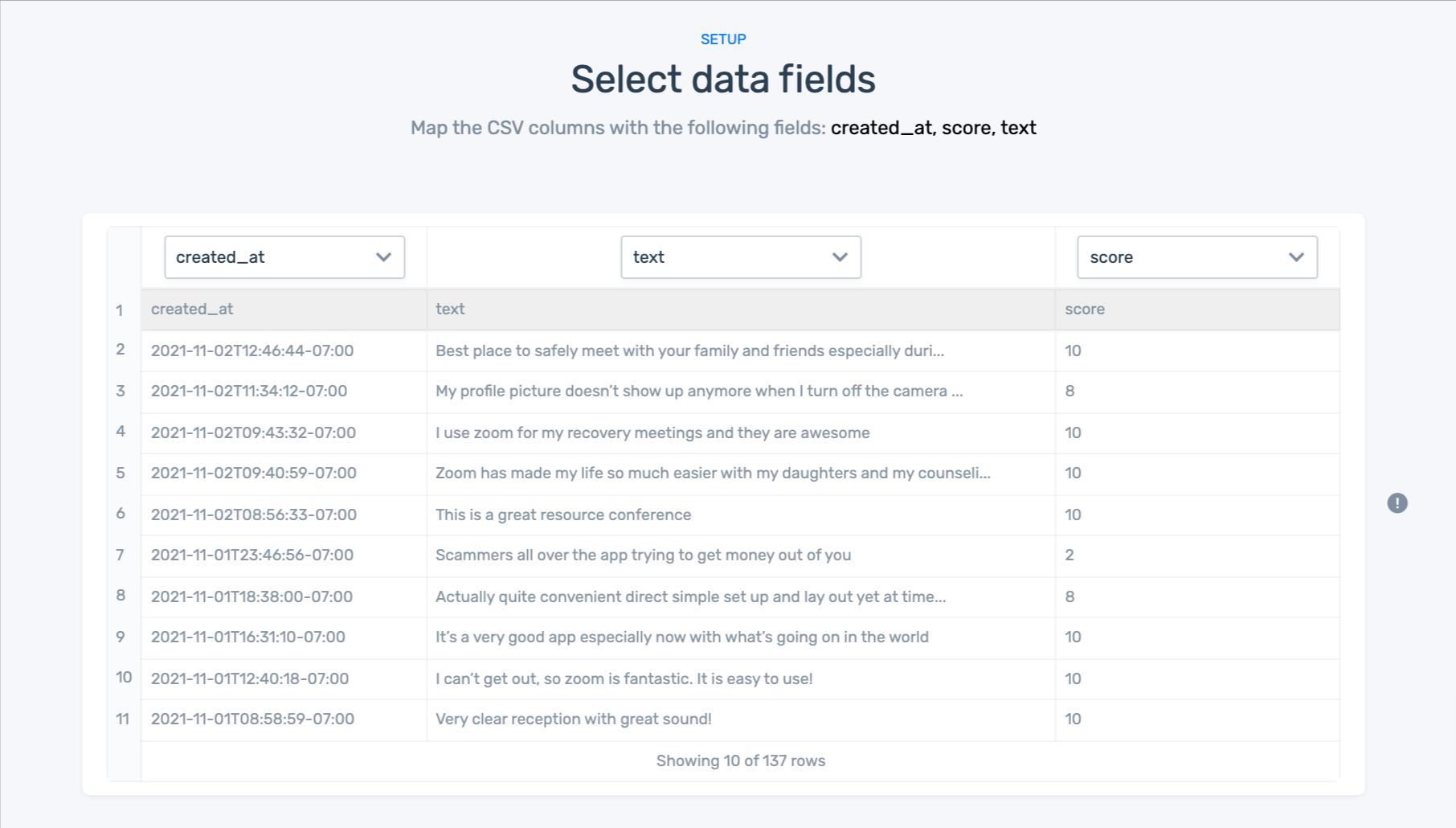
3. Match your data to the right fields in each column:
Here are the field you’ll need to match up:
- created_at: Date that the response was sent.
- text: Text of the response.
- score: NPS score given by the customer.
4. Name Your Workflow
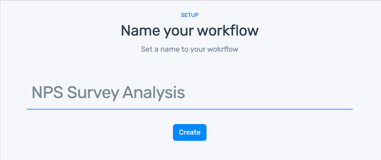
5. Wait for MonkeyLearn to process your data:
6. Explore your sentiment analysis dashboard!
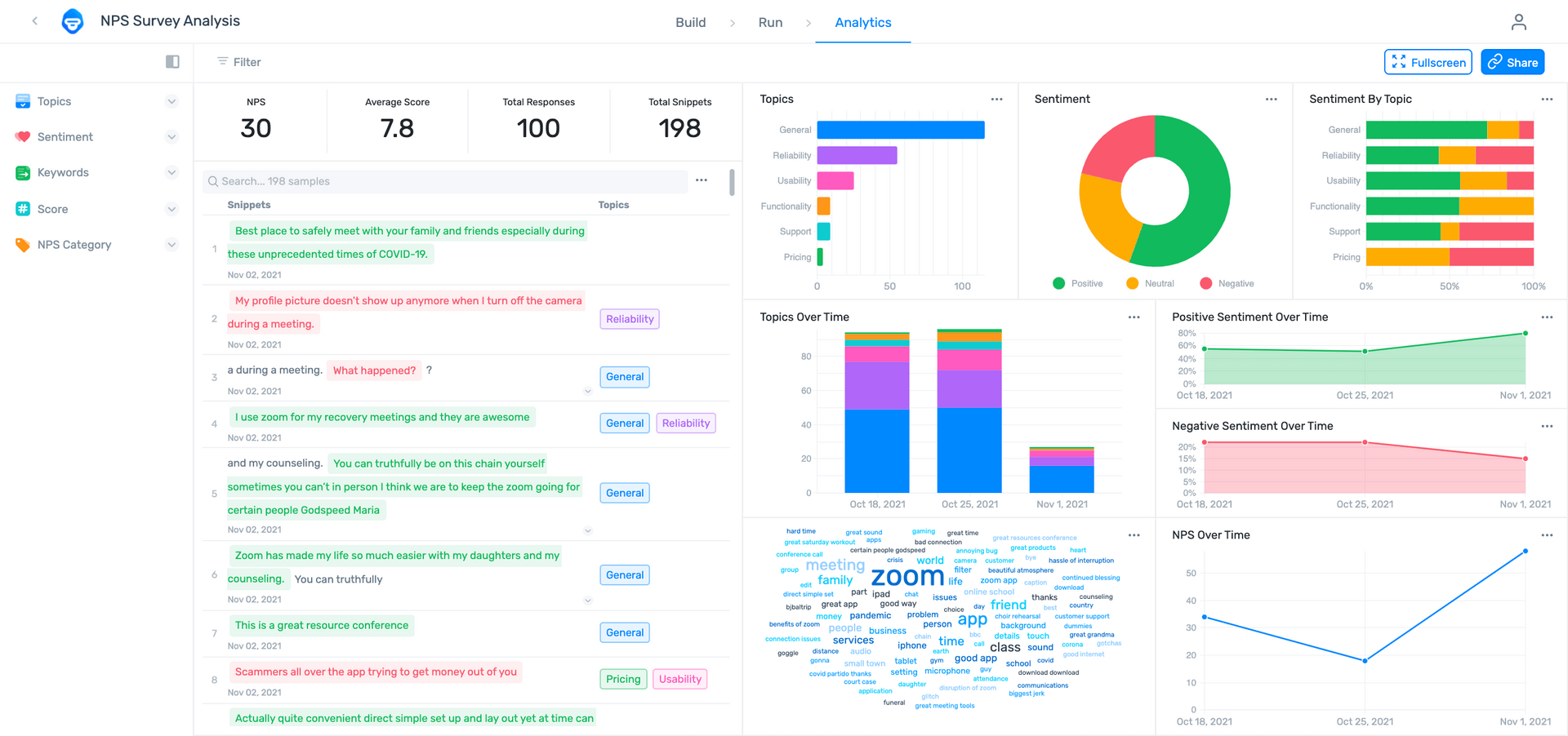
Our data visualization dashboard allows you to display your results in convincing, striking detail..
- Filter by sentiment, topic, keyword, score, or NPS category.
- Share via email with other coworkers.
- Notice how multiple aspects and sentiments have been split into fragments, otherwise known as opinion units.
Machine models that have been trained to detect opinion units are much more precise when it comes to analyzing data. Why? Well, it’s a lot easier for a machine to understand a sentence with one sentiment, than it is to understand a sentence containing multiple sentiments.
Gaining granular insights from your survey responses helps you understand your customers and solve their problems before they turn to your competitors.
Here are a few of the benefits of using text analysis to analyze open-ended survey reponses:
Scalability
Human agents can only handle a certain number of tasks per day, no matter how hard they work. If all of a sudden you get 1,000 responses to a survey you sent out, how will they cope? Adding more members to your team is not only expensive but also time-consuming, as you will have to go through a hiring process and then train agents to tag your survey responses accurately.
Instead of hiring new employees to deal with the extra workload, you can train a machine learning model to sort thousands of surveys in just minutes.
Real-Time Analysis
Businesses send out qualitative surveys on a regular basis to get insightful feedback about a particular product, feature, service, etc. And, if you’re a medium-sized company, you could get anything from 100 to 3,000 responses. This is new information that could give you valuable, up-to-date insights about your business, so you probably want to sort it immediately and share this information with the wider team.
Consistent Criteria
Tagging survey responses is not only time-consuming but also a boring task and this leads to mistakes and inconsistencies. Also, people have different views depending on their cultural and political values, which will shape the way they categorize texts, for example, they may disagree on whether a text is Positive or Negative, about Pricing or Refunds, or Urgent or Not Urgent.
In contrast, AI-equipped text analysis models will never get tired, bored, or change their criteria.
Deeper Customer Understanding
Getting deep insights from your survey responses is the ultimate aim of analyzing feedback. As we mentioned above, it’s crucial to create a defined structure for tagging your texts to truly understand what your customers are saying. By creating sub-tags within main tags, you can get a fine-grained analysis of your text data and not just a general overview.
For example, one of your main tags may be Usability, and you want to know what aspect of usability your customers are talking about. Thus, you can create sub-tags such as Mobile Interface or Loading Speeds.
Survey Analysis Tools
Find relevant survey analysis examples and automate survey analysis with these tools. These are some of the best tools for creating, executing, and analyzing surveys.
Best Survey Tools for Creating and Conducting Surveys
- SurveyMonkey: an inexpensive online survey tool with templates for all kinds of popular surveys and relevant survey question examples.
- Typeform: an easy-to-use survey tool to create customize online surveys, forms, polls, and questionnaires.
- Google Forms: a great survey tool to integrate easily with Google Sheets, Google Docs, and Google Slides.
- Alchemer (formerly SurveyGizmo): focused heavily on VoC, Alchemer is a helpful tool for gathering surveys and other customer data from multiple sources.
- GetFeedback: create and conduct mobile surveys easily with templates to measure customer satisfaction, customer effort score, product experience, and more.
- Delighted: focused on Net Promoter Score (NPS), with Delighted you can customize surveys, add follow-up questions, and send them via email or SMS.
- Promoter.io: an end-to-end solution for creating productive NPS surveys with high response rates.
Bust Survey Tools for Analyzing Open-Ended Survey Data
When it’s time to analyze your surveys, you no longer have to waste countless hours processing them manually. AI-guided machine learning tools can automate survey analysis to save time and money and perform with near perfect accuracy.
Deciding what text analysis tools you want to use comes down to the Build vs. Buy Debate. If you have a data science and computer engineering background or are prepared to hire whole teams of engineers, building your own text analysis tools can produce great survey analysis results, though it’s still expensive and time consuming.
SaaS tools with easy-to-implement APIs, on the other hand, provide low to no code solutions and can integrate easily with other survey tools to get your analysis up and running, usually in just a few steps. Best of all, they can be customized to the language and criteria of your business.
- MonkeyLearn is a powerful, multi-channel text analysis platform you can put to work on survey responses, as well as social media data, online reviews, customer feedback data, and more. You can upload your survey data directly to the app or integrate with Google Sheets, SurveyMonkey, Typeform, Zendesk, Zapier, and more. Learn how to auto-tag your survey responses in SurveyMonkey with MonkeyLearn.
- Thematic offers simple integrations with SurveyMonkey, Zendesk, Medallia, and more, or allows you to extract data from NPS surveys or your personal database. Thematic’s text processing finds recurring themes and subjects to present infographics and insights that are easy to understand.
- Idiomatic is designed to take full advantage of VoC by allowing communication across all internal departments, so marketing, customer support, and product development are always in touch with the most recent survey metrics.
- ScopeAI aims to centralize product feedback by helping your business perform regular NLP surveys and track down other useful feedback to ensure your product design is up to speed with your customers’ needs.
- Prodsight combines survey analytics and CX analytics from review sites and internal CRM data to help make sure you’re following the customer journey from start to finish.
Final Words
Conducting surveys is crucial for businesses to check customer satisfaction and obtain powerful insights that will improve overall customer experience.
Quantitative feedback is definitely helpful, but qualitative feedback is where the real insights lie, so you need tools to extract them in the most effective way possible. That’s why analyzing your survey feedback with machine learning is key.
MonkeyLearn offers a plethora of pre-trained machine learning models, or you can create your own extractors or classifiers using our intuitive interface. As you have seen, it’s very easy and you can choose tags that are tailored to your business to gain deeper insights from your survey responses. And once your analyses are set up, you can easily visualize them with MonkeyLearn Studio and run regular, real-time analysis with little human interaction needed.
If you’re interested in getting started with AI for survey analysis, request a demo to get more information. Our team is ready to help you start analyzing your surveys using machine learning models right away.

Federico Pascual
September 20th, 2019


