How to Effectively Create a Net Promoter Score (NPS) Report

Knowing your Net Promoter Score (NPS) is a great starting point, but it's exactly that, a start.
It's what you do next with the qualitative data that your NPS survey brings back that really matters.
A good NPS survey can bring a wealth of information about your customers including whether they are likely to stick around and refer you to others.
However, to get to this information, you need to analyze your NPS results.
You then need to visualize these insights in an NPS report that every team can understand.
If you want to learn what an NPS report entails and how you can use it to get detailed insights, keep reading
Feel free to skip ahead to the section that interests you the most here:
What Is A Net Promoter Score (NPS)?
Net Promoter Score, or NPS as it is often referred to, is a metric which measures customer loyalty.
It was created by management consultant Fred Reichheld in 1993 to predict loyalty, as well as how likely customers would be to recommend an organization to friends and/or family.
The NPS is obtained using a simple question (or a variation on this question.) This is as follows:
"On a scale from 0-10, how likely are you to recommend this company to a friend or colleague?"
While the NPS can just be just this one question, it's best to follow this closed-ended question with an open-ended question. An example would be:
"What is the main reason for your score?"
Here your customers can expand on why they chose the score they did. This, in turn, gives you the chance to learn more about what customers want and need from your organization.
Depending on the number your customers choose in the closed-ended question, they are then assigned a label. These are the following:
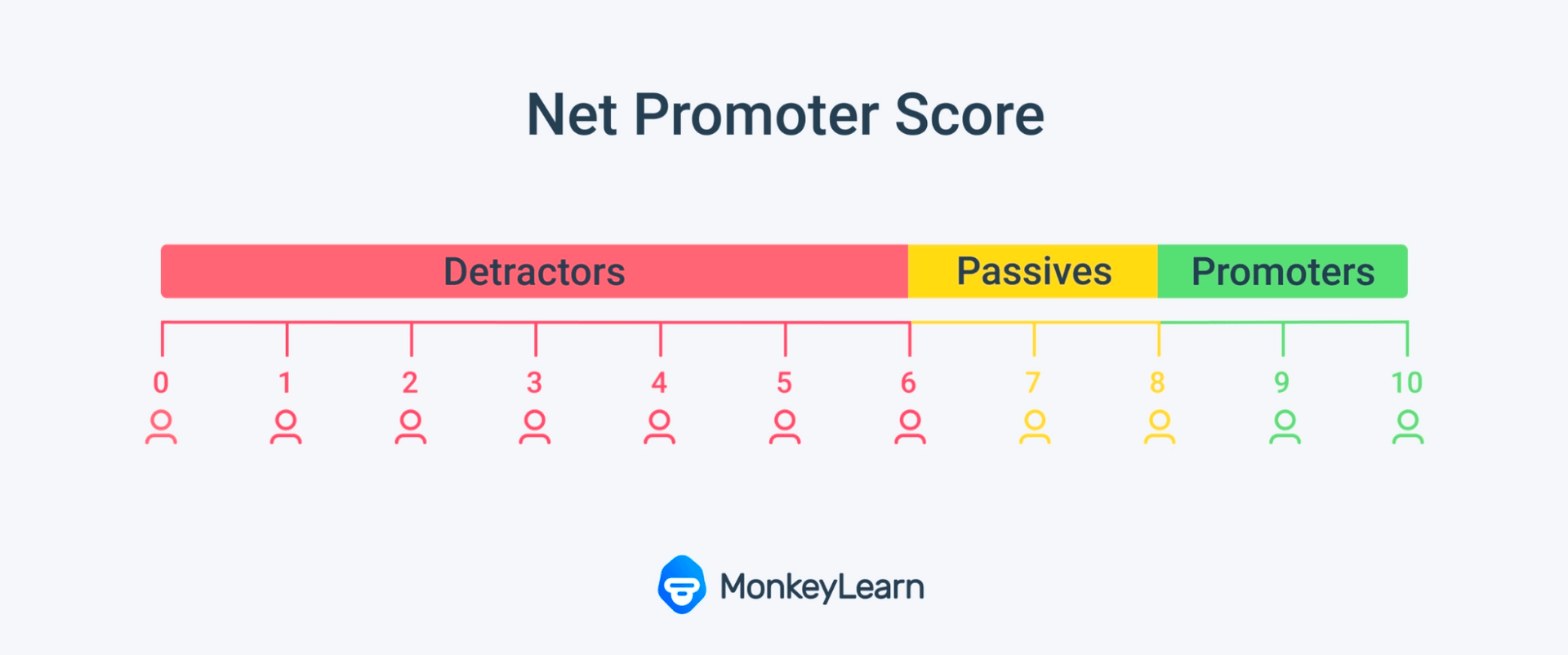
0-6: Detractors
These are customers that would not recommend your company to a friend or colleague, and who would actively discourage their contacts from doing business with your company.
7-8: Passives
Passives are customers who would neither recommend your products and services to their contacts, nor would they advise against using them.
9-10: Promoters
These customers would actively recommend you to their contacts and would continue using your products and services themselves.
In order to calculate your NPS you simply subtract your percentage Detractors from your percentage of Promoters.
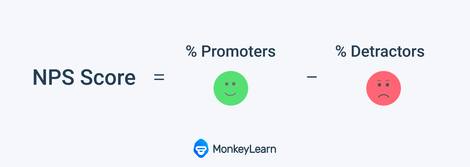
For example, if you have 50% promoters, 10% detractors, and 40% passives, your Net Promoter Score would be 40.
50% - 10% = 40
Why It's Important To Keep Track of NPS
Employee loyalty is directly connected to retention. Loyal customers are also more likely to recommend your products and services to their friends and family. This makes it essential to keep track of customer loyalty.
Studies have also shown that the probability of selling to an existing customer is 60- 70%, whereas selling to a new customer is 5-20%. This means that retaining customers is likely to increase your profits too.
This makes it important to not only be aware of your NPS but to also take steps to analyze your NPS results, and then act on them.
Listening to your customers and acting on their feedback is the best way to improve your NPS.
Closed-ended questions are easy enough to tally with the help of Excel or even your NPS survey tool. It starts to get trickier when you need to analyze open-ended responses. This is especially true if you have a large volume of responses.
It is simply impossible to analyze tens of thousands of open-ended responses manually.
For that you'll need the help of a tool like MonkeyLearn that can help you process your data automatically in seconds using machine learning and AI.
You'll also need to be able to access and share your results in an easy to view and share format. This is where an NPS report comes into play.
What Is an NPS Report?
An NPS Report is a breakdown of the results of your NPS survey and the analysis of the responses to your open-ended questions.
An NPS report can have a number of different elements. What you need in your report will be determined by your organization's goals.
You should also take into consideration who you will present these results to within your organization and what you need to show them.
Here we'll go through 4 examples of the different elements you can expect to find in an NPS report using MonkeyLearn's all-in-one text analysis and data visualization studio.
1. Numerical Data
At the top of MonkeyLearn's data visualization dashboard, you'll see your overall NPS score and other high-level important stats. This is essential information.

Your NPS number should be easy to view. Here we can see that the NPS is 30.
This is a positive number which indicates more Promoters than Detractors.
What is considered a good NPS score will depend on your industry, you can find more information on that here.
You can also see the average score your customers gave you. The above example is 7.8 which shows us that the majority of the respondents in this example are Passives.
Passives don't feature in the NPS calculation but their feedback can often be insightful, so shouldn't be ignored.
The number of snippets is also featured here. Snippets are the useful soundbites that are taken from your customer responses that contain insights.
Unlike the score, which just takes into account Promoters and Detractors, these snippets also include comments made by Passives.
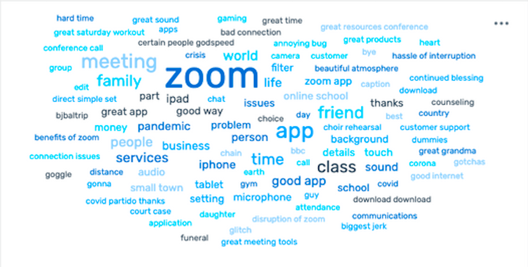
2. Word Cloud
A word cloud uses AI technology to help you quickly identify keywords that are frequently occurring in your customer feedback.
These are occurring frequently for a reason --- they are topics that matter to your customers, and can alert you to customer issues that need resolving immediately. Therefore you should pay particular attention to these keywords.
Word clouds are easy to visualize and are great to share with different teams for instant impact. You can try our free word generator out here.
3. Topic and Sentiment
For more in depth insights you can include an analysis of your data by sentiment and topic in your report.\ These are both Natural Language Processing (NLP) techniques which use machine learning models to break down and understand human language.
In the below charts you can see how responses have been analyzed for topic, sentiment, and sentiment by topic.
Sentiment analysis analyzes text for positive, negative, and neutral emotions. It's a great way to see how your customers feel about your brand. It also helps you quickly pick up on any negative experiences before they spiral out of control.
In the chart below you can see that the majority of sentiment is positive. By then digging into sentiment by topic, you can get a better understanding of where that positivity is placed, and where it is lacking.
Topic analysis lets you draw out meaning from text by automatically identifying recurring themes. This allows you to see what customers are focused on and what matters to them. This then helps you to decide which areas to tackle first.

4. Trends Over Time
As the NPS is a continuously changing metric, it's important that you are able to see how your NPS is tracking over time in granular detail.
As we've seen, loyalty has a direct impact on your retention so you need to make sure customer loyalty doesn't take a sharp downwards turn.
In the below graphs you can see how topics change over time. You can also see how both positive and negative sentiment is tracking over time.
This is important because it lets you see whether certain changes you have put in place are making a difference to your customers' satisfaction levels and loyalty.
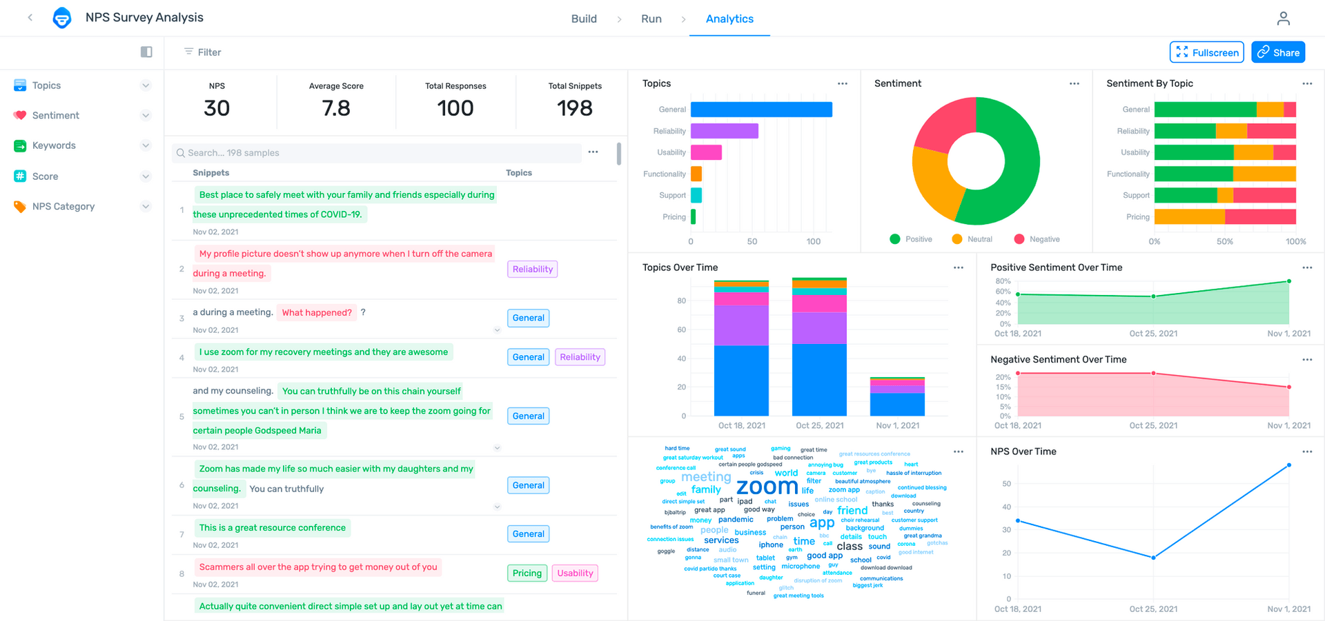
And when you combine the above four elements, here's what your report could look like.
MonkeyLearn's interactive NPS dashboard
MonkeyLearn offers a number of no-code templates, including an NPS template.
All you have to do is upload your NPS data in a CSV file. Machine learning models will then get to work, and you'll get an informative NPS report like the one pictured above.
Want to see how MonkeyLearn can help you create an NPS report? Book a demo.
The Wrap Up
Net Promoter Score is a great way to measure your customers loyalty, how likely it will be to retain them, and how likely it will be that they recommend your business to their contacts.
But, to make the most of NPS data you need to be able to analyze it in an easy-to-read report.
This will make it easier to pull out insights that will help you improve your organization and profits.
It will also make getting buy-in from stakeholders that much simpler when you can present them with a clear and concise report.
Tracking your NPS over time will also help you to see which of your improvements or changes are working for your customers, and which are not.
To see how our NPS template can help you create effective NPS reports that allow you to make sound business decisions, book your free MonkeyLearn demo today.

Inés Roldós
March 23rd, 2022


