7 Effective Ways To Visualize NPS Results
If you've been making decisions off the back of NPS visualizations that show your Net Promoter Score (NPS) score over time, or pie charts that show which category customers fall into -- Detractor or Promoter, then you may have been making the wrong decisions.
That's not to say that these data visualizations aren't useful. They are.
They're a great starting point and help you know when you need to take action.
For example, if you notice a sudden spike in Detractors then you know that something needs fixing.
That 'something' though isn't always clear, which is why you also need to visualize the more detailed NPS data: the open-ended responses in the follow-up NPS question.
In this guide, we'll take you through why you need to visualize your NPS results, and we'll cover how to visualize ALL your NPS responses (both close-ended and open-ended) for maximum impact.
Let's get started.
Why Visualize NPS Results?
NPS is a metric which shows you how loyal your customers are, and how likely they would be to recommend your products and/or services to their network.
NPS surveys normally include an initial close-ended question where customers can rate how likely they would be to recommend you to their contacts on a scale of 1-10. These responses are then calculated to get your overall NPS score.
The survey should then ask an open-ended question where the customer can explain the reasons for their score.
Open-ended responses are often filled with insights that you can use to improve your overall customer experience, retain more customers, and grow your business.
To make it easier to spot insights in your NPS data, you have to visualize both your close-ended and open-ended data.
This is where NPS visualizations come into play.
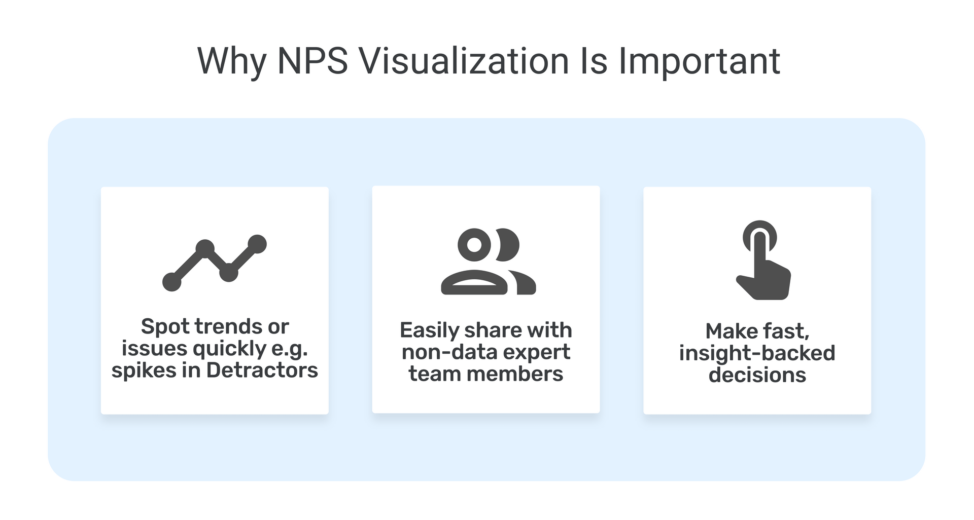
Humans absorb information better when it's in a visual format. So, showing numeric values in a bar chart or some other kind of visualization is always going to have more impact.
This is especially true when you are dealing with large amounts of data, i.e. thousands of survey responses.
With NPS visualizations, it's easier to:
- Draw clear insights
- Present your results to members of your team in an easy-to-digest format
- Get buy-in from various stakeholders
- Make important, informed business decisions.
7 Great Ways to Visualize NPS Results
There are a number of different methods you can use to view your results.
Ideally you would combine a number of different elements in your final NPS report in a way that makes sense for your organizational goals.
Seeing your results from a number of different angles and with different levels of complexity will allow you to pull out varied insights.
Here are 7 different ways you can visualize NPS results:
- Key values - an overview of your NPS in numbers
- Bar charts - breaking down NPS scores and groups
- Pie chart - high impact visual showing NPS split
- Line chart - NPS trends over time
- Word cloud - an overview of your NPS in words
- Topic analysis - dialing in on specific topics in NPS comments
- Sentiment analysis - grouping specific NPS comments by sentiment
1. Key Values
The most basic, but very important, element is your key values.
Your overall NPS score is a value that you should always include. In the example below you can see the current NPS score and whether it has increased or decreased since the last quarter - and by which percentage this value has increased or decreased.
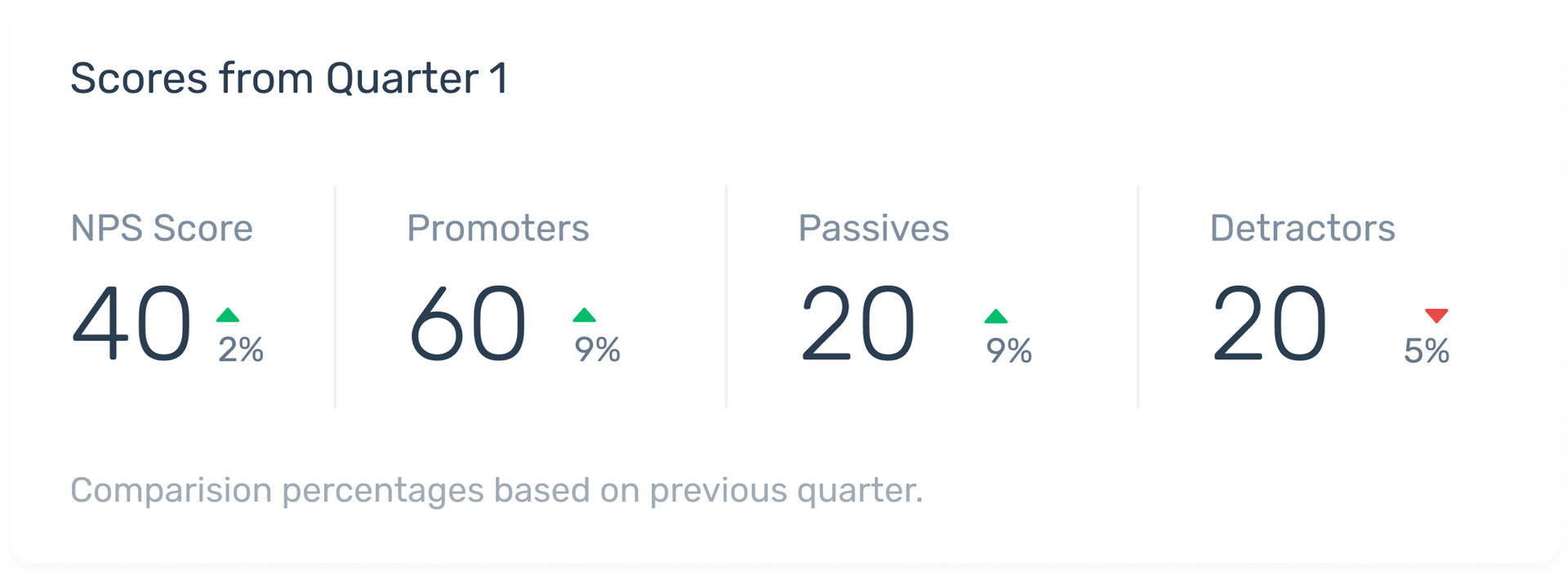
In your panel of key values, it's also useful to visualize the number of Promoters, Passives, and Detractors.
Again in this example you can see whether these numbers increased or decreased. This helps you measure your NPS and detect a sharp drop in score or drop in Promoters that would require urgent attention.
2. Bar Chart
Bar charts are an effective way to visualize your spread and numbers of Promoters, Detractors, and Passives.
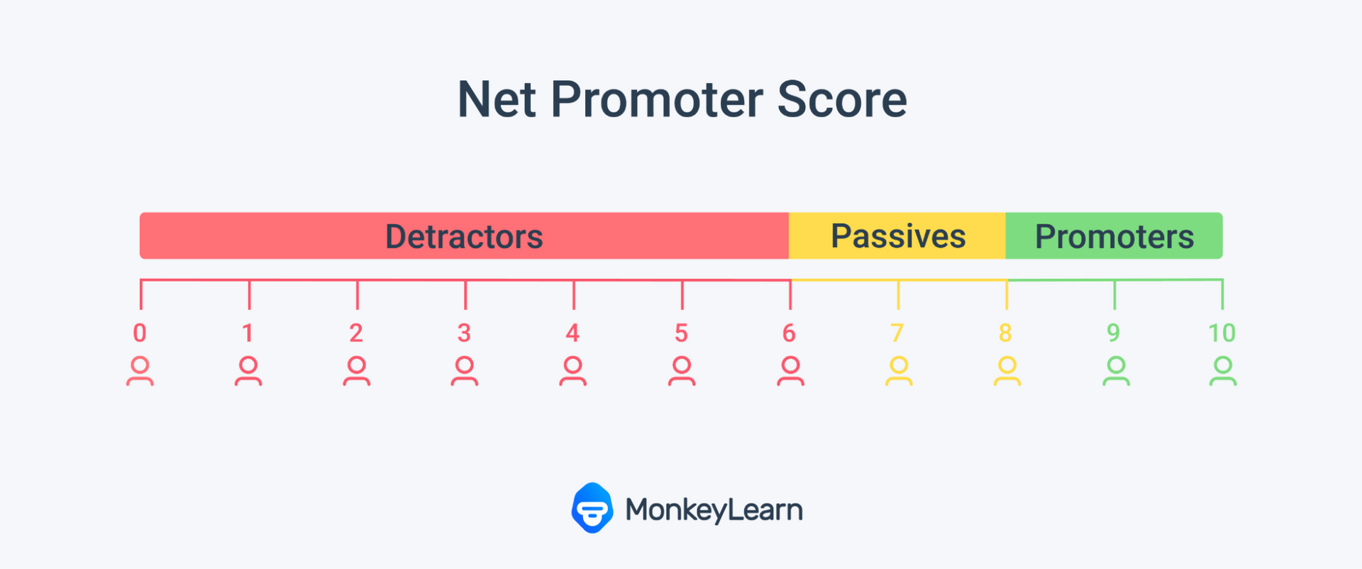
They can show you the exact score your respondents gave you. This is extremely useful because you can see how close Detractors are to becoming Passives, and vice versa. For example, if Detractors give you a score of 6, they are close to becoming Passives.
On the other hand, if they all gave you zeros, they are much further away from conversion.
Seeing the scores and the number of customers that gave each of these scores can help you decide which group of customers to target first to have the biggest impact on your NPS score.
While you might already have these numbers listed as values, having them stacked out in a bar chart will make it much easier to draw conclusions about your data.
3. Pie Chart
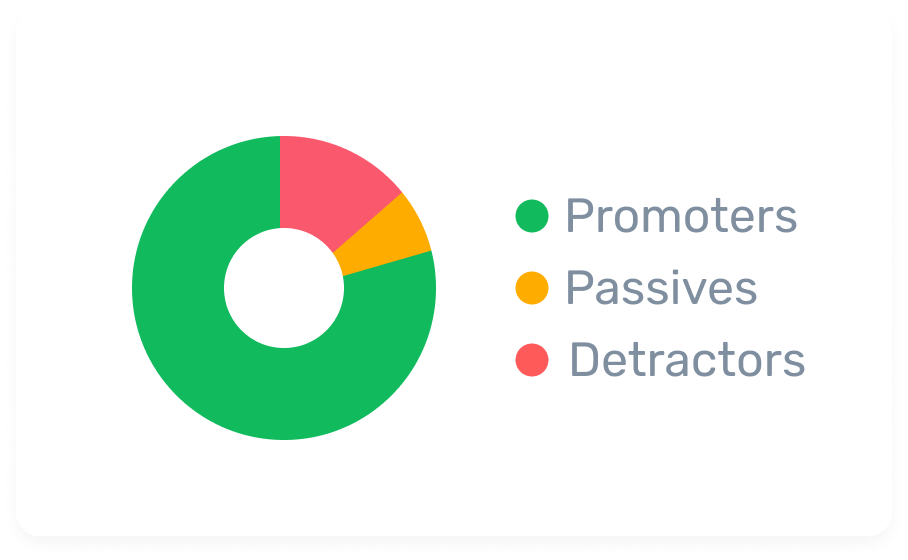
Pie charts are simple and easy for anyone to read. You don't need a background in statistics to understand what is going on in a pie chart. This makes them useful as a quick glance high impact visual.
Pie charts can get messy with too many variables but they work well with the split of Promoters, Passives, and Detractors. They also serve as a good introduction to more advanced visualizations.
4. Line Chart
In order to really understand what your customers are going through you need to track your NPS over time.
This is because customer loyalty can change and can be influenced by a number of factors, including any corrective measures you put in place.
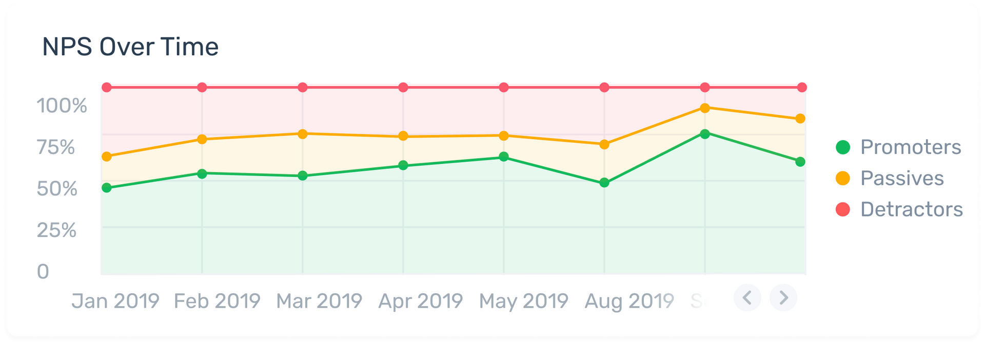
Line charts are a great way to see how your score is rising and falling over time. They can also tell you whether the changes or improvements you have made across this timeline are making an impact.
In this example below, you can easily track the percentage of Detractors, Passives and Promoters from one month to the next.
5. Word Cloud
NPS surveys, when administered correctly with an open-ended survey question, can bring back a lot of qualitative data.
Word clouds help you to quickly see important keywords that are occurring within these open-ended responses without having to trawl through endless reams of text.
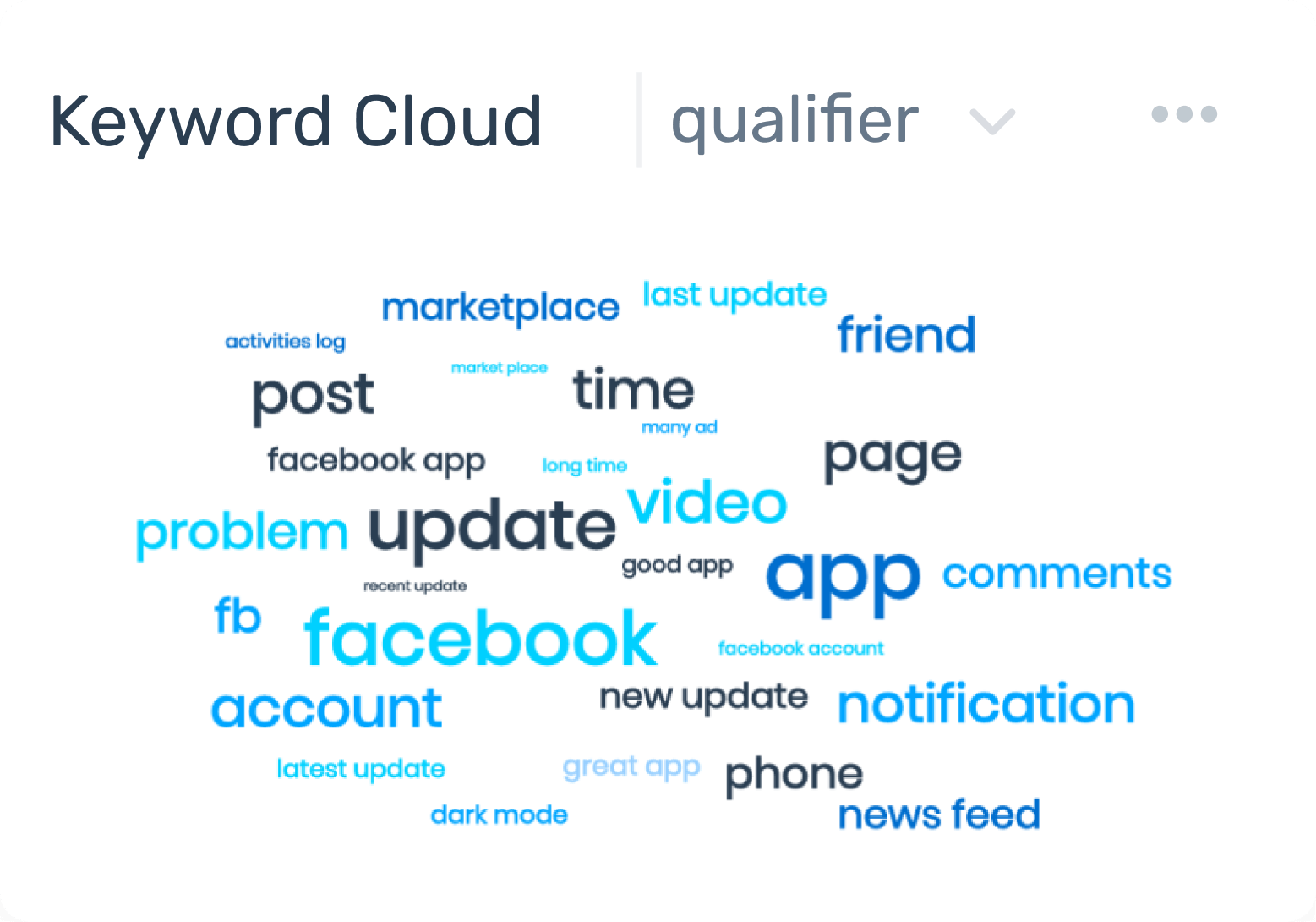
If certain words are cropping up more frequently than others then it's important to pay attention as it's obviously a topic that matters to your customer.
Customers might be mentioning these topics in a positive or negative way. But you'll need to pair word clouds with more in depth analyses and visualizations to get the full picture of what is going on.
6. Topic Analysis
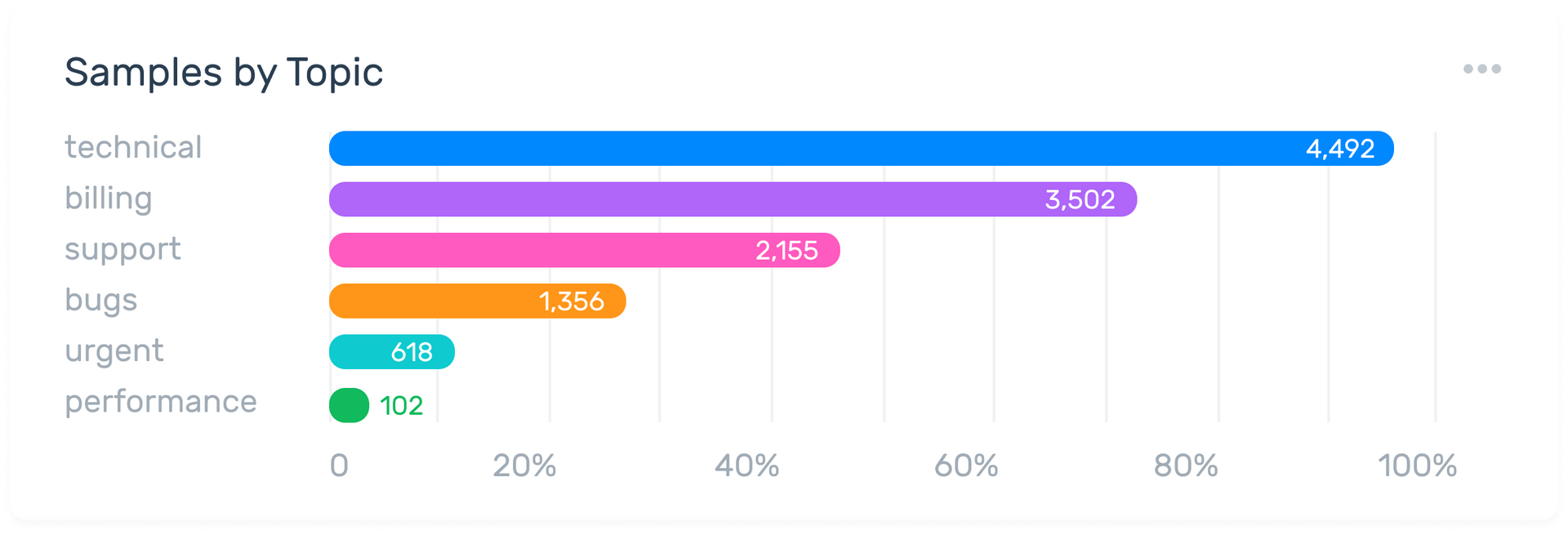
A more in-depth way you can visualize your open-ended results is with topic analysis. Topic analysis is an advanced form of analysis and helps you spot emerging trends.
It allows you to find particular themes or issues that are occurring within your survey responses that are unique to your business. It also shows you the rate at which these themes or issues are occuring.
In this example below, you can see that the topic 'technical' is occurring more frequently, but to find out whether this topic is being mentioned in a positive or negative way, you'll need to perform sentiment analysis.
7. Sentiment Analysis
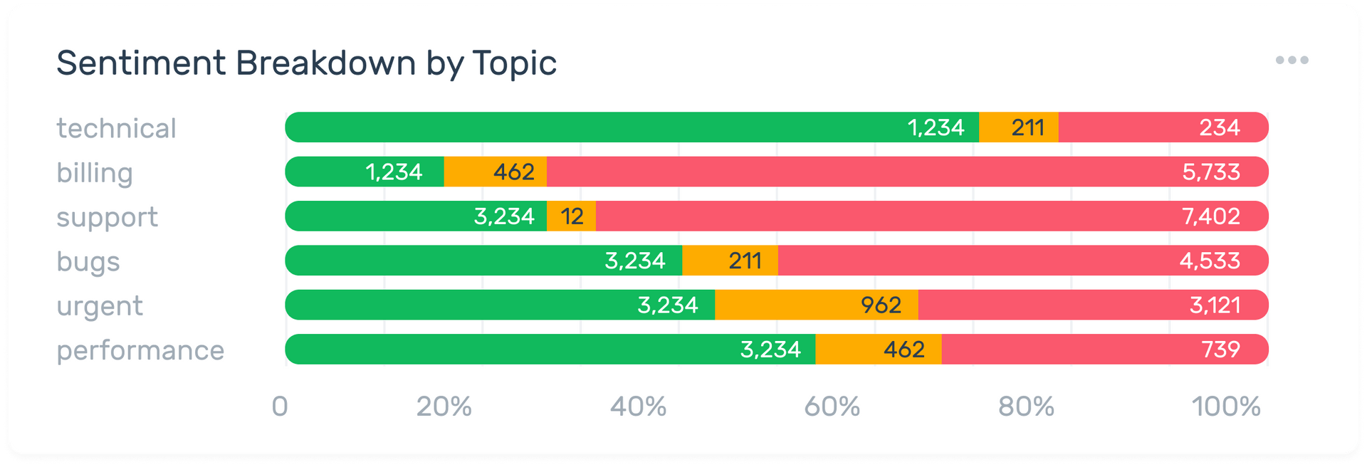
Sentiment analysis is another advanced technique which tells you how your customers are feeling. This can be happy, sad, or neutral.
Negative sentiment showing up in survey results can indicate that something is wrong and needs fixing quickly.
You'll learn about this negative sentiment much faster if you have your sentiment insights visualized.
Then, by getting to it quickly, you can resolve the issue at hand much faster.
Positive sentiment is also important to investigate further as it tells you what aspects of your business your customers appreciate and what you should do more of.
More advanced techniques like sentiment and topic analysis give further context to the Promoter, Detractor, Passive split. This means they are a good accompaniment to a pie chart or bar graph.
For even deeper insights you can combine topic analysis and topic labeling with sentiment analysis.
This is known as aspect-based sentiment analysis and it allows you to see which aspects of your products and/or services are being talked about the most and how customers feel about these aspects.
Takeaways
Visualizing your NPS results brings them to life. It makes it easy for you, and whoever you need to share your data with, to get the information you need to make important business decisions.
When it comes to making these decisions, being able to see and share insights at speed and with clarity is crucial.
Analyzing and visualizing your results go hand in hand, and it's a good idea to have one tool that can do it all.
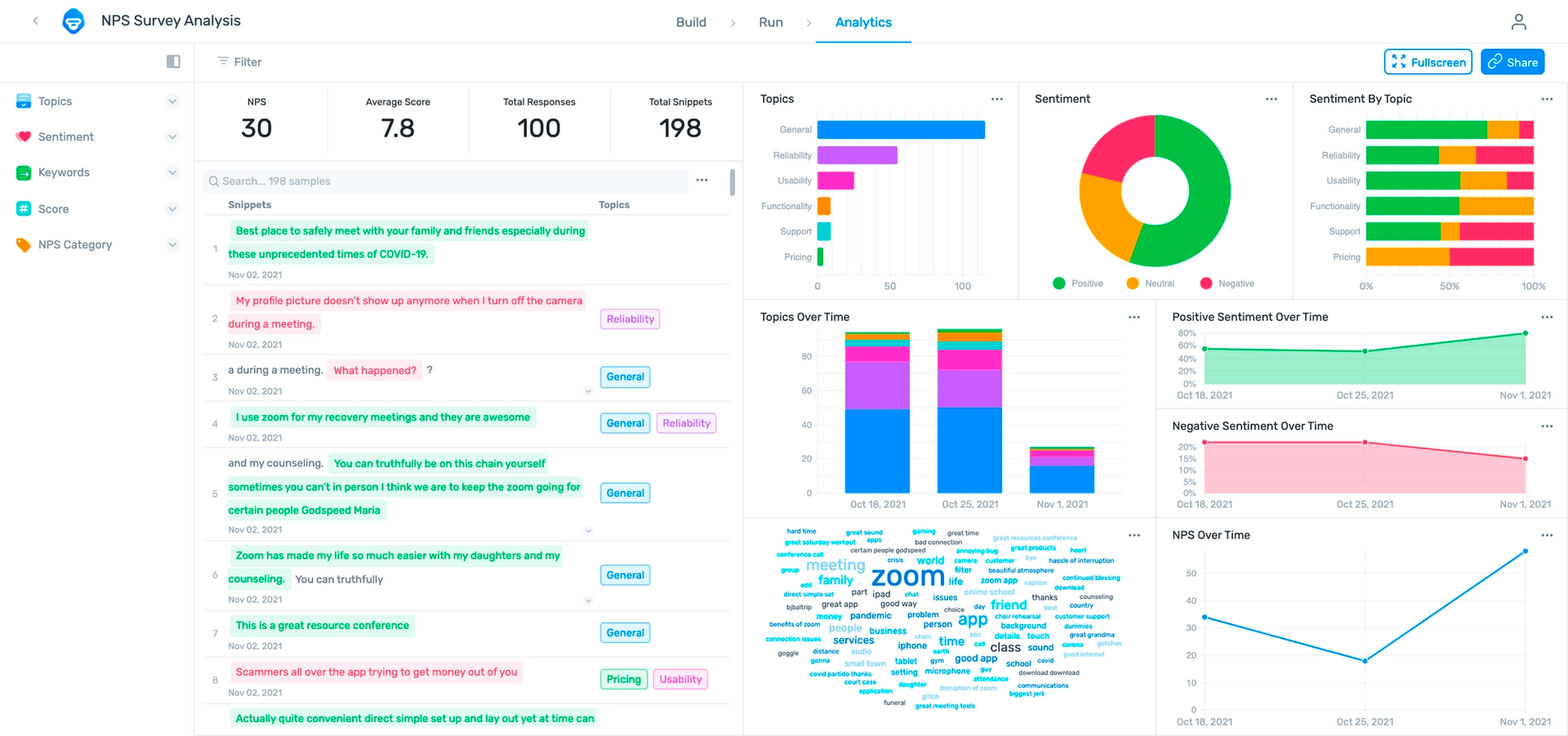
MonkeyLearn offers a number of no-code templates, like our NPS template, that help you both analyze tens of thousands of survey results using techniques like sentiment and topic analysis.
You can then visualize these results in an easy to view dashboard (pictured below). All this in a matter of seconds.
When you're dealing with tens of thousands of survey responses, manual analysis simply won't be possible.
You'll need an automated, AI powered solution like MonkeyLearn that lets you perform advanced analysis and visualization quickly.
Sign up for your free trial today and see how you can access the insights within your NPS survey data and visualize them with ease.

Inés Roldós
April 1st, 2022


