Excel Data Analysis & How to Gain Deeper Insights

Data analysis is at the core of every successful business, whether analyzing performance, team processes, customer behavior, or market trends.
It’s the process of collecting, analyzing, and interpreting information, using various data analysis tools to extract value and create compelling visualizations to support decision-making.
Excel performs exceptionally well when it comes to analyzing structured data (numbers, scores, groups, etc).
In this article, we’ll focus on how to analyze your data in Excel using various functions, and Excel add-ins, then we’ll introduce you to a simple way of analyzing unstructured data in Excel.
- How to Do Data Analysis in Excel
- Perform Complex Data Analysis with the Analysis Toolpak
- Take your Data Analysis in Excel to the Next Level with No-Code AI
How to Do Data Analysis in Excel
Businesses collect both quantitative and qualitative data and often export this data to Excel, ready for analysis. Excel is one of the most popular and reliable tools for managing and analyzing business data and discovering trends in large data sets.
It’s also the easiest place to start your data analysis, so let’s take a look at some of the top Excel functions, below:
Filter Your Data
Filters help you narrow down a large dataset by grouping data based on different criteria. Applying filters to data allows you to easily view what's relevant to you.
In this set of product reviews, for example, data in the company size column is filtered to show only reviews from small businesses.
Functions
Excel has more than 400 functions, which are predefined formulas that help you automate calculations. Some of them are particularly useful for data analysis, for example:
- CONCATENATE: blends two or more cells together.
- COUNTIF: counts the number of cells that meet specific criteria.
- AVERAGEIFS: it calculates the average of cells based on multiple criteria.
Below, the formula “COUNTIF(I2:I190,“Positive”) is used to automatically count how many opinions from a set of product reviews were classified as Positive:
Pivot Tables
Pivot tables are one Excel’s most powerful features for data analysis. Otherwise known as cross-tabulation, pivot tables are used to summarize (or slice) data so that you can focus on specific aspects that you want to explore in more depth.
You can quickly build a pivot table by dragging and dropping fields and rearranging them without needing to write any formulas. The flexibility to blend information also makes it easy to spot trends that might otherwise go unnoticed.
Before building a pivot table, decide on the final outcome: what are you trying to understand? Maybe you want to know which product was more popular during the summer season or identify segments of customers based on purchasing behavior. With a clear question in mind, you’ll have a better idea of the data to include.
In this example, below, product reviews previously classified by topic and sentiment using MonkeyLearn (we’ll explain this later), are summarized in a pivot table show the number of Positive, Negative, and Neutral opinions for each business aspect (Ease of Use, Performance, Features, and more):
In the final pivot table, above, sentiment data has been summarized in columns and topic data in rows, and Excel has automatically calculated the totals.
Conditional Formatting
Conditional formatting in Excel automatically highlights cells using colors based on predefined rules, making it easy for you to identify different data. For instance, you might want to use this rule to add a color gradient to NPS scores, to easily identify promoters, passives, and detractors.
The example below, shows how to create a conditional formatting rule in a dataset of NPS scores: “If the value is greater than 8, color the cell green”.
For more granular results, you can combine this with other features such as sparklines, which are tiny line charts that display your data from a series of values. They’re useful for analyzing and spotting trends in data related to performance, like customer support and seasonal fluctuations, or to highlight high or low values.
What-If Analysis
What-if analysis allows you to create different scenarios and easily compare results. By changing values in cells, you can see what the outcome would be.
Another useful feature of this tool is Excel’s Goal Seeker, which helps you understand how to achieve the desired goal (for example, a revenue target).
In a nutshell, these tools save you time and effort when you don’t have all the data available to answer a certain question.
Charts
Visualizing your data through charts in Excel helps you communicate ideas effectively. There are different types of charts available, such as column charts (ideal for comparative data analysis), pie charts (suitable for depicting proportional data), and linear charts (great for analyzing trends over a time period).
While the above functions and features can help you learn a lot from your data, there are more advanced tools that you can use in Excel designed to handle more complex data.
Perform Complex Data Analysis with the Analysis Toolpak
Armed with a set of powerful features, you can save time and effort when using Analysis ToolPak in Excel to perform statistical, financial, and engineering calculations. Basically, you provide the data and specific parameters and the tool automatically does the calculations for you.
With the Analysis Toolpak, it can be easier for you to detect outliers in data (by calculating variance), as well as calculating correlation and regression.
To start using the Excel data analysis add-in, first, you’ll need to set up Analysis ToolPak:
- In Excel, click Options in the File tab.
- Go to Add-ins, then select Analysis ToolPak and click Go.
- In the pop-up window, check the Analysis ToolPak option and click OK.
- Under the Data tab in the toolbar of your Excel sheet, you’ll now see a Data Analysis option
- Click on it and choose the analysis you want to perform (correlation, descriptive statistics, t-test, etc.) then clicke OK
To learn more about each of the tools available in Analysis Toolpak, go to Microsoft Support, which explains when and why to use each type of data analysis.
Take Your Data Analysis in Excel to the Next Level with No-Code AI
There’s no doubt that Excel is a great starting point for data analysis, especially when crunching numbers. However, more and more businesses are starting to see the benefits of unstructured data, like open-ended responses, social media comments, reviews, etc., since it holds many valuable insights that help you understand the ‘why’ behind the numbers.
Traditional data analysis software is not capable of processing strings of text to extract meaning. While you can use Excel to collect open-ended responses from your latest NPS survey, you can’t use it to automatically understand what they’re about or how customers feel.
Fortunately, you can now use machine learning tools to analyze Excel data allowing you to capture value from huge amounts of text data in real-time.
Machine learning tools, like MonkeyLearn, can automatically classify text or extract specific information from text data. To start with, you can use a keyword extractor to gain quick insights, like the most frequent and relevant words customers use in a set of product reviews.
If you receive a lot of online reviews or social media data, you might also want to try out a sentiment analyzer, which helps sort your text by positive and negative.
You can also combine sentiment analysis with topic analysis, a text analysis technique known as aspect-based sentiment analysis(https://monkeylearn.com/blog/aspect-based-sentiment-analysis/).
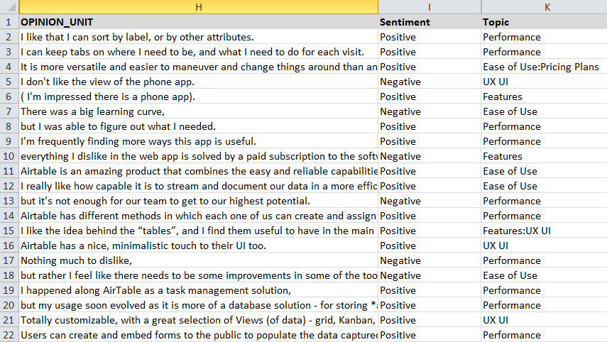
Here’s how your initial dataset of product reviews in Excel might look after performing aspect-based sentiment analysis:
Here’s how your initial dataset of product reviews might look after performing aspect-based sentiment analysis:

Now that you’ve analyzed and sorted your unstructured Excel data, you can visualize it in the same way you would with structured data.
Get the Most Out of Your Excel Data
Excel is a powerful tool for quantitative data analysis. However, it’s unable to unlock the power of qualitative data.
Machine learning tools take your data analysis in Excel to the next level level, by allowing you to make sense of text data in a fast and cost-effective way.
With a SaaS no-code platform like MonkeyLearn, you can easily classify data by topic, sentiment, intent, or find important keywords, among other text analysis tasks. Then, you can customize interactive dashboards to showcase the results and share them with your team in real time.
Sign up to MonkeyLearn to discover more data analysis tools.
Interested in seeing what MonkeyLearn can do for your unstructured data? Schedule a demo and we’ll show you how to analyze your data in Excel with machine learning tools.

Tobias Geisler Mesevage
October 1st, 2020


