Unstructured Data Analytics & The Tools You Need to Succeed

Unstructured data is any kind of data that doesn’t fit into a predetermined framework or design, like audio, video, images, and mostly text data found in documents, emails, or on websites and social media.
Unstructured information is generally qualitative rather than quantitative – presenting thoughts, ideas, and opinions rather than simple numbers and values. It’s important that businesses implement a process to analyze unstructured data because it represents the vast majority of business data, and can help teams better understand customer behavior.
It can be hard to analyze and visualize this data, however, because its lack of format doesn’t easily lend itself to computer analysis. That’s where unstructured data analytics comes in, offering solutions to give structure to unstructured data so that it can be properly processed and analyzed.
Unstructured data analytics tools can be used to tackle big data – to mine for opinions, monitor social media sentiment toward your brand, summarize thousands of pages of text, and more. Many of the tools can be trained to your company’s specific needs and criteria for unsurpassed speed and accuracy, so you don’t have to hire whole teams to analyze your data.
Let’s dive in
- Unstructured Data Analytics Tools
- Unstructured Data Analytics Tutorial
- Put Unstructured Data Analytics to Work
Unstructured Data Analytics Tools
Unstructured data analytics tools are equipped with machine learning and natural language processing (NLP) to collect, break down, and analyze information that doesn’t have a predefined format. This type of information includes emails, reports, social media, customer support tickets, and more, and is hard for a machine to understand without the help of unstructured data analytics software.
Depending on your goals and the depth of analysis you need, there are a number of tools you can use to simplify the process of analyzing unstructured data.
Get started with these top 6 unstructured data analytics tools:
- MonkeyLearn | All-in-one data analytics and visualization tool
- Excel and Google Sheets | Organize data and perform basic analyses
- RapidMinder | All-around platform for predictive data models
- KNIME | Open-source platform for advanced, personalized design
- Power BI | Business intelligence leader from Microsoft
- Tableau | Visualization tool with a number of business integrations
MonkeyLearn
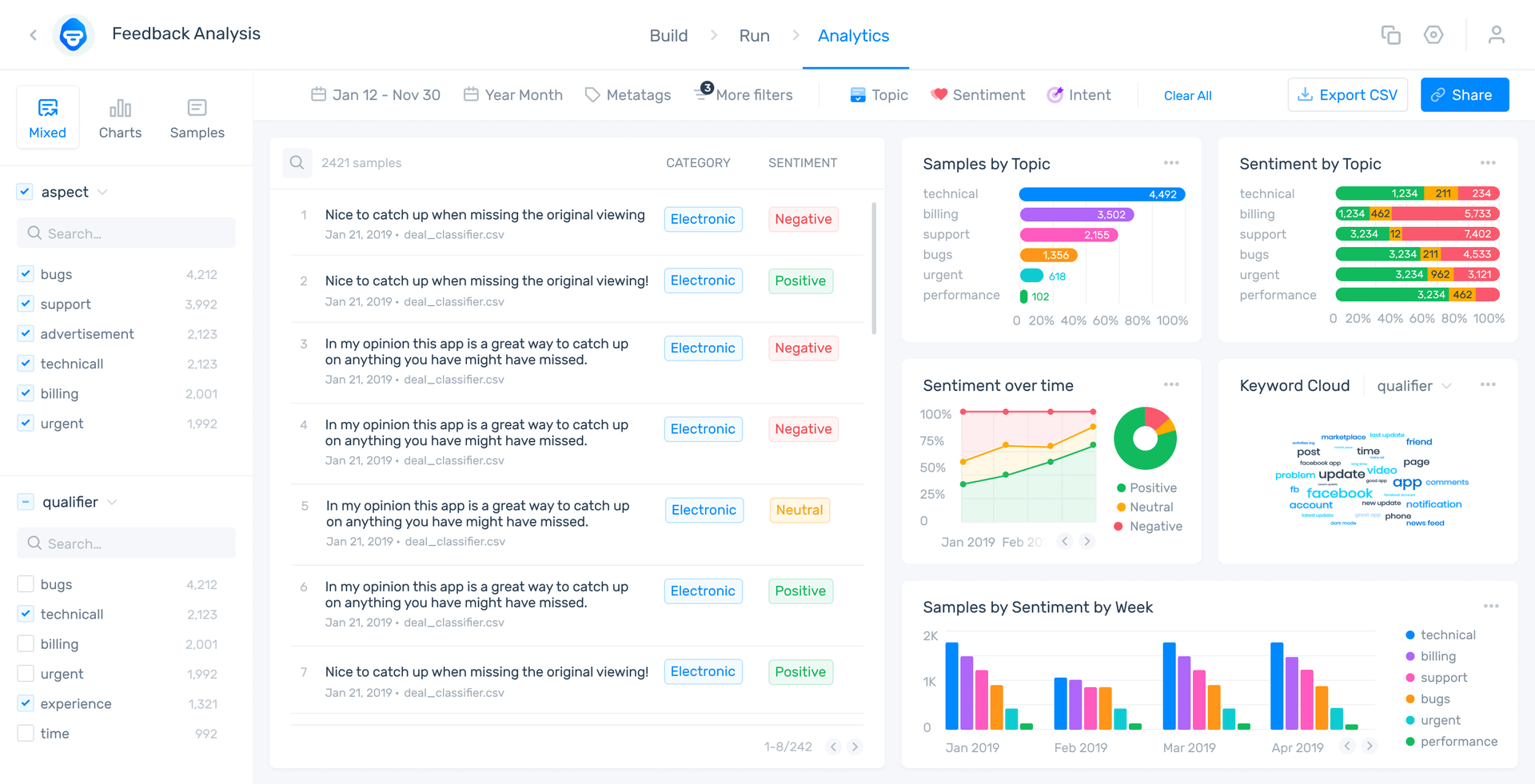
MonkeyLearn is a text analysis platform that allows you to dive right into unstructured text – from customer service tickets to social media data, surveys, online reviews, news reports, wherever you may find it – for real, data-driven insights.
You can use pre-trained tools, like the sentiment analyzer, keyword extractor, survey feedback classifier, intent and email classifier, and more. Or train your own to your data and your criteria, usually in just a few steps, for industry and company-specific results.
Best of all, you can chain together these analyses to work automatically and in tandem, then visualize the results with MonkeyLearn Studio. Bring all your data together, in one striking dashboard, and change tools or tweak analyses right in the browser.
MonkeyLearn is a low-to-no-code option that integrates easily with applications you already use, like Excel and Google Sheets, Zendesk, Zapier, SurveyMonkey, and more. You can even use MonkeyLearn API to connect directly to your data sources.
Explore MonkeyLearn's plans and pricing
Excel and Google Sheets
Spreadsheet applications, like Excel and Google Sheets can be a good intro into data analytics because nearly everyone has access to them, but they are designed to handle quantitative data, so they don’t perform at high levels with unstructured data analysis.
Excel can be great for semi-qualitative survey data analysis, where you can organize and calculate data from multiple choice questions, number rankings, etc. Like in the example below with a graph showing a product’s rating by category on a scale of 1-5 (“Stars” = “overall rating”):
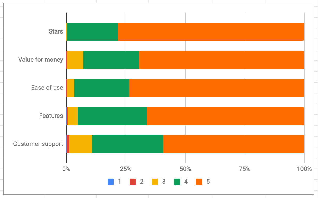
There is a limit to the amount of data spreadsheets can handle, however, and they require data to be fully structured before they can further analyze it.
RapidMiner
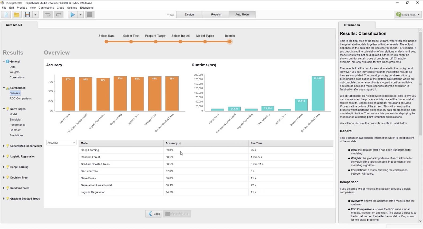
RapidMiner is a full data science platform that aims to build predictive models with unstructured data across a multitude of industries. The analytics are powerful and can handle huge amounts of data but can be somewhat complicated to put into practice, so a data science background is recommended.
RapidMiner can take you from data prep to machine learning training, through model deployment in a linked process. With RapidMiner Studio you can customize models to your specific needs, integrate third-party applications, and visualize the results.
KNIME
KNIME is a free, open-source data analytics platform, so a data science and engineering background is a must, but it can be great for experienced coders who want to create hyper-specialized tools. That said, the drag and drop interface is a huge advancement on other, code-heavy designs, allowing you to import data from other sources and fairly easily visualize your data.
It has a strong following, so new updates are regularly available. And the KNIME server allows for large-scale, team-based collaboration, automation, and deployment of their data analytics platform.
Power BI
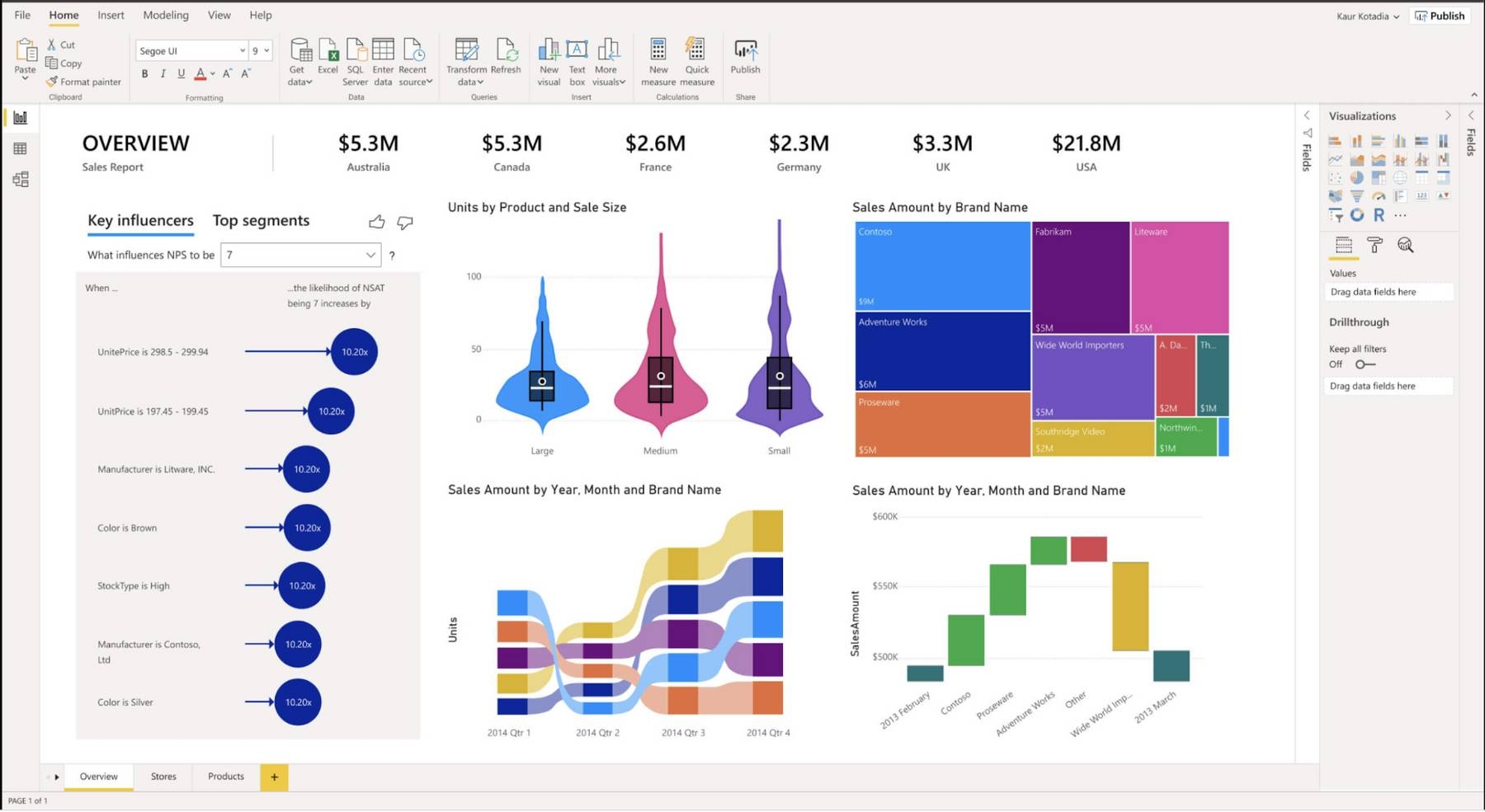
Microsoft Power BI is one of the preeminent business intelligence data visualization tools with impressive dashboards that show data in broad strokes and minute detail. It offers great integrations across a number of applications, but it can be a little slowed down, as there are few data controls offered directly in the dashboard.
However, once you have performed your data analytics, the visualization tools are excellent for all manner of presentations and reports and can be used within or in tandem with other Microsoft applications, like Excel, PowerPoint, Outlook, and more.
Tableau
Tableau, another top business intelligence visualization tool, offers endless charts and graphs and easy-to-understand devices, like word groupings to get the power of keywords across simply and boldly. You’ll see trends and patterns in captivating visuals that are much more engaging than mere numbers and lists.
Tableau integrates easily with most unstructured data analytics software and can offer a powerful visual advantage when presenting reports to staff, clients, and stockholders.
Unstructured Data Analytics Tutorial: 4 Steps
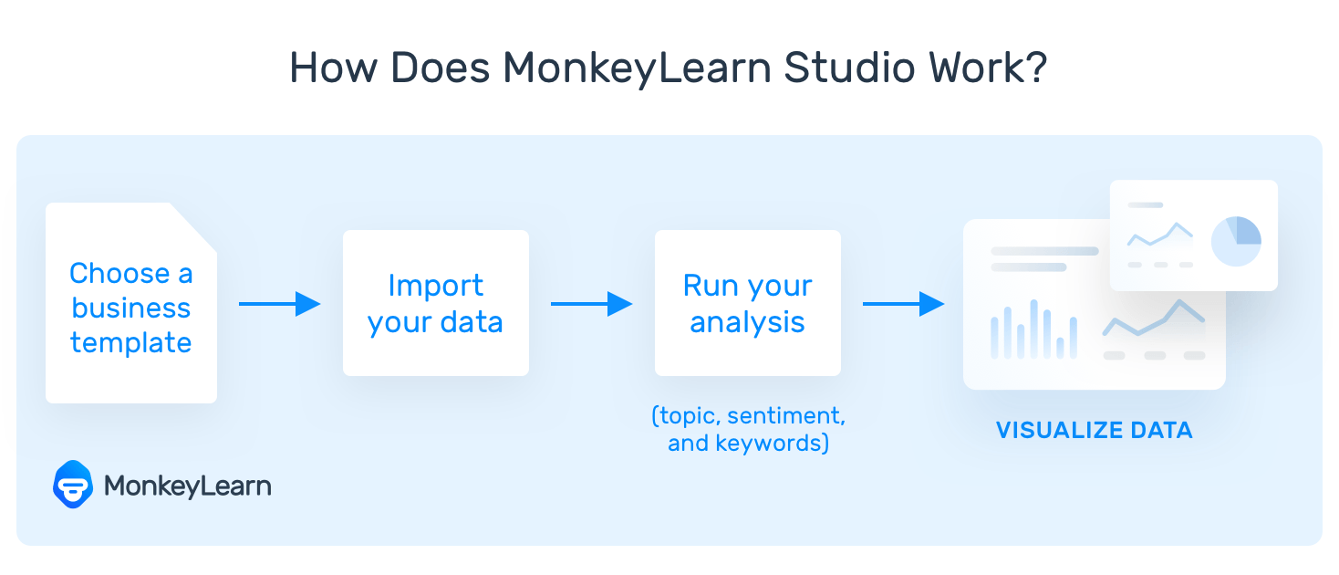
Follow along below to see just how easy it is to transform unstructured data to structured data, get immediately actionable insights, and visualize your results with MonkeyLearn Studio in just four steps. You can analyze all manner of data sources: surveys, customer feedback (from all over the web), emails, call center data, customer service tickets, and more.
After a quick set-up, you can analyze unstructured data right in MonkeyLearn’s intuitive interface.
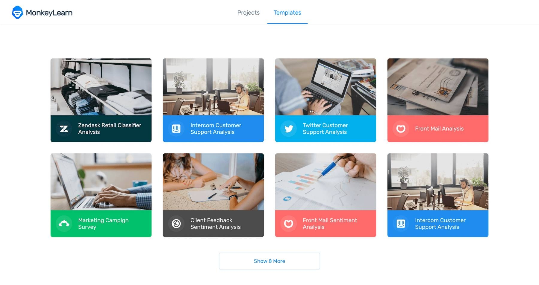
1. Choose a MonkeyLearn Studio template
With MonkeyLearn Studio you can automatically chain together multiple analysis techniques, like keyword extraction, sentiment analysis,aspect classification, and more for super fine-grained results.
You simply choose a template that fits your unstrcutured data needs or you can design your own.
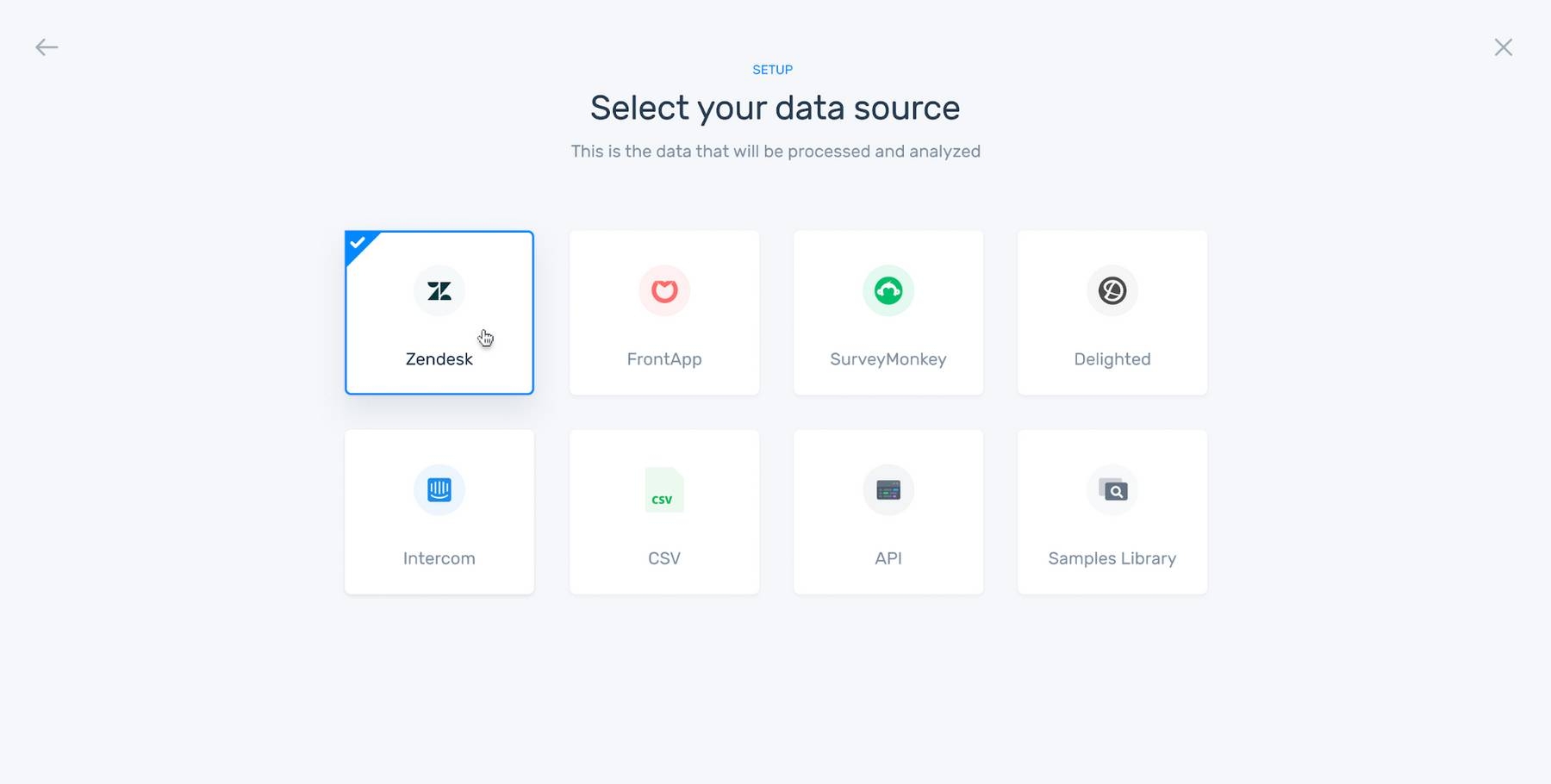
2. Upload your data
You can upload text data from a CSV or Excel file, integrate directly with Zendesk, SurveyMonkey, etc., or use MonkeyLearn’s low-code API to connect your data directly.
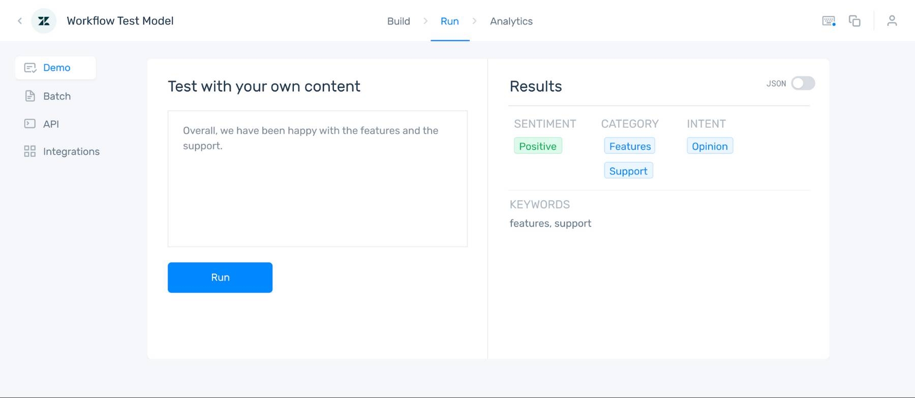
3. Run your analysis
It all happens automatically, usually in just a few seconds. In the model below, you can see three analyses running simultaneously.
- Opinion extraction and sentiment analysis: First of all, as comments may contain multiple opinions, each review is broken into “opinion units” – meaning one single opinion. Then sentiment analysis shows the feeling of each opinion unit (positive, negative, neutral, and everywhere in between).
- Aspect or topic classification: Places the statement into one or more predetermined categories.
- Intent classification: Automatically tags the statement for intent, usually used for email classification (e.g. Interested, Not Interested, Spam, Opinion, etc.).
4. Visualize your results automatically with MonkeyLearn Studio
Now that your analysis techniques are set up, MonkeyLearn Studio will visualize them automatically. It’s a seamless process that can work 24/7, in real time.
Take a look at the MonkeyLearn Studio dashboard below showing results for aspect-based sentiment analysis of customer reviews of Zoom.
Each opinion unit has been classified by “aspect” or category: Usability, Support, Reliability, etc., and then each category analyzed for sentiments: Positive, Negative, or Neutral.
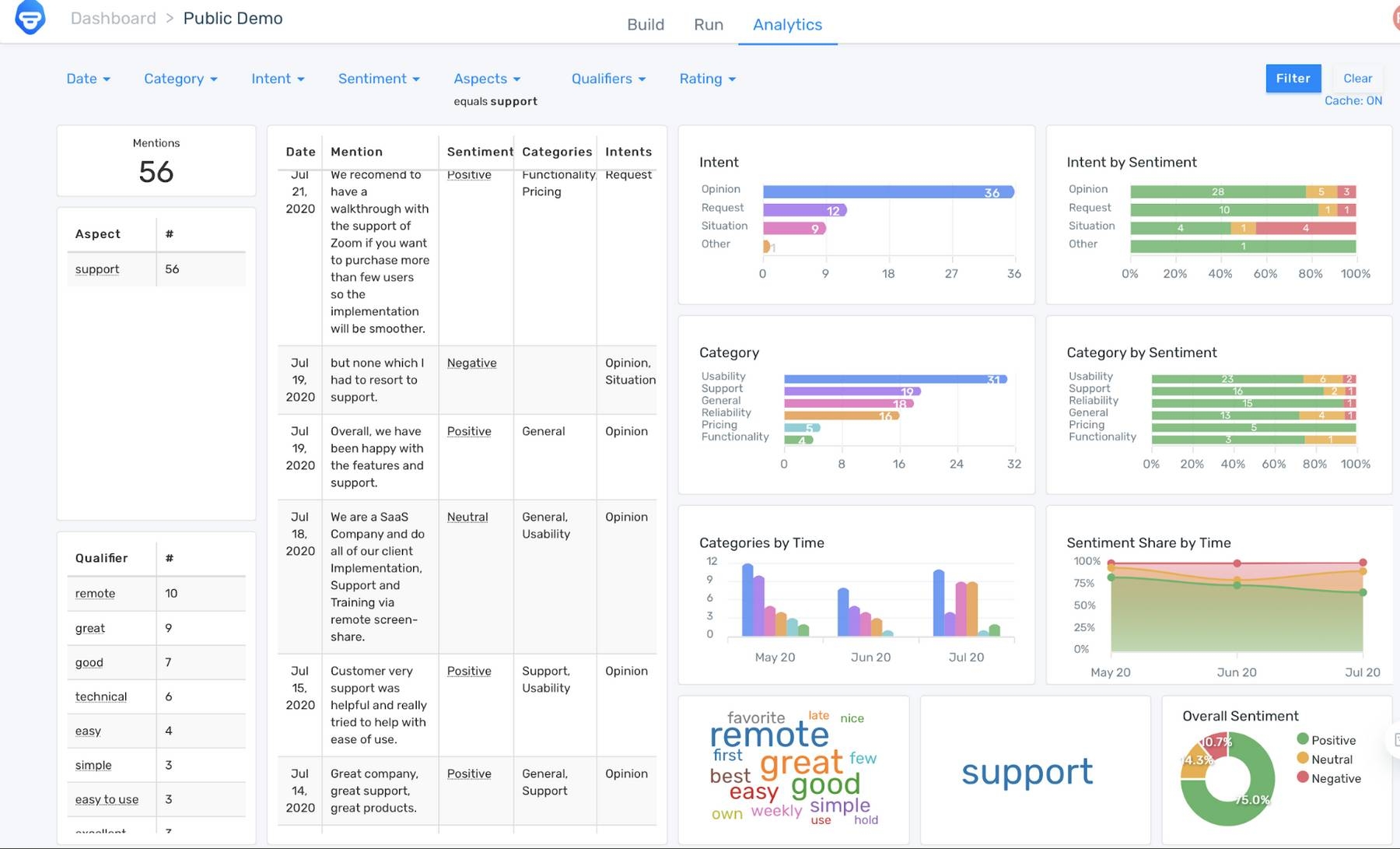
You can search for reviews by date and time to find when your company or product may have been trending and follow categories and sentiments as they change over time.
The below is filtered only by the topic Reliability, for example:
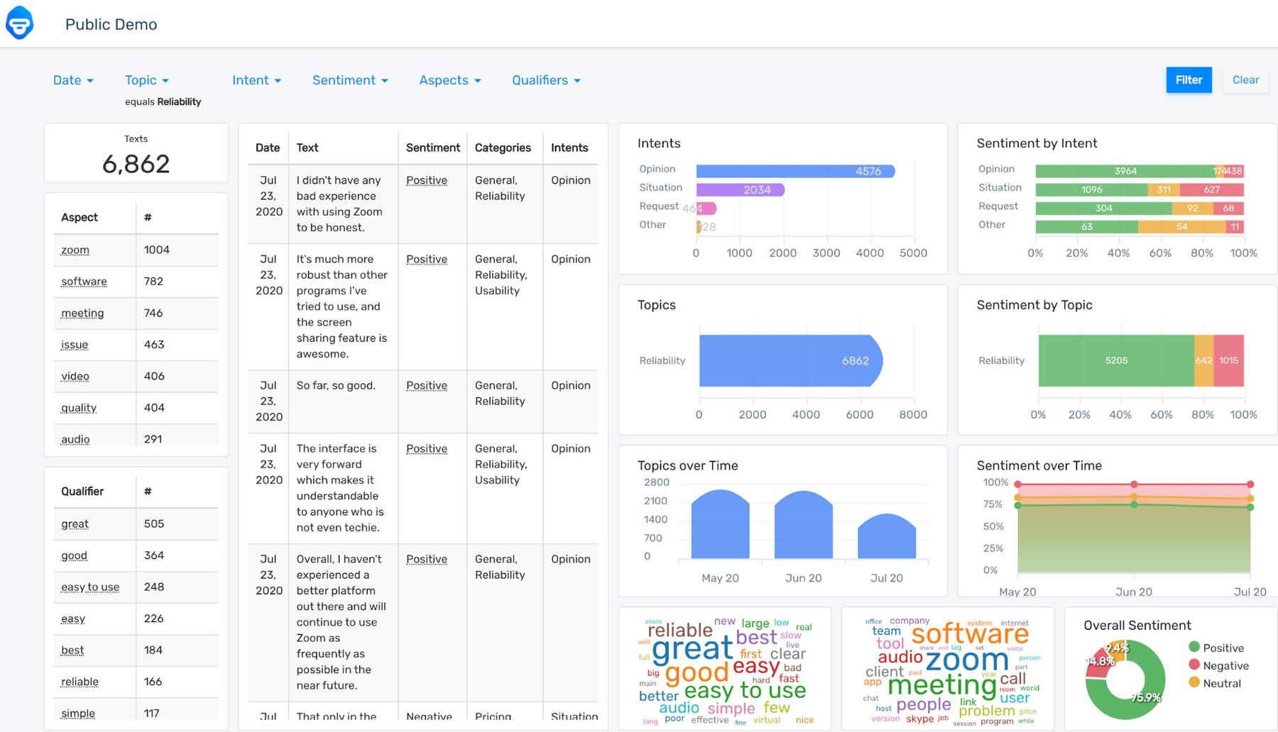
Charts and graphs give an instant overview of all your data and fine-grained details to help understand the whys of unstructured data analysis results.
On the bottom right you can see word clouds showing the most used and most important words pertaining to Reliability.
Request a demo to see how MonkeyLearn Studio can help you. Filter by date, topic, sentiment, etc. With MonkeyLearn Studio you can add or remove data and analytic techniques right in the dashboard, so you don’t have to bother uploading and downloading between applications.
Put Unstructured Data Analytics Software to Work
It’s clear that there are truly valuable insights to be gathered and visualized with unstructured data analytics. And when you put the right tools to work, it can be a painless process.
Do you want to monitor social media for brand mentions and follow your customer sentiment as it rises or falls over time? Do you want to compare the sentiment of your brand or products against those of your competition? Do you need to categorize customer service tickets by category or urgency and automatically route them to the proper department or employee?
With text analysis platforms, like MonkeyLearn, the possibilities are endless. And, with MonkeyLearn Studio, you’ll be able to locate, analyze, and visualize your data in a single, seamless process – no data science experience necessary.
Sign up for a free demo to see how MonkeyLearn can help get the most from your data.

Inés Roldós
September 30th, 2020


