Beautiful Data Visualization: 6 Examples of Great Datavis

Data analysis can be beautiful, but it’s data visualization's job to make it beautiful.
The standard-of-beauty for datavis is not abstract. A table/chart/graphs ‘beauty’ is directly proportional to how effectively it conveys its data to its target viewing audience.
If a data visualization can effectively convey the data behind it to the humans viewing it, it has succeeded.
This can best be achieved by:
- Understanding of your audience - What are they looking for?
- Choosing the right data visualization type
- Applying effective design tweaks
- Leveraging the best possible datavis tools to shape and hone the resulting graphic
With this in mind, we’ll explore what a beautiful and effective end product data visualization looks like as well as the value it can add.
We’ll breeze through what data visualization is and expand on why you should strive for great datavis. Then, we’ll jump into some examples of the best datavis out there.
What is Data Visualization
Data visualization is the presentation of data or information in a visual format. Humans aren’t machines and have trouble interpreting long rows and lists of numbers - if the data is curated in a pleasing, understandable visual format, it is much easier for us to draw helpful conclusions.
Data visualization, or datavis, is the science of effectively displaying that data for interpretation. But it can also be an art form. Finding the right format, design, and color palette for your data can leave you with eye-catching, pleasing to behold results.
This is easily demonstrated by going through some examples. We’ll show you different datavis samples, then unpack why they work.
Data Visualization Examples
Here are 6 examples of data visualization, explained:
- Coronavirus World Map Tracking: Geographic Datavis
- Flight Radar Map: Heatmap Datavis
- Google Trends: Analytical Datavis
- Visualizing Customer Feedback: Suite Datavis
- Climate Time Machine: Geographic Datavis
- Human Body Visualization: Interactive Datavis
- WW2 Bullet Holes on Planes: Creative Datavis
We are going to explain each example in a similar manner to the approach we took in our ‘14 Types of Datavis’ overview - we’ll categorize each example by its datavis category, then explain why that approach works for its data.
Off we go!
1. Coronavirus World Map Tracking: Geographic Datavis
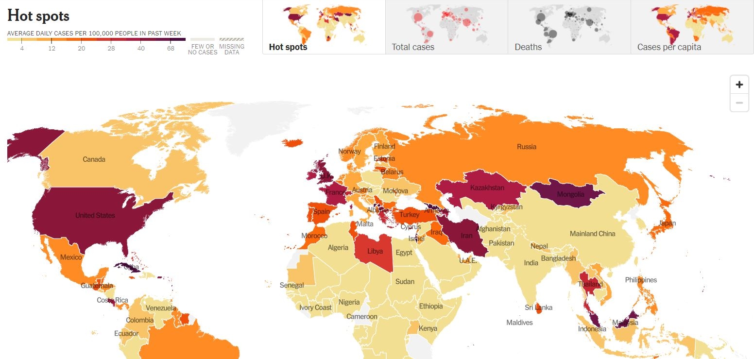
Type: Geographic (specifically Choropleth!)
While the New York Times article that features this suite of Covid-19 datavis offers a ton of different ways to look at the data, the choropleth world map (above) is the most prominent.
The map is geographic (self-explanatory) and choropleth, meaning that it conveys information via sections of various color sections.
In the above sample, it conveys national coronavirus rates by coloring in the different countries on a scale of light tan to dark red, indicating their lack of, or high amount of coronavirus cases.
Choropleth datavis is great because most people are familiar with maps from early education and are able to locate the countries they are curious about. They are not so great at conveying exact data, as the shade of each country does not convey an exact figure, just a generalized estimate on the color swathe.
2. Flight Radar Map: Heatmap Datavis
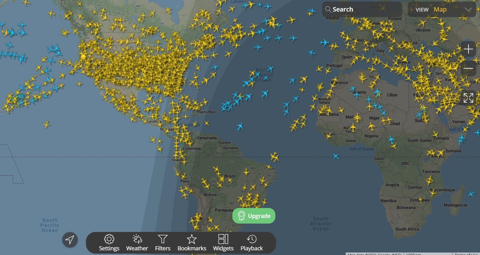
Via FlightRader24
Type: Geographic
A twist on geographic datavis is the increasingly popular ‘heatmap’ variant. As you can see in the above flight tracking heatmap, this helps illustrate where data points cluster across a geographic landscape.
This can be applied more in the abstract when it comes to the geography of, say, a website.
Via Hotjar
By applying this type of datavis, you can effectively track where your customers put their attention, and thus tweak your business strategy to match.
3. Google Trends: Analytical Datavis
Via Google Trends
Type: Combined
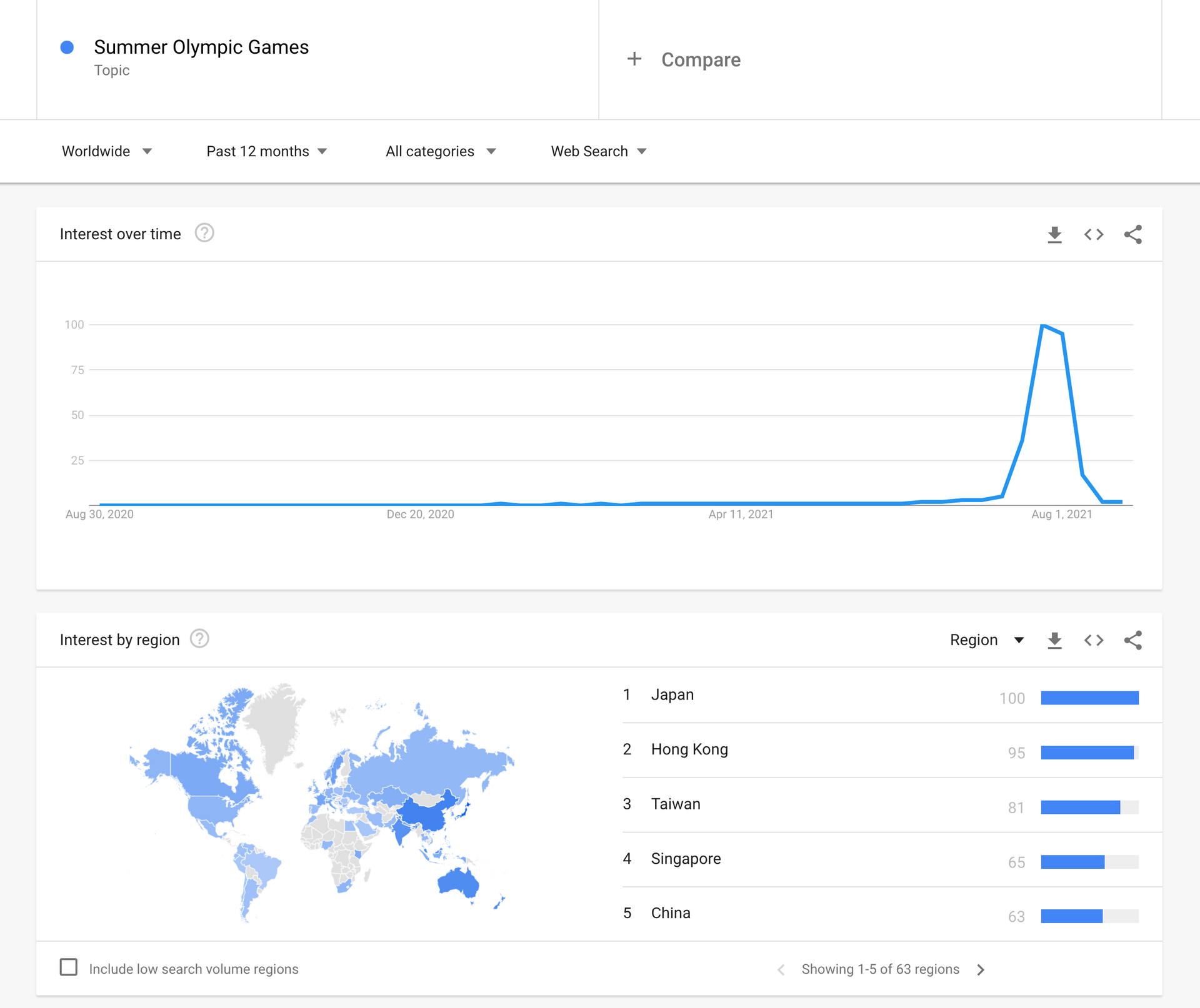
Here we take our first steps into the world of ‘big data’ and ‘datavis suites’.
The Google Trends datavis suite gives you the options to explore search engine data. As you can see above, it can collate the amount of searches for ‘Summer Olympic Games’ and surrounding trends, map it on a time-scale (temporally) and by region (geographically).
It also hints at related terms that are linked and may be worth exploring, like ‘badminton olimpiade tokyo’ (for the hardcore badminton fans out there’), or ‘hockey olympics 2021’ (presumably people curious if hockey would be played).
This is also our first suite style datavis-type. Let’s expand on what that entails.
4. Visualizing Customer Feedback: Suite Datavis
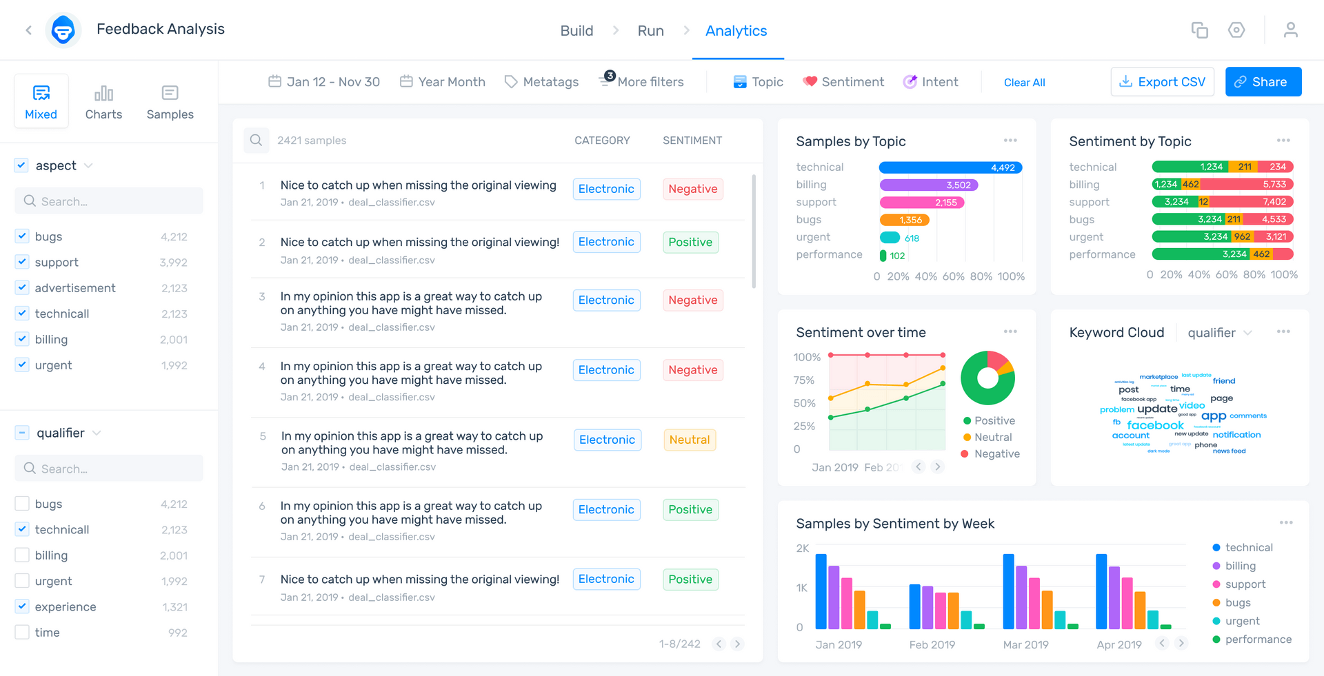
Google Trends demonstrates a great framework for datavis suites. But other suites expand on their options, generating and suggesting further types of tables/charts/graphs and offering access to all the underlying programs used to generate them.
MonkeyLearn Studio’s datavis suite, is an all-in-one text analysis and data visualization platform that lets you visualize actionable insights from your business data.
In this demo model, for example, you can visualize a detailed analysis of Trustpilot reviews of the company Chewy. This allows you to detect trends and patterns at scale, to perform informed business decisions.
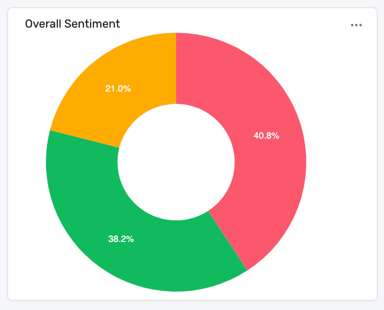
Here, you can see a donut chart showing the overall sentiment of the reviews. 38.2% of comments are positive, 21% neutral and 40.8% negative:
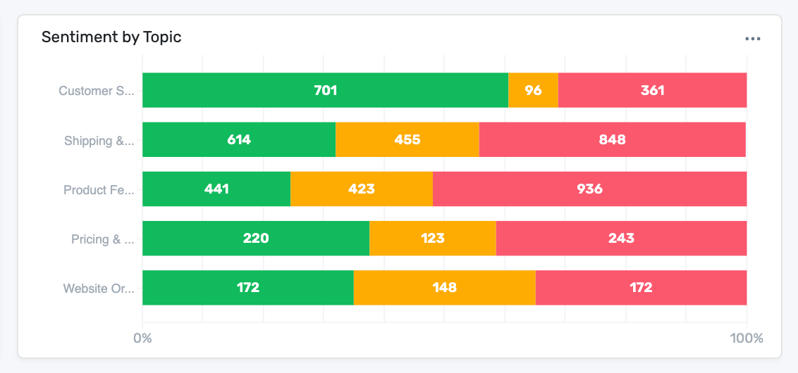
To gain even deeper insights, you can also see the sentiment specifically applied to each topic mentioned in the reviews, to quickly detect which areas need improvement in your business:
5. Climate Time Machine: Geographic Datavis
Tracking back to the general category of ‘geographic’ datavis, it's worth exploring visuals tied to factors other than time or density.
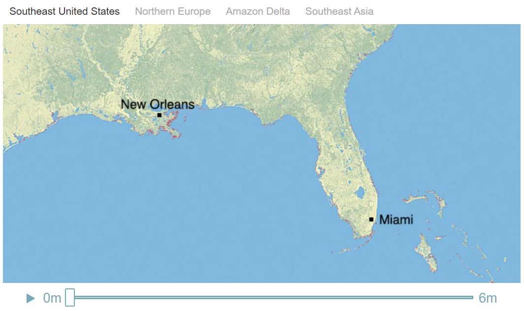
Let’s explore climate change. Specifically, the effect that rising sea levels will have on the Louisiana and Florida coastlines.
A sobering topic, but one worth exploring. And this choice of datavis makes its point extremely well.
Courtesy of NASA’s Center for Remote Sensing of Ice Sheets, here’s where our region stands now:
Via NASA Global Climate Change
Type: Geographic
The red spots thinly dotting the coast indicate the rise in sea levels due to global warming that has already occurred.
The data behind this graph notes that Greenland’s lower ice shelf is melting at an alarming rate. In the coming years it could melt as much as 5-7 meters if the progress of global warming doesn’t slow drastically.
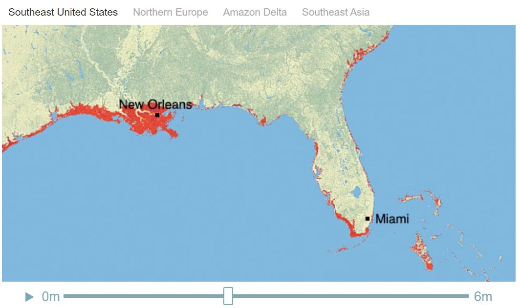
Let’s see what this looks like in two intervals. First, we’ll look at what a 2 meter partial melt would look like. Then, we’ll see what a 6 meter, complete melt would entail.
Via NASA Global Climate Change
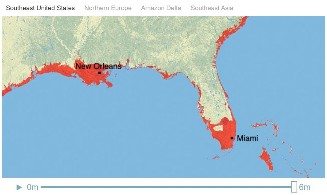
As you can see, at 2 meters we already lose most of New Orleans aside from a tiny sliver of high ground and the surrounding bayou as well as the southwestern Florida coast and most of the Florida Keys.
Now let’s look at a 6 meter rise.
Via NASA Global Climate Change
Just wow. That’s a complete loss of Miami, New Orleans and all of the Florida Keys, as well as the majority of the Louisiana and Florida coastlines (where most of the cities happen to be). This isn’t even the worst case scenario - losing the entire shelf could even push the estimated sea rise to 7 or more meters.
Hopefully this demonstration underlined the efficacy of choosing the right type of datavis for your dataset. By choosing a geographic display and coloring in the sea rise with obvious landmarks noted on the map, we are able to understand the severity of the problem.
This approach could make a cogent point in a corporate war room or a university classroom - great data and clear datavis are able to make clear points regardless of context.
6. Human Body Visualization: Medical Datavis
Not all datavis is meant to inform board or product team decisions. Rather, some skews towards the informative, interactive, and fun.
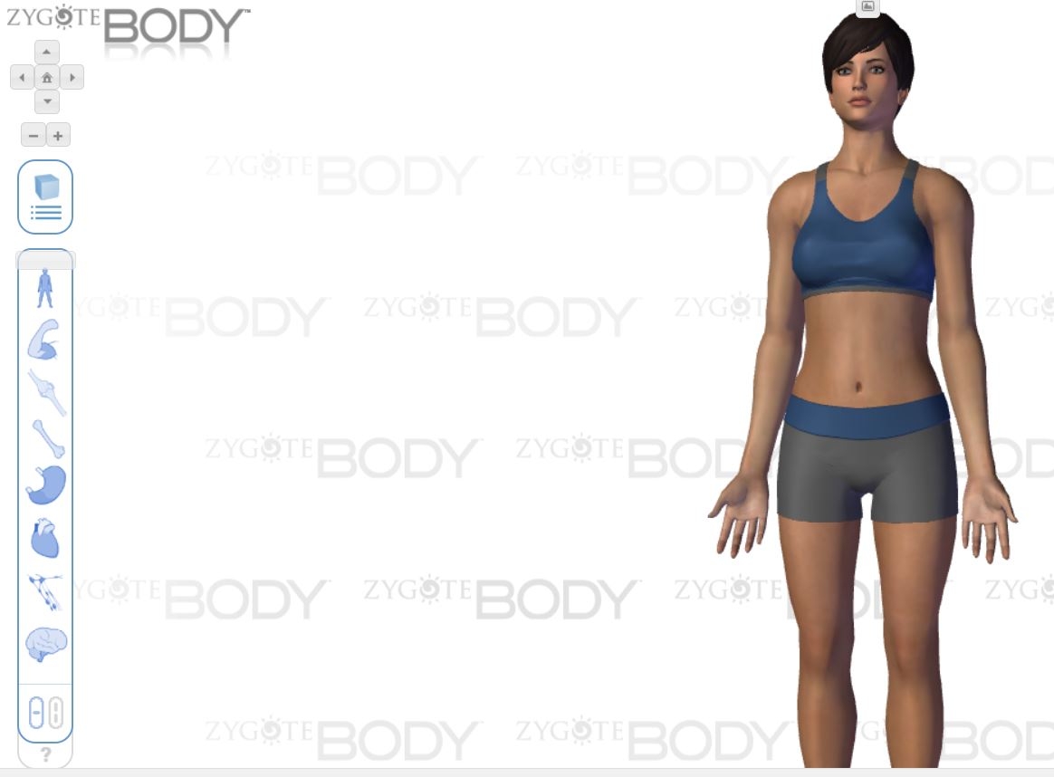
Take this human body datavis software. We start with a default person:
Via Zygote Body
By dragging the bar down the column on the left, we can explore the various life systems, types of tissue, muscles et cetera. Check out what happens if we move it down to the musculature level:

Via Zygote Body
At this setting we’re able to see the muscle systems and even some of the veins, especially where they overlap the muscles. We can also pick out where the bones are exposed and where they aren’t.
Testing this datavis offering in this manner lets us determine its type as well as infer some uses.
Type: Interactive
This software could easily be used for educational purposes, or even to produce custom medical diagrams which could explain situations to patients. Because it is intuitive to explore and the display responds to what the user wants to see it's a great example of effective interactive datavis.
7. WW2 Bullet Holes on Planes: Creative Datavis
Finally, thinking outside of the box can be key for great datavis. Take this analysis of where WW2 bombers were shot. This was collected by the Center of Naval Analysis who would take a look at every bomber post mission and record where it had taken fire.

Type: Geographic
The minds at Naval Analysis took a look at this combo geographic/scatterplot visualization and drew an obvious conclusion - armor up where the bombers were getting shot the most.
Logical, right? Absolutely. But it misses a key variable.
In datavis, as in art and data analysis, it is just as key to look at what is not there as to what is there.
Take a look at the negative space on the plane diagram above. It’s clustered around the engine (the length of the fuselage by the tail wing), the cockpit (only three shots taken), the propellers, and where the wings meet the fuselage.
Why might that be?
This is when data visualization is absolutely crucial. If the Center for Naval Analysis had just logged each incident (hit mid-right wing, hit far left wing), and collated it all on a large, excel-like sheet, they would have never realized what they were missing.
By plotting it on the mock plane here, and having experts think about the diagram, they were able to unlock human intuition and get on the right path.
Planes were sustaining hits in the dark areas. It’s just that the planes getting hit in the dark areas were not coming back. The Center could only collect data from surviving planes, and planes hit in the engine, propellers, or cockpit tended not to survive.
So, rather than doubling down on armoring the hit-many-times but likely survivable damage areas (the white dots), focusing on protecting the black areas was much more critical.
Datavis can, in this way, make the most of human intuition, prevent calamity, and save lives. For another example of the disaster-prevention capacity of excellent datavis, check out our datavis focused analysis of the Challenger launch.
Takeaways
Of course, not every situation is life or death. But, when it comes to your data, it pays to get it right. ‘Getting it right’ can mean reduced customer churn, improved product safety, better target audience identification and much more.
The ideal is to have the datavis you need (tables/graphs/whatever is required), when you need it, without having to spend time and money searching for the best software.
If you want to have all your data in one place and ready to analyze at the drop of a hat, look no further than MonkeyLearn’s all-in-one datavis studio. It comes with a comprehensive repertoire of graphs, all kept up to date in real-time, so you can monitor an overview or sample individual graphs to your heart's content. And it's API is easily integrated, with an open coding library for those who want to customize further.
Play with our public dashboard here and see it works. Or, sign up for a demo with one of our feedback and datavis experts today. Free trials are also available for those ready to dive right in.

Rachel Wolff
August 27th, 2021


