How to Analyze Survey Results & Visualize Your Insights

Surveys are, of course, one of the best ways to gather information and opinions from your customers or target audience.
They’ve long proven successful because you can focus on exactly the people you want opinions from, and ask questions about specific aspects of your business and products.
Questions are often quick to answer, and the abundance of online survey tools has made conducting surveys even easier.
The hardest part is analyzing that data.
In this guide, we’ll show you how easy it is to analyze your survey results and how you can visualize them in a striking dashboard.
- What Is Survey Analysis?
- Types of Survey Results
- How to Analyze Survey Results
- How to Visualize Survey Results
Firstly, let’s go over what we mean by survey analysis.
What Is Survey Analysis?
Survey analysis is the process of analyzing results collected from customer surveys, such as NPS and customer satisfaction surveys. Your survey analysis, if performed correctly, will deliver actionable insights that you can visualize in all manner of business intelligence (BI) tools.
Types of Survey Results
Before you start analyzing your survey data, it’s important to know what kind of results you need to decide what kind of survey analysis you want to do. Do you need to calculate market share? Rate overall customer satisfaction by percentage? Determine the features of your product your customers like best?
Or are you looking for more nuanced data about why your customers like certain features best or what drives customer acquisition, retention, and churn? Do you want to add new features to your product or find out new use cases?
Knowing your goals will help you decide the types of questions to ask, so that you elicit the right type of data: qualitative or quantitative data. Both can be effective tools for measuring customer satisfaction and gaining insights:
Quantitative data comes from close-ended questions, with a predetermined set of responses: Yes/No, multiple choice, or scaled (for example 1 to 5 stars). Close-ended responses are simply given a number value, so the results can be easily calculated, but they only go as far as comparing whole numbers, values, and percentages.
Net Promoter Score (NPS) surveys are an example of quantitative/close-ended survey analysis results, aiming to answer the question:
From 0 to 10 how likely are you to recommend [our product or service] to a friend or colleague?
Qualitative data comes from open-ended questions – questions that can’t be answered with a pre-set choice of responses. Open-ended questions are worded to elicit new information from the responder, in their own words. Open-ended responses dig into the responder’s feelings and opinions and allow for findings and personal data that the questioner may have never even considered previously.
How to Analyze Survey Results
So you’ve sent your surveys using online tools, like Typeform, SurveyMonkey, and Google Forms, and received a bunch of survey results.
Now what?
You need to analyze your data, of course. Quantitative and qualitative survey results need to be analyzed in different ways, and there are many different tools you can use to make this process a lot easier.
First, let’s dive into how to analyze quantitative (close-ended) survey results.
Close-ended survey results analysis
Close-ended/quantitative survey questions and responses are relatively easy to analyze because the results correspond with whole numbers and percentages, so it’s mainly about comparing them against each other.
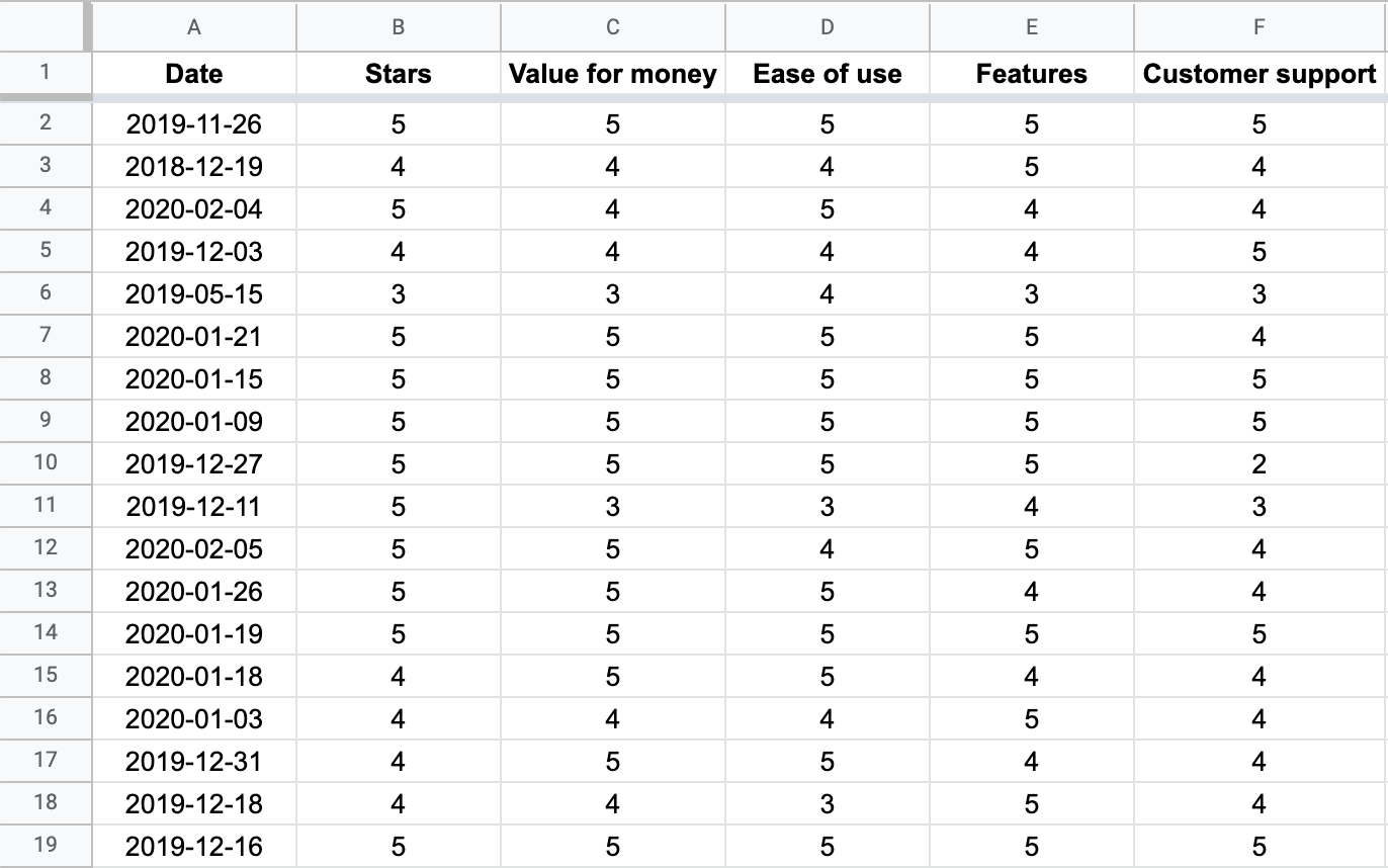
You can use Excel to analyze your survey data, like we did in the example, below, showing the results of over 2,500 survey responses from Slack users.
This is a scale question review, ranking the app from 1 to 5 stars on General Use (the “Stars” column), Value for Money, Features, Customer Support, and Ease of Use:
To begin analyzing survey results, follow these 4 steps:
1. Filter survey results by different criteria
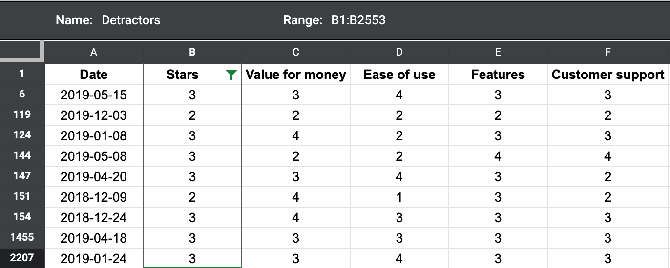
Close-ended survey results can easily be filtered to show respondents that gave a rating of 3 stars or lower, for example:
2. Calculate mean, maximum, and minimum
Excel, Google Sheets, and other spreadsheet programs have built-in formulas. In Excel, simply highlight the entire column (or group of columns), and choose the correct formula in Excel. Type ‘=average’, ‘=max’, or ‘=min’ in the corresponding field and Excel will calculate the statistics for you.

3. Cross-tabulate your survey results
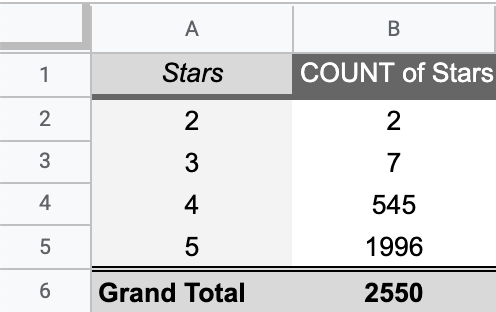
Cross-tabulation allows you to easily compare one group of respondents with another. This is done in Excel with a pivot table. Focus on specific age groups, occupations, geographic regions, etc.
In this table, we can see a summary of the column "Stars." It counts the number of times each star appears in a review.
4. Draw conclusions from your close-ended survey results
Close-ended results will give you a good idea of what is happening. If you’ve collected data correctly, you’ll be able to understand in what region and with what demographics your brand is strongest and what new areas you may be able to expand into.
You could, for example, find out that Pricing is not a particular issue for any of your customers, so it might be about time to raise your rates. Close-ended results, however, don’t allow you to fully understand why your customers feel the way they do, simply that they “do” or they “don’t.”
Open-ended survey results analysis
Open-ended survey responses give you a much more nuanced view into the opinions of your customers, simply because they are responding in their own words and not reacting to leading questions or with presupposed response choices.
Although this qualitative data is much more useful, it’s also a bit harder to analyze.
Fortunately, you no longer only have the option of costly, time-consuming, and not entirely accurate hand-annotated human analysis, you now have the power of machine learning on your side.
MonkeyLearn is a text analysis platform with powerful machine learning tools that can gather major insights by automatically analyzing and visualizing your customer surveys.
Sign up free to MonkeyLearn and follow these few steps to get data-driven insights.
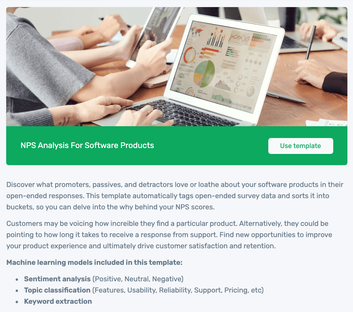
1. Choose Template
MonkeyLearn offers different templates for a number of data anlysis use cases:
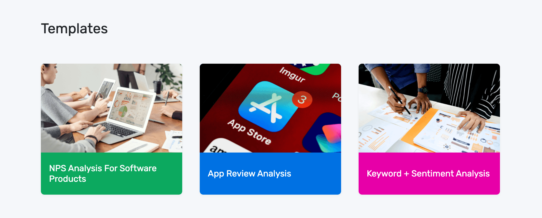
In this turorial, we'll use the NPS Analysis template:
2. Upload Your Data
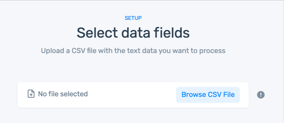
If you don't have a CSV file:
- You can use our sample dataset.
- Or, download your own survey responses from the survey tool you use with this documentation.
3. Match Your Data
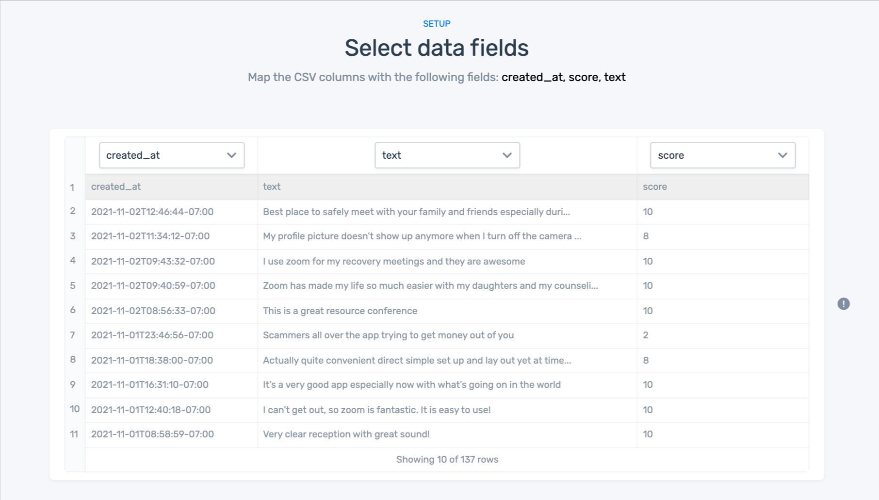
After you have uploaded your data you'll need to match the columns of your dataset to the right fields.
Here are the field you’ll need to match up:
- created_at: Date that the response was sent.
- text: Text of the response.
- score: NPS score given by the customer.
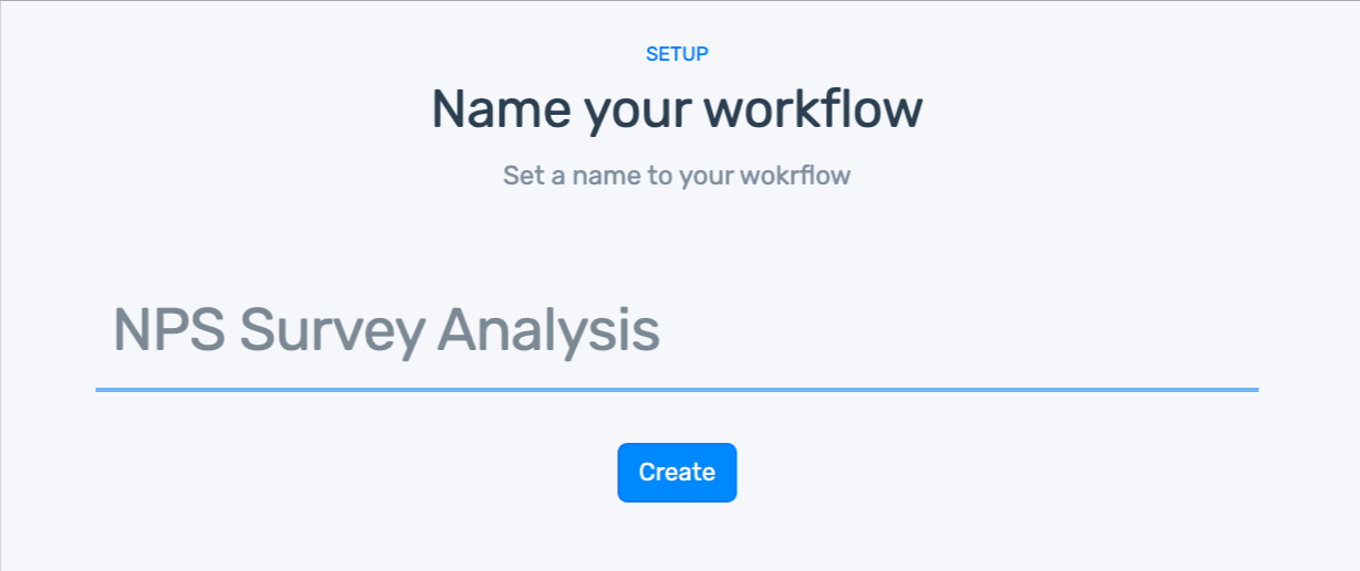
4. Name Your Workflow
5. Explore Your Dashboard
Our data visualization dashboard allows you to display your results in convincing, striking detail:
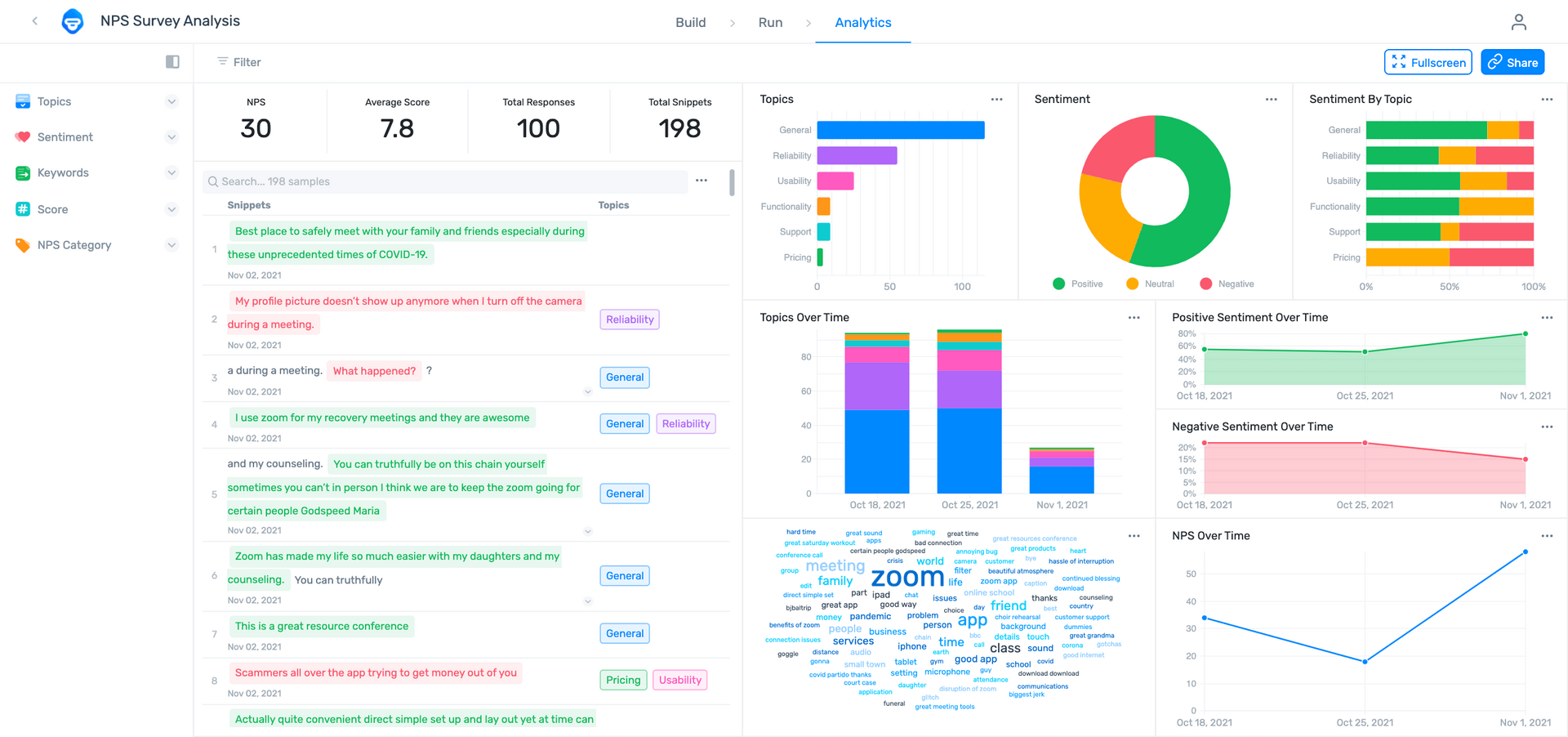
With your dashboard you can:
- Filter by sentiment, topic, keyword, score, or NPS category.
- Share via email with other coworkers.
- Notice how multiple aspects and sentiments have been split into fragments, otherwise known as opinion units.
The Wrap Up
Whether you’re working with the simple statistics, whole numbers, and averages of close-ended quantitative survey results, or diving headlong into your customers’ free-flowing opinions, feelings, and emotions with open-ended qualitative survey results, you’re guaranteed to uncover useful insights about your customers and the customer journey.
While close-ended survey results may be a bit tougher to work with, they can produce much more valuable information to help your company gain real-time, real-world, data-driven insights. And SaaS tools, like MonkeyLearn make machine learning accessible to everyone, at any level of computer literacy.
Sign up to MonkeyLearn to try the tools for free before you buy; take a look at MonkeyLearn’s pricing page to see your plans and options, or schedule a demo, and we’ll walk you through everything you need to know, from survey execution, to analysis, to survey results visualization.

Rachel Wolff
January 18th, 2021


